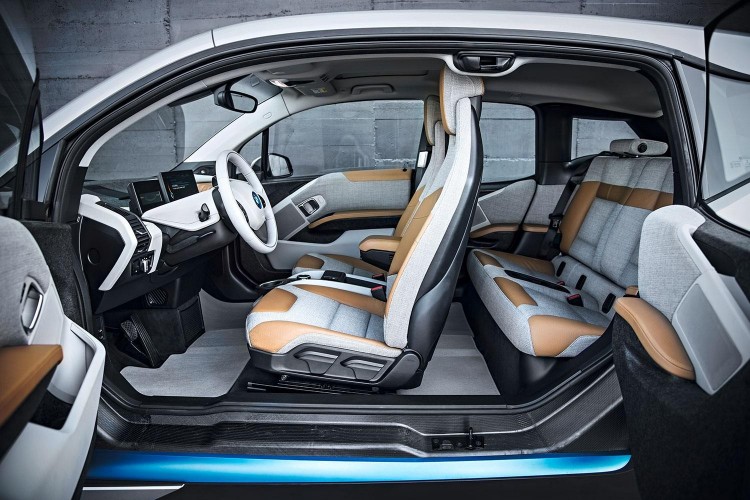
Interiors are one of the most important aspects of an automobile. It’s the place where you will spend 90 percent of the time with your car. So the interior must be a nice place to be. A good interior is one that is comfortable, ergonomic, and aesthetically pleasing all at the same time. But the really special ones are the kind that are able to do all of those things as well as being very different and shaking things up a bit.
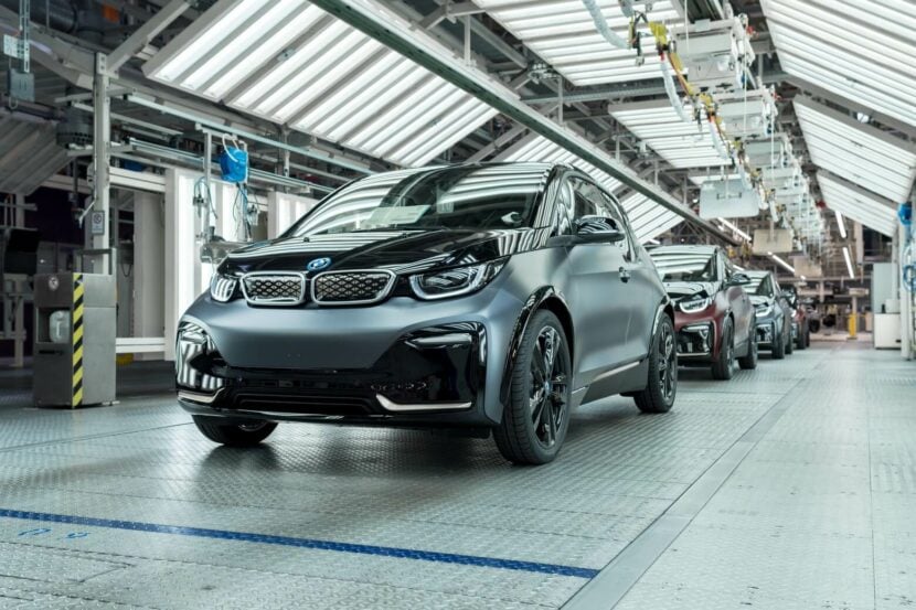
The interior that I think does this best is the BMW i3.
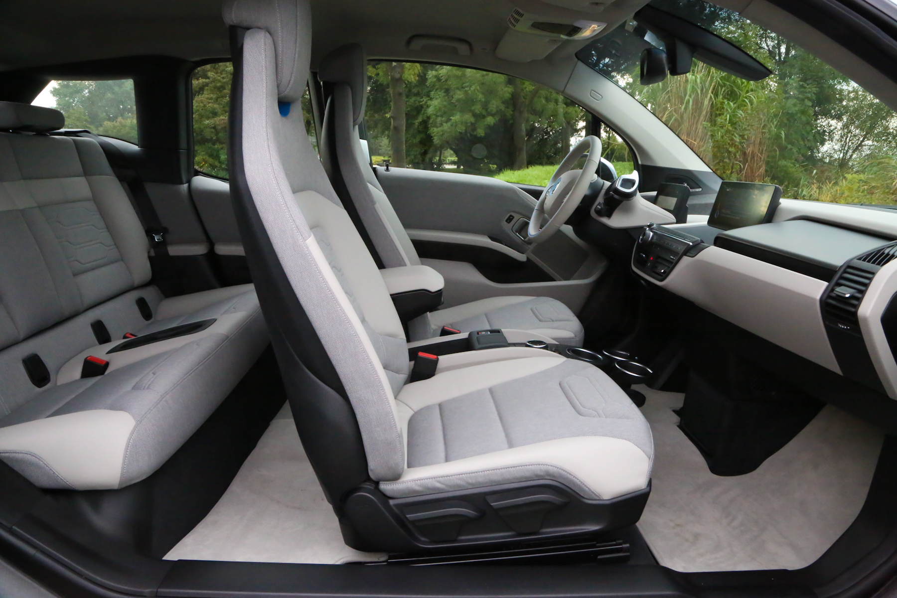
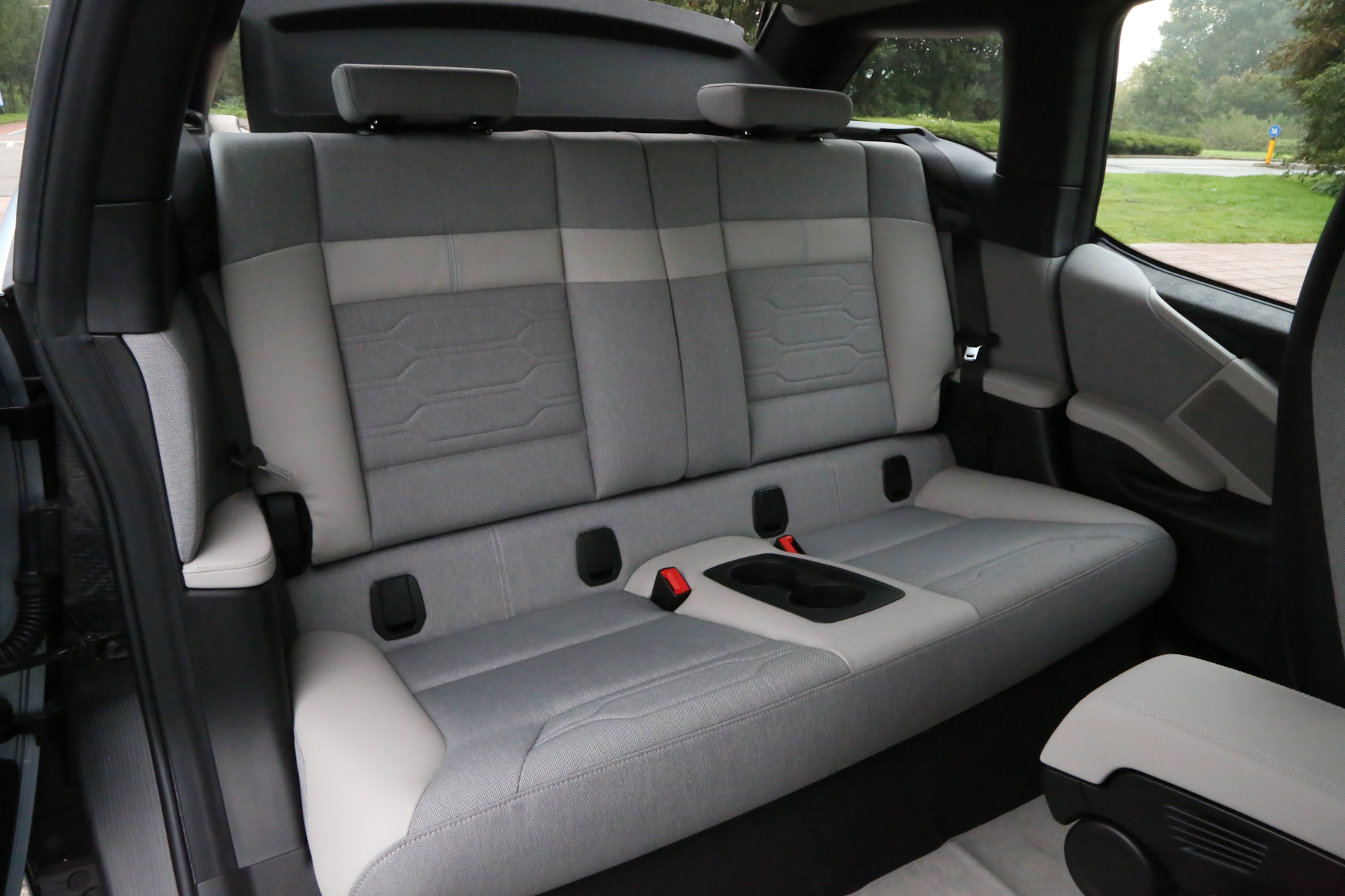
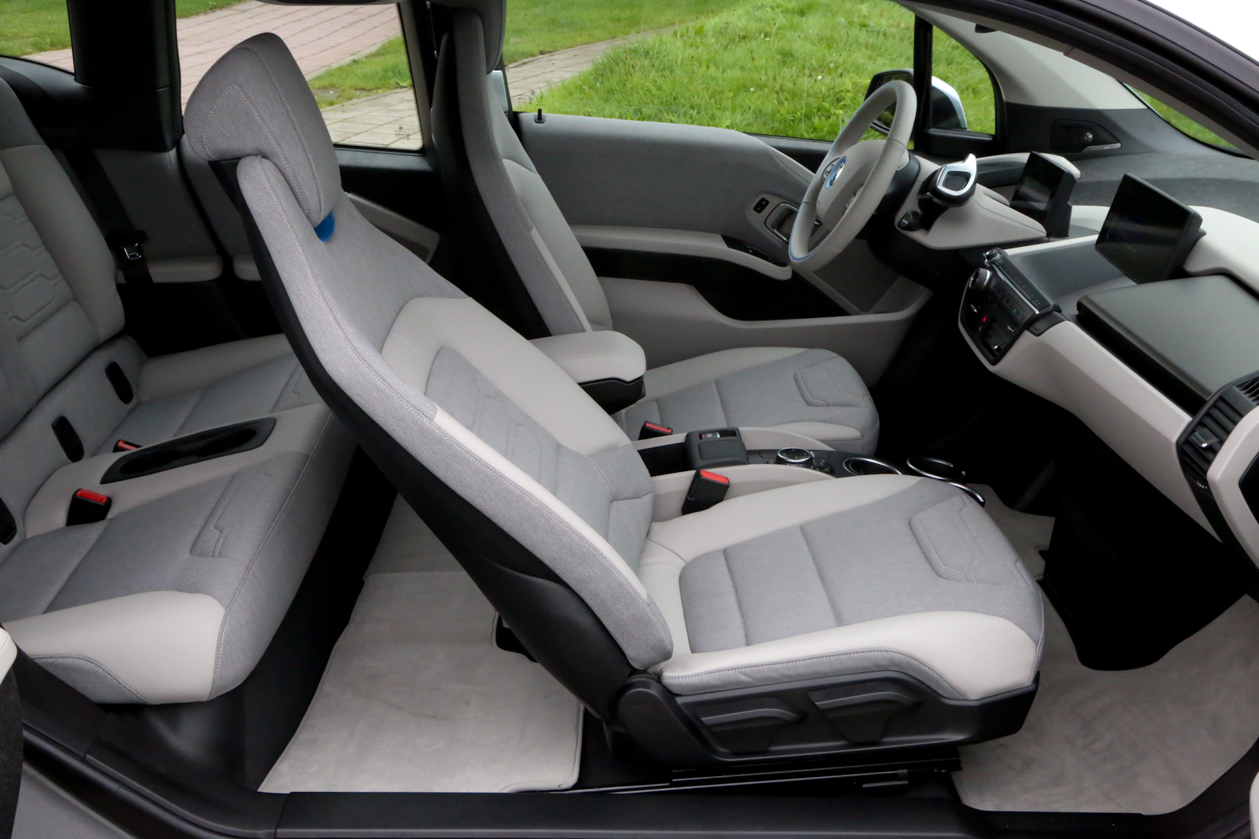
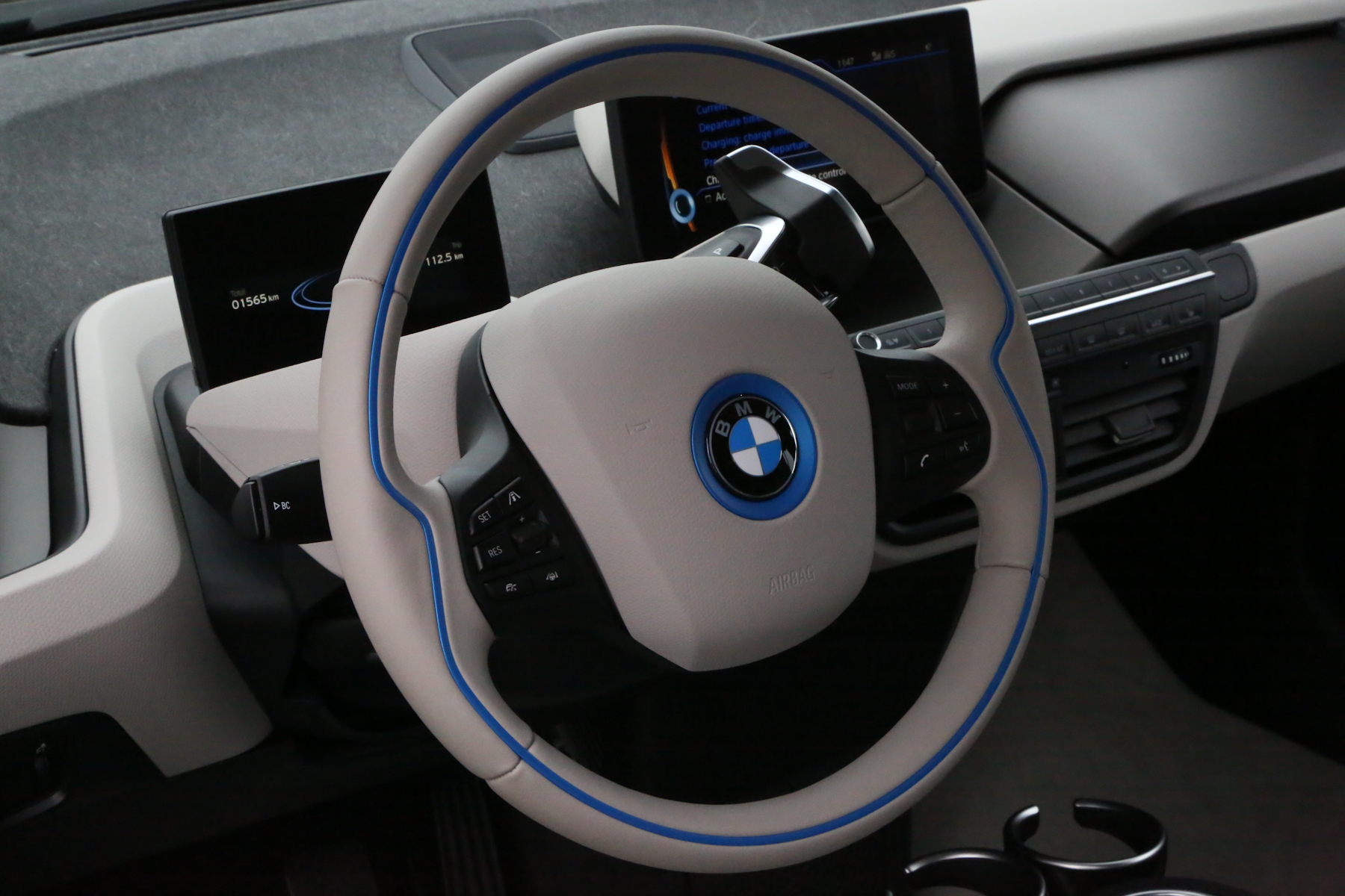
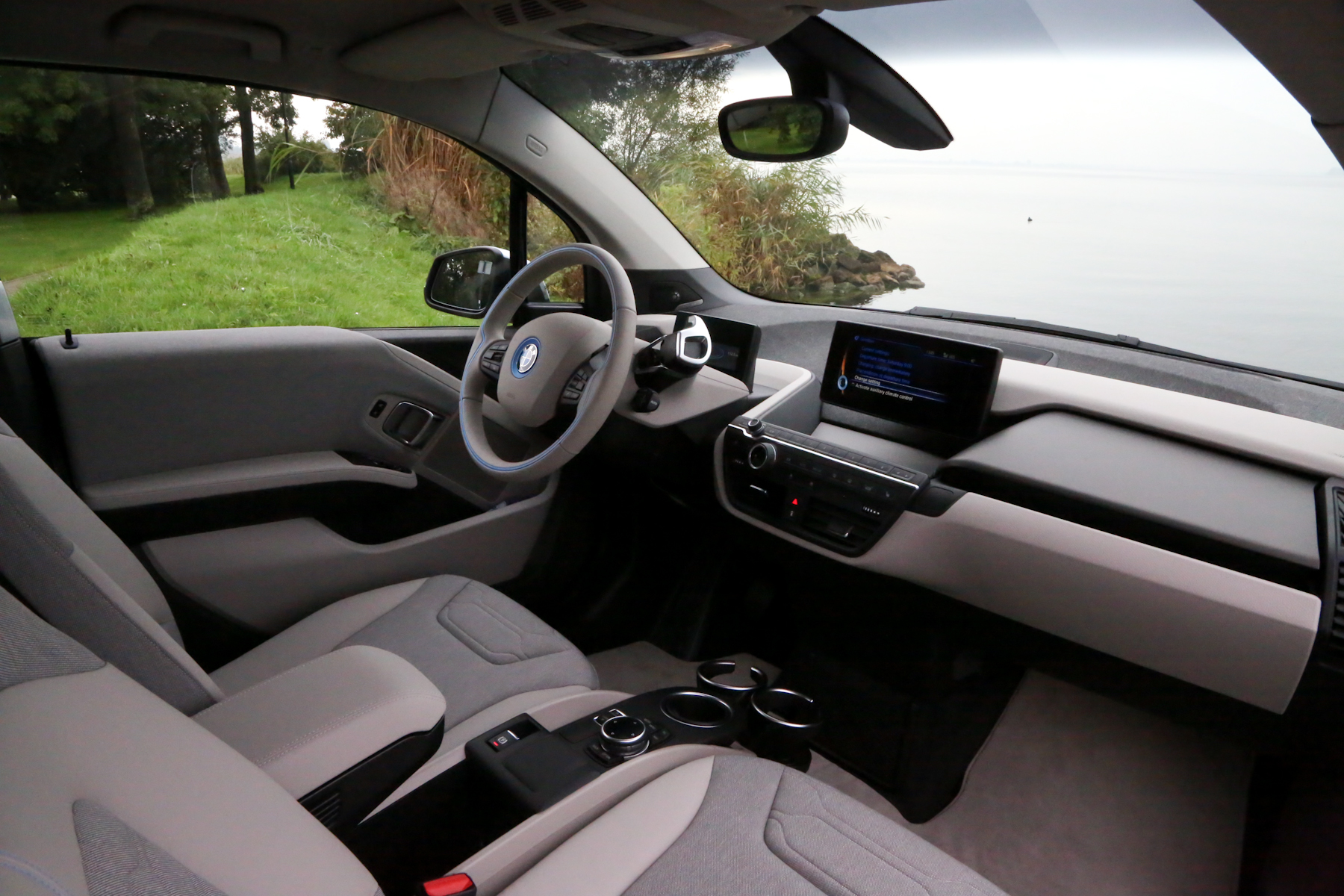
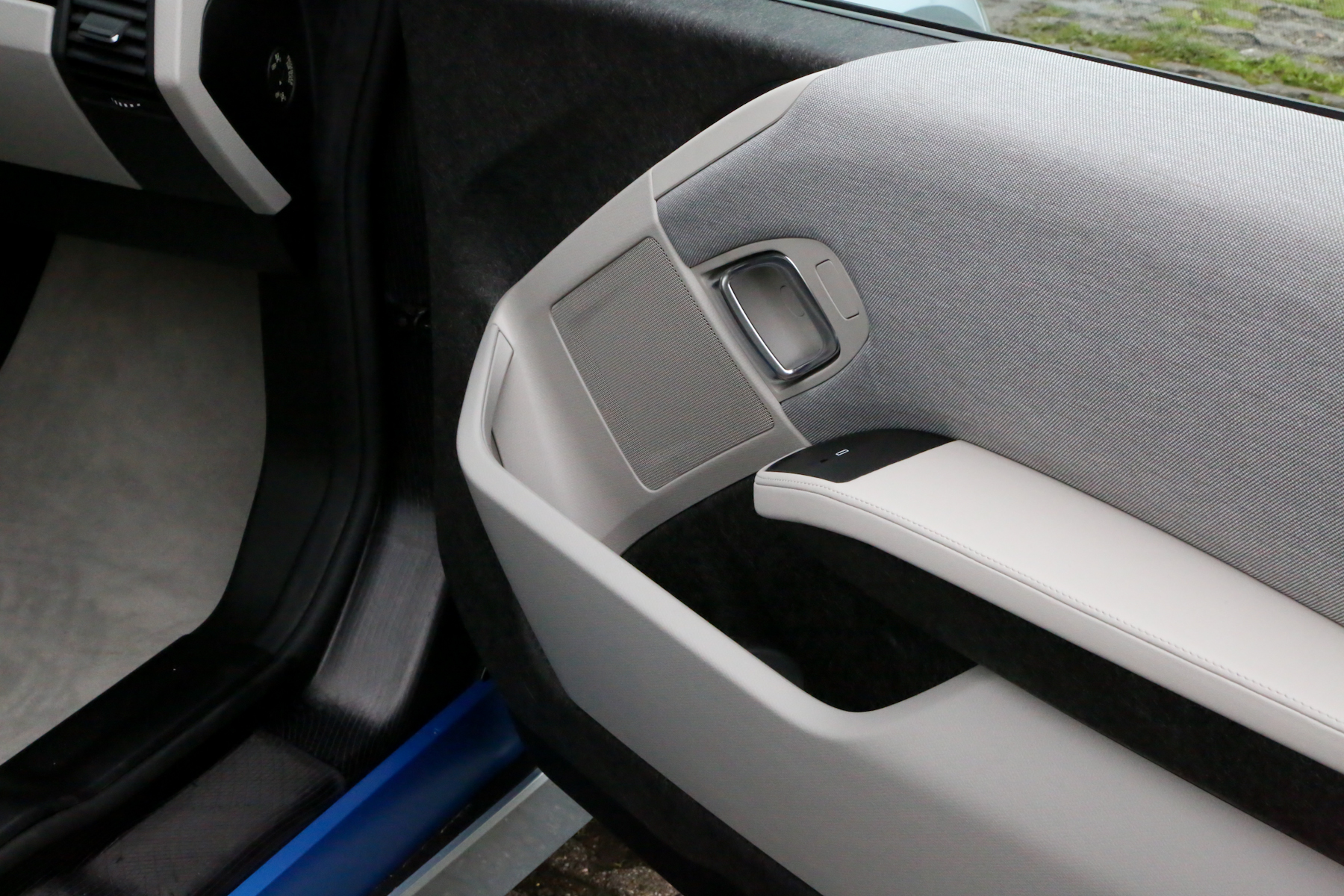
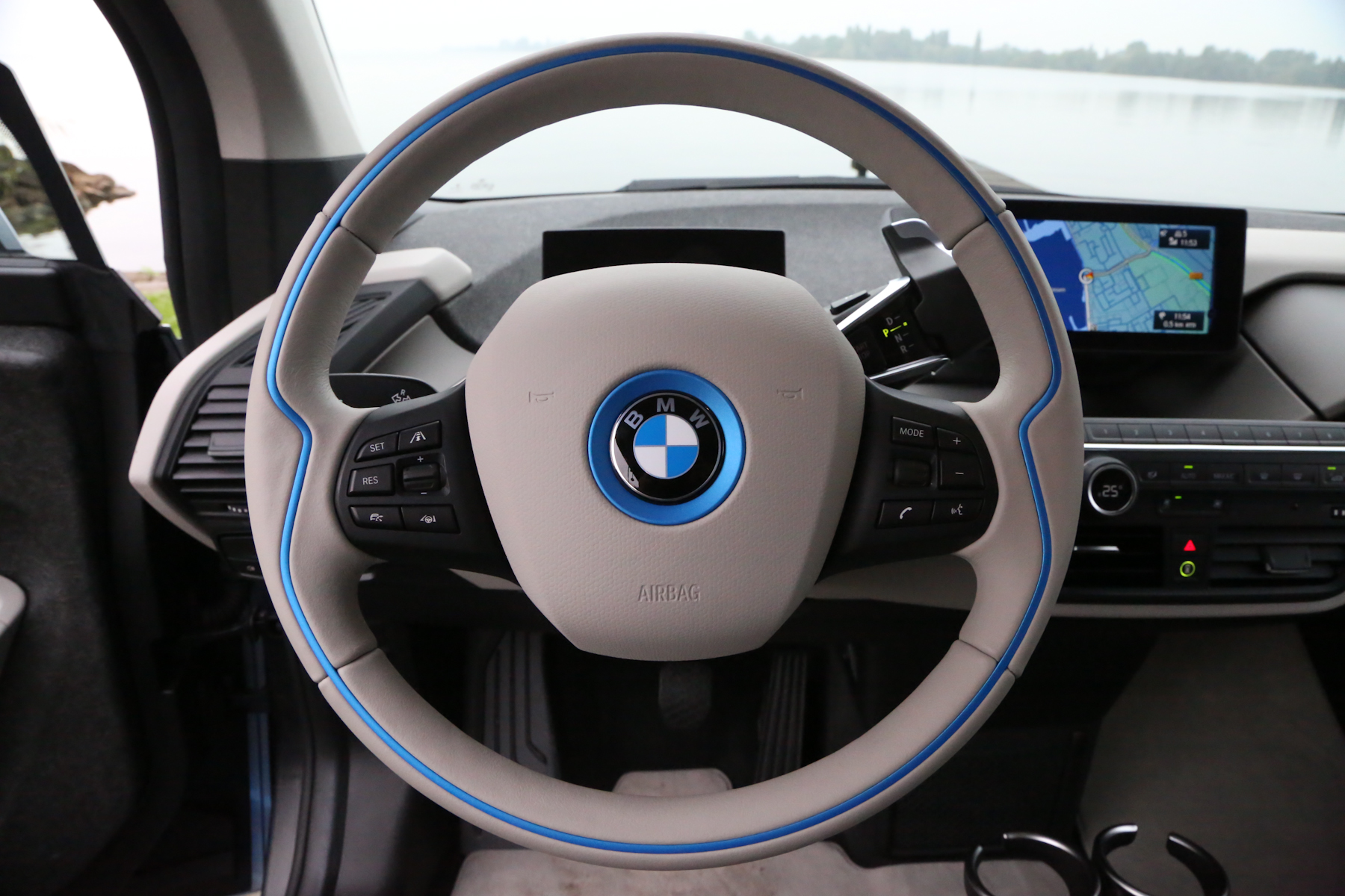
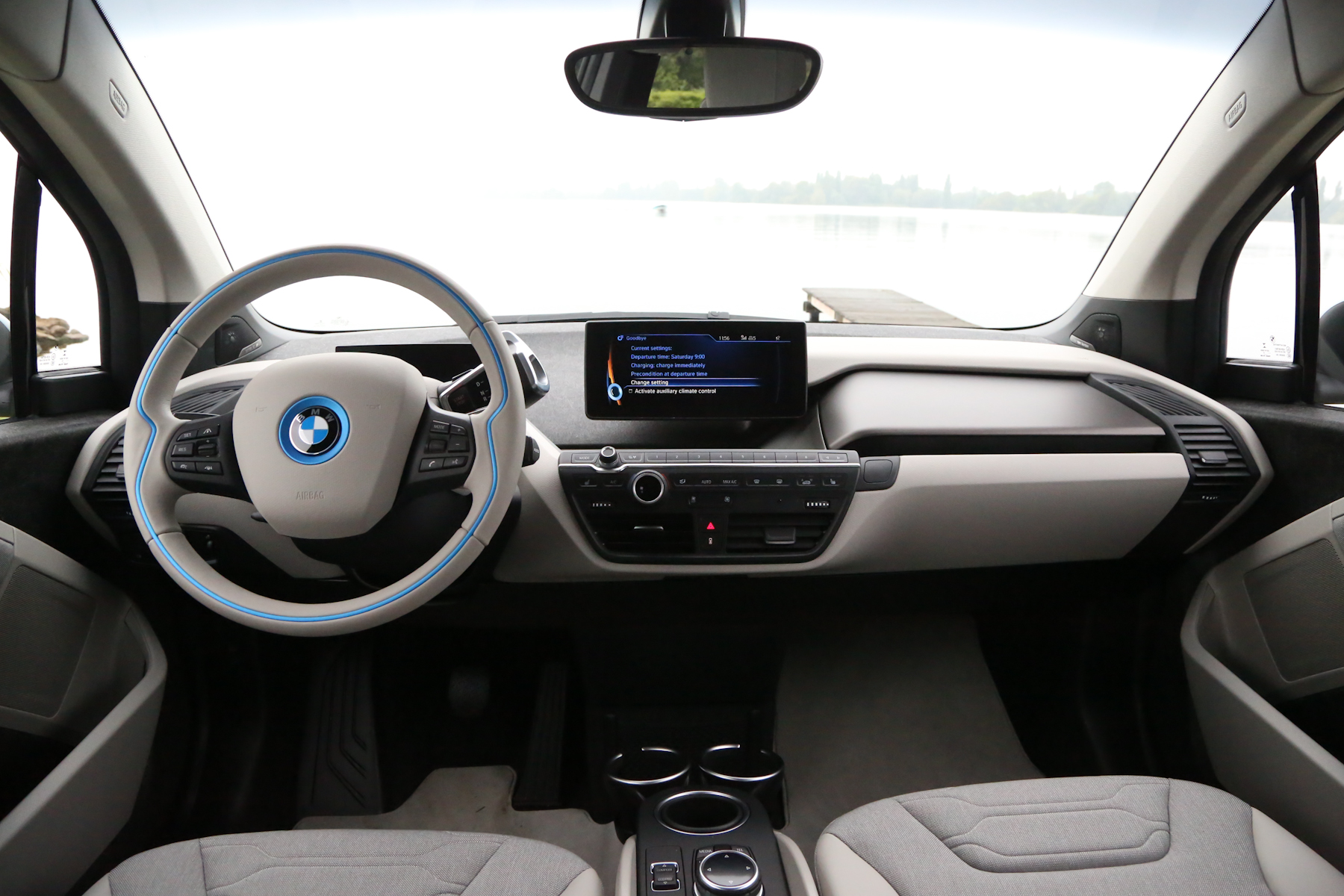
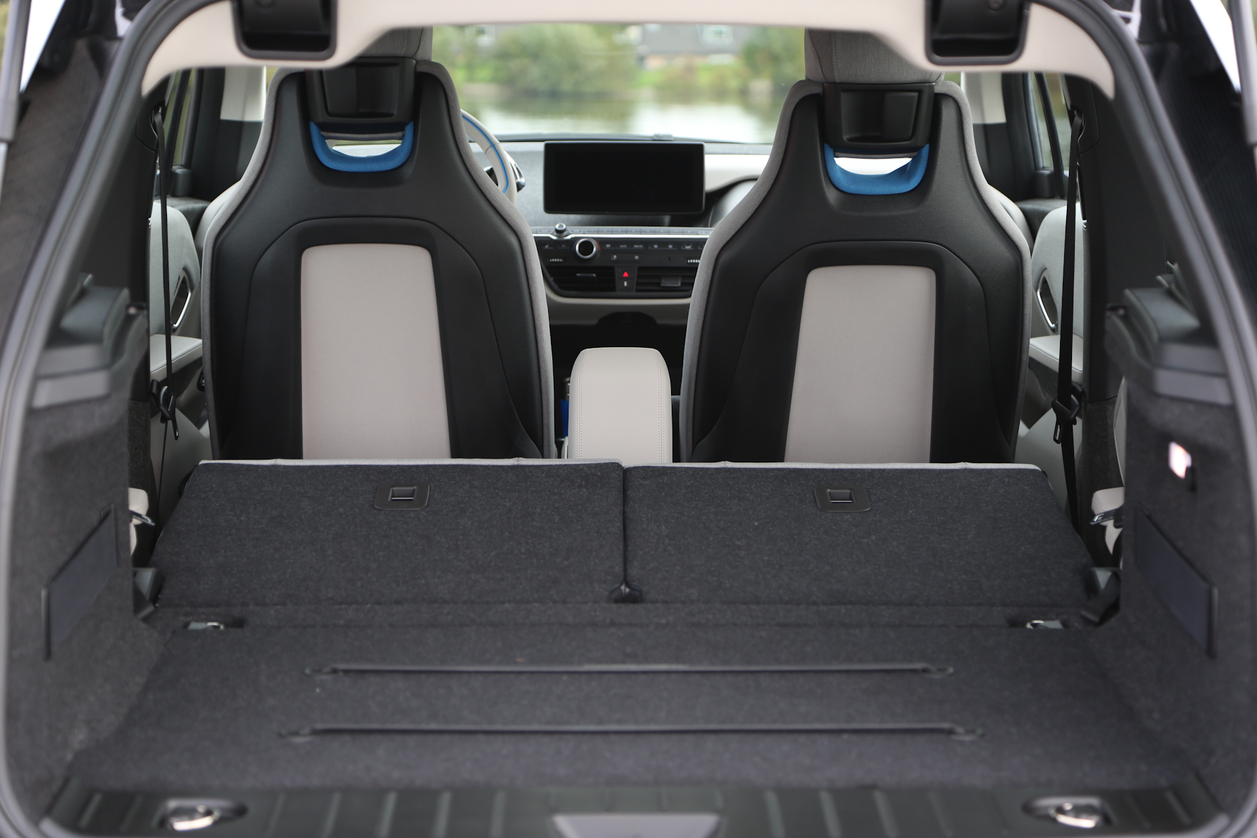
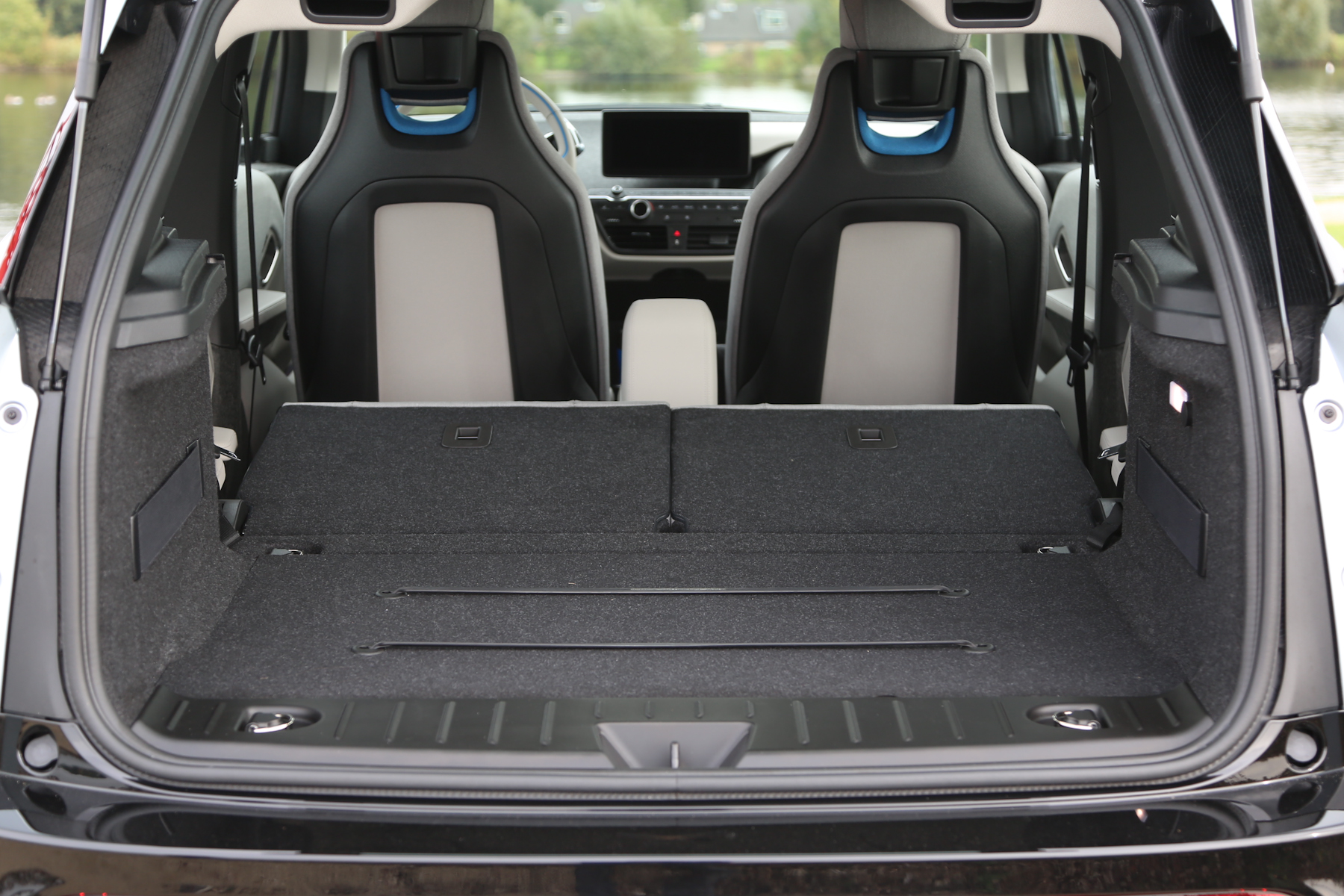
The i8 is very good too, but the i3 to me is the real winner. It’s just so different and refreshing and inspired. With its exposed carbon fiber, funky recycled seats, eucalyptus wood and incredibly open design, the i3 is like no other interior on the market. Which perfectly suits the i3, a car like no other on the market. It’s also so unlike any other BMW on the inside. The i8 sorta kinda feels like a typical sporty BMW from within those swan doors. But the i3 feels different. It feels happy and serene, not at all sporting, which was the idea to begin with.
Car and Driver recently sat down with the head of BMW i design, Benoit Jacob, and asked him some questions about its design. What he shared on designing the i3’s interior was quite interesting. When asked if there was an overall theme to the interior design of the i3, Jacob had this to say “What if the interior would inspire a more relaxed driving behavior? It’s Zen, in a way. From a higher design level, that was quite an interesting challenge.”
READ ALSO: BMW i3 – First Drive Review showcases Interior 2.0
Jacob also spoke about the use of the wood on the dash and how it pays homage to older BMW’s, such as the 2002 — “I’m very passionate about cars, and I believe there is no future without history. Sometimes, if there’s a way to echo the past a little bit—without any sort of retro design, because that’s absolutely not the point—why not? It just came by chance.”
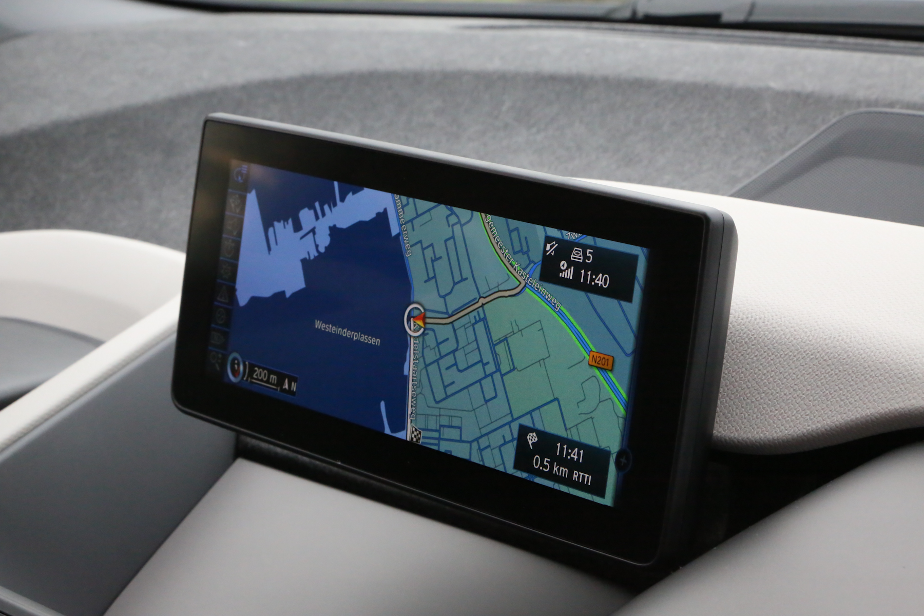
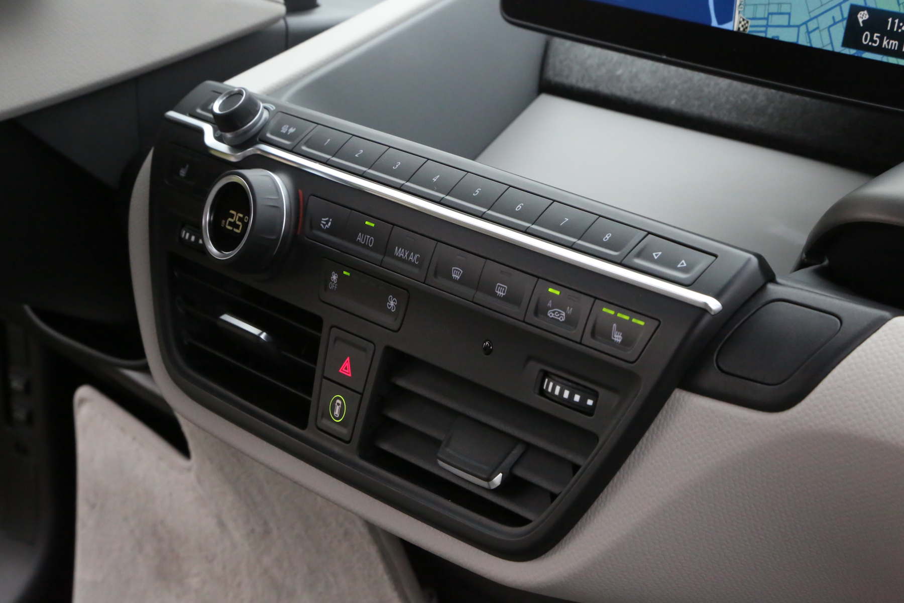
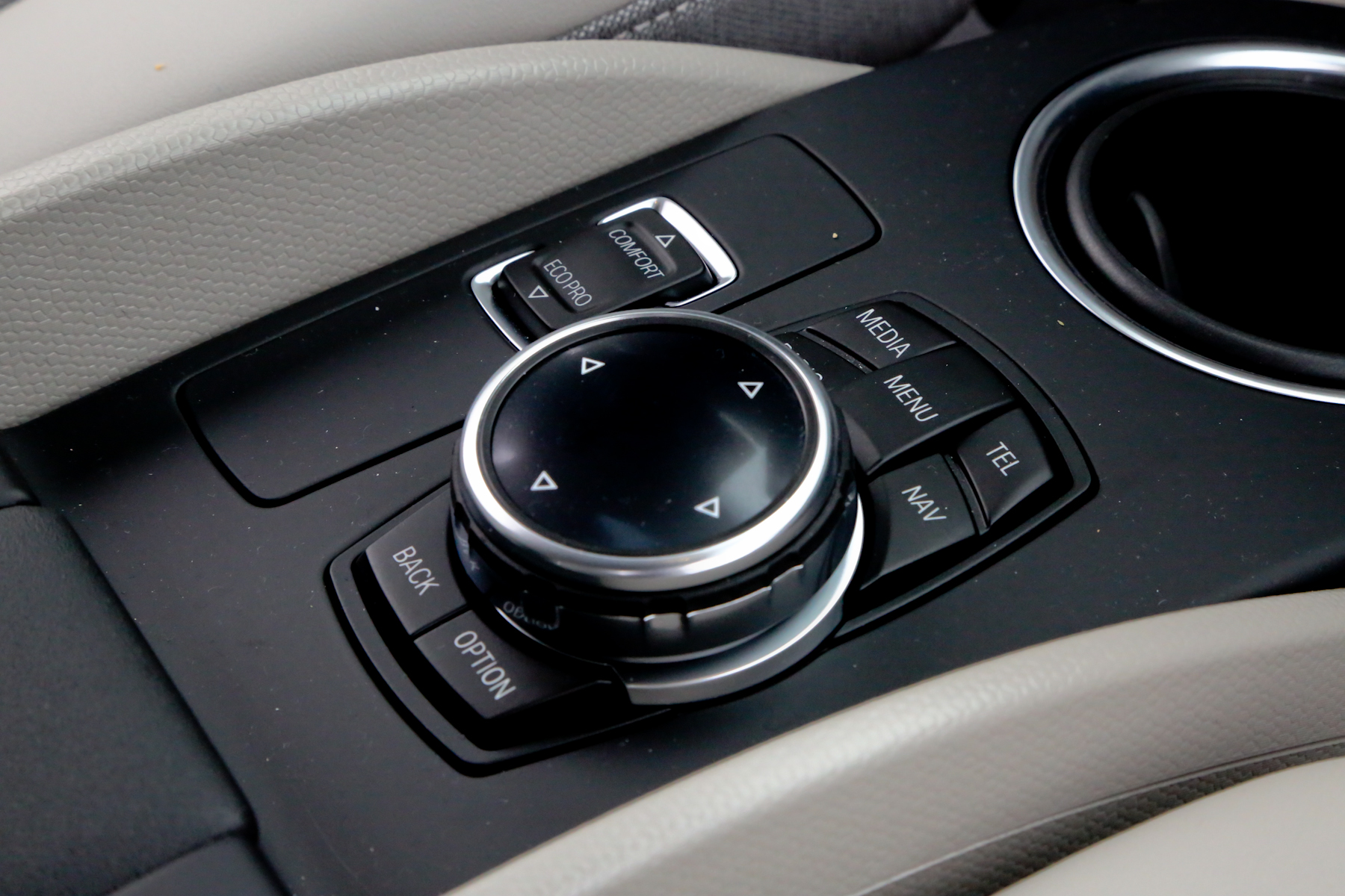
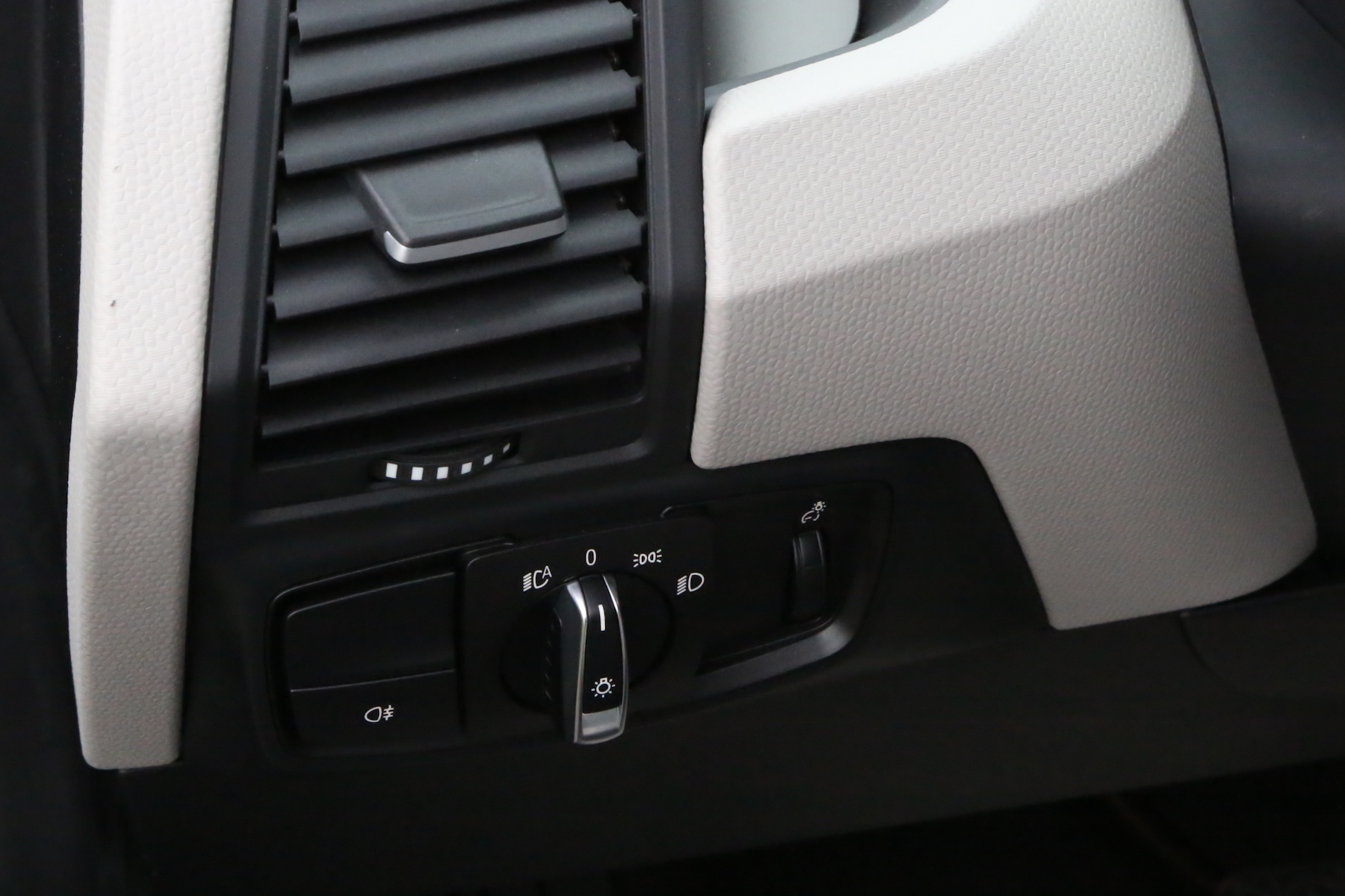
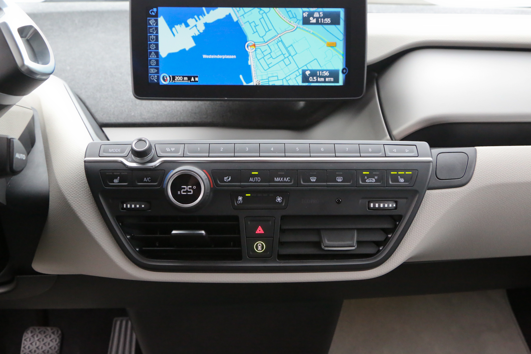
It’s so refreshing to hear a designer trying to inspire a driver with the interior. Too often, these days, car interiors are so flooded with buttons and mobile phone connectivity that the car feels so detached, like a computer. They feel like they’re just there as vessels for the driver to control the car. While that is, technically, what a car interior is, I like an interior to give the car a mood. The i3’s does that better than any other. And I applaud BMW for straying from its sporting roots to try a different genre. It’s refreshing and I hope there’s more to come.


