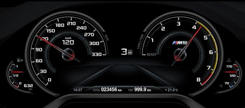
A while back BMW M decided to start a miniseries about how the cars we love and cherish are being built and, most of all, developed. After checking out the first three episodes, going over how the body is designed and how the whole package is colored inside and out, today we’re taking a closer look at how the user interface is being designed. Once again, the brand new BMW F90 M5 is used as an example.
Trailblazing design and breathtaking performance undoubtedly arouse longing and pure emotion. However, the actual connection between driver and high performance car is provided by the user interface. Since its early days, BMW M has always displayed an ambitious vision in this field. The BMW M1, for example, was considered a trailblazer by many due to the technology infused in it, which was cutting edge for the 70s.
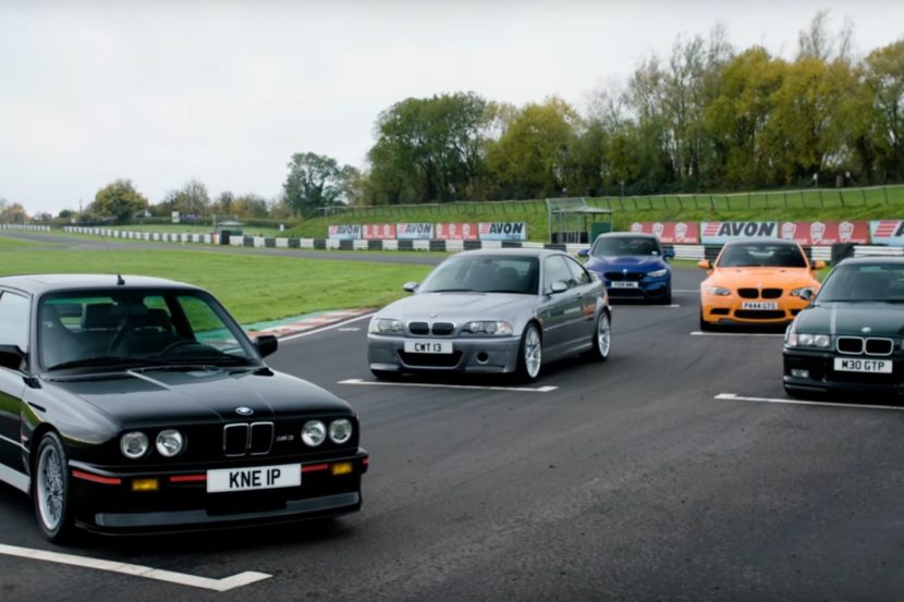
The user interface designers of the BMW M Design Department did not have to submit to the usual constraints and specifications when it came to the new M5. Instead they saw the brief as a gigantic playground free from compromise and let their creativity run wild. The result is an innovative, intuitive interface that instantly connects the driver to the M5’s sporty spirit. As a sign of respect to its predecessors‘ heritage, motifs from iconic models of BMW‘s history are also incorporated in the design.
“The fact that the instrument clusters can be digitally programmed has opened up a wide range of possibilities to designers,” said Mariko Iijima, User Interface Designer BMW M5. “An M Design differs from the BMW brand, because it is much more progressive and should be as sporty as possible,” said Stephanie Wermbter, User Interface Designer BMW M5. It’s a known fact that BMW designers create the series production models while the M and M Sport models are put together by designers working for the BMW M Gmbh division.


