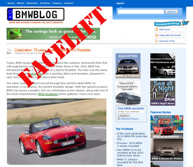
We don’t even know where to start…..it has been several months of planning, brainstorming, more planning and again brainstorming trying to figure out how to create a new, better, modern and user friendly design.
We started from the idea of creating a new theme that will focus mostly on you, our readers, and providing more content at your finger tips and just a click away. Another goal and quite difficult task was to reduce visual clutter to improve usability and we believe we manged to achieve that.
While the old design has done an amazing job offering content in a simple straightforward way, we wanted to evolve from that and move towards a magazine type of design, where all the content is well structured and defined.
The first step was to increase the font size, this has been a request that we have received since last year, we acknowledged it and received a high priority on our list.
By doing that, we implicitly had to go over to a wider reading column, a design feature that we always wanted to change. As you might have notice, we post a lot of photos and I mean…A LOT…last year, there were over14,000 photos uploaded by us. Since we know how much you enjoy seeing photos right in front of your eyes, we thought it would be a great idea to show them to you in a larger format.
The increased fonts and the wider central column will substantially increase the overall browsing and reading experience, maybe now all that tiny, but still important text will not be overlooked anymore. Also, the entire commenting system has been revamped, redesigned and brought up to the current standards. How did we do that? Well, beside the Facebook login that we offered in our previous design also, the comment replies are now threaded, so if you would like to reply to a particular member, simply click on the Reply link below their comment and an indented box will appear. Pretty cool, right?
What else have we done? OH YES…the top menu, which keep in mind, it’s a work in progress and it will better organized and categories well grouped together. So here, we decided to go with a fairly simple design, regular text link menus with a sub-menu that will display topics within the main category, this way, we can break down now several models that belong to some of the BMW Series. Above the main menu, we kept the usual Contact and About pages, but to the right of that, we added all the other blogs in our network.
As some of you might have noticed in the past, we expanded and now we control equal shares in BimmerToday.de, a very successful blog operated by our former contributor, Benny H., and also BMWBLOG.ro, the Romanian version of this blog. All these websites serve over 1 million pages to BMW fans around the world. But more on our future plans in another article…
Incorporated in the menu, you can see some placeholders we created for auto related services, of course the focus of these pages will be to provide tools and resources for all the BMW owners, from looking up new and used BMWs, to car insurance, warranties, financing and even classifieds. In the next few day, all these sections will be populated and even more content added in the future.
You might have noticed that our famous German license plate type of logo is not there, but no worries, it will return shortly since it has been part of our blog from the beginning and we intend to keep our identity intact.
Now onto the right sidebar, one of the most important pieces of puzzle in our re-design process. We strongly believe that the sidebar is one of the most powerful, useful and content display tool on an auto related site. If done well, it can help provide the readers interesting information that might be lost within the thousands of past and new articles. Beside that, it brings upfront some of the most popular articles and accessible with a click of a mouse.
We wanted to keep it fairly clean, so we grouped together some of the things like Recent Comments, Top Articles and our newest invention, Editor’s Pick. Once again, it’s still work in progress and we know there are a few bugs that need to be corrected.
Part of our increased usability plan was the addition of pagination to the entire blog, so the popular Next/Prev links have been replaced by actual page numbers, so this should help you browse back and forth the pages way faster than before.
So in the end, why al this brainstorming? Well, we wanted to create a platform, a base for our future plans than can be built on top of this new layout without having to make any compromises or overloading the pages even more. We have been blessed to have such a great community of BMW fans and not only, formed around our blog and we owe you the best experience possible. Your comments, suggestions, feedback and even criticism has always been appreciated, and with your help and support, we came a long way and we promise, it will only get better.
Now putting away this emotional monologue -at least for us it was- we encourage you to report any bugs or issues that you might notice, please feel free to either leave a comment here or send it through our Contact page.
We hope you enjoy our facelift and while it might not be better than the one on an M3, M5 or Z4, we’re confident that you will appreciate it.
Many thanks to the talented team of designers and software developers at WP-Design, especially for putting up with the never ending change requests and additions. Awesome job Paul and Nicu, and we already look forward to our next project.


