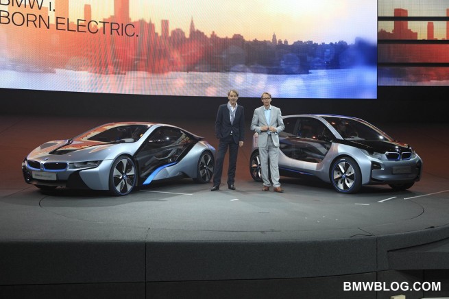
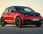
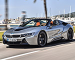
When you create a new branch of the family tree, the deign of the vehicles should show independence, yet still be familial. That was the task BMW’s design team was given with the new ‘I’ sub-brand. Two differentiators that are immediately noticeable are the blue surround on the roundel and the lack of a Hofmesiter kink at the back edge of the
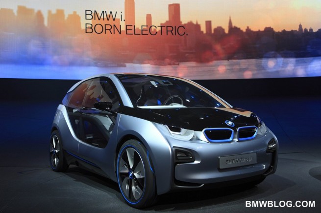
side lights. The twin kidney grilles are retained but the concepts incorporate a blue surround also (and the grilles on the i3 are not functional – they are strictly a design element).
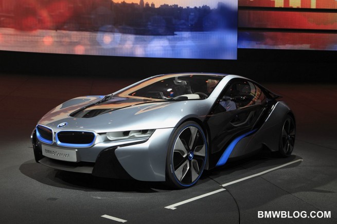
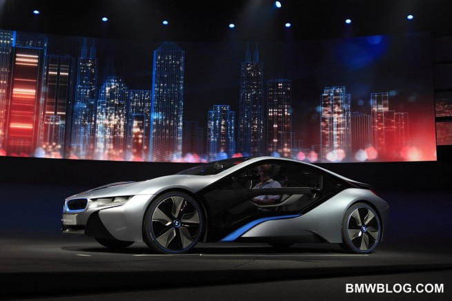
The side lights of the concept rather take their inspiration from aerodynamics. The sheer volume of glass in the flanks allows for the almost teardrop shaping from front to rear, what the designers call ‘stream flow’, with a thin trailing element at the rear. The i8 incorporates real aero elements in the rear deck. And those elements reflect the layering approach the designers have taken with the ‘I’ concepts.
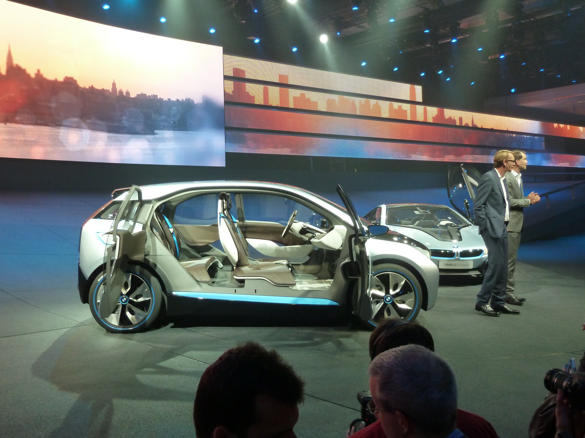
The interiors of the i3 is incredibly airy and open. Great car was taken to maximize the apparent space (and there is ample space to begin with). Layering is again a design element that provides a distinct feel to the car. Minimalism and environmentally friendly materials have been transformed into an interior that captures BMW’s premium image and yet still conveys sustainability.
The i3 incorporates a single box, maximizing the internal space in the smallest exterior space possible (not unlike the original Mini). The designers had the luxury of working with very large ‘glass’ areas on the flanks of the car, and the layers they’ve created do a good job of disguising the boxiness of the car. It will be interesting to see how they approach that when the production versions have operating side glass, and the usual accoutrements needed in the interior door panels. That’s when they will earn their money.
The i8 is the aggressive bomb that we imagined. The exterior is as future forward as possible (and yet, as a low volume car, it may look closer to its production version than the i3. The grille of course is functional and as on the i3, layering is the theme. With a high central tunnel incorporating the battery pack, the interior will be separated side to side and front to rear. Consider it a 2+2 grand touring (in the true sense of the word). But there is no ‘worn Birkenstock’ feel to the surfaces and controls but rather a simple, crafted elegance that incorporates the high tech touches expected from BMW.
There are a few restrictions that the platforms impose on design. In the case of the i3, the press materials mention the fact that the seat bottoms are continuous from side to side, allowing easy entrance and access to either side’s seating position. But if you look at the battery pack of the i3 you realize that the ability to bolt individual seats in, like a ‘normal’ car would intrude on the battery pack. It will be interesting to see how they mount the seat belt buckles without intruding on the battery compartment. The battery pack also intrudes on the i8’s interior, but it’s less of an issue because it’s visually similar to a driveshaft tunnel in a ‘normal’ car.
But when asked about how working with CFRP impacts design, Adrian van Hooydonk basically described it as a gift of design freedom thanks to the incredible stiffness of the CFRP panels. It allows for the very open and airy feeling achieved in the i3, and gave them the structural freedom to produce a very aggressive, futuristic feel on the i8.
CFRP is a key enabler for the ‘I’ sub-brand and, as the production processes and supply of the raw material improve, expect to see more structural CFRP in the mainstream brand. The designers can’t wait.


