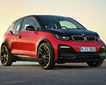
Adrian van Hooydonk described the i3 exterior as a ‘mono volume’, what some in the US would call a ‘one box’ design. Think of the old 1960s vans in the US. It’s a difficult shape to sculpt into something proportionally pleasing.
That said, with the exception of the door panels, the production vehicle looks better than the concept in my eyes. (https://www.bmwblog.com/2013/07/30/comparison-bmw-i3-concept-vs-bmw-i3-production-car/) The use of the blue and black accents hides some of the boxiness of the exterior.
The fact that the panels are thermoplastic allows for early (and often) life cycle impulses – and possibly color changes. But the see through doors would have been nice, though not possible in production.

One thing that was immediately apparent is that they have given the i sub-brand distinct and separate styling features. The BMW roundel is surrounded in i Blue or Frozen Grey depending on the model – and the rear side window is not outlined by a Hofmeister kink but rather with what BMW is calling stream flow. There are six available body colors, two non-metallic.
The interior comes in three trim levels. The BMW worldwide press literature refers to the trim levels as, Loft, Lodge, and Suite. In the US the trim levels are said to be Mega, Giga, and Tera (and we’ll wait for the uber-lux Peta). After seeing the three trim levels I’d refer to them as, Geek, Professor, and Eco-Chic.
The base trim level features a non-leather, Sensatec material with a science-fictiony pattern. It appears to be light grey. The next level features wool and leather in a natural tan and beige color scheme, evoking a look of a tweed jacket with elbow patches. This is the interior that I think looks best in the car. The upscale interior features a dark leather that frankly reduces the visual space in the interior. But it is an all-leather interior.
The interior space is comfortable with elevated seating, thin seats (to maximize space) and flat floors – completely flat. And yes, as advertised you can enter from one side of the car and exit the other. Raise the arm rest in the front and even I can manage the process.
But the highlight of the interior is the dashboard and IP. The use of a horizontal swath of eucalyptus wood is gorgeous in this car. The two flat screen panels seem to float above the dash. The door card surrounds and the back of the dash panel have a felt like appearance though the tactile sensation is smooth. I wish they felt more like felt to the touch – but it appears the production process eliminates that possibility.
All in all this is a welcoming place to see a city from, especially in the mid-level wool/leather trim. It’s nice to see the detail in the interior and there are plenty of exterior design features that will delight as well. It’s just difficult to make a one-box exterior design look appealing and this may be as good as it gets.


