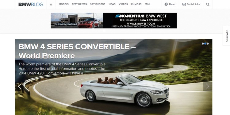
If you’re one of our loyal daily readers, you may have noticed some significant changes here at BMWBLOG. After months of planning and designing I am proud to introduce to you the NEW BMWBLOG.
This new design is our biggest change since we launched BMWBLOG seven years ago and a step into the era of mobile devices and content consumption from anywhere and with any device.
While the previous version focused on bringing most of the content upfront, the new design is a bit more subtle and invites you to further explore the content.
We have also moved away from the darker skin and aligned ourselves with the modern and simplistic approach of today’s design. You will notice the design being dominated by white colors and whitespaces, with transparency that allows you to seamlessly browse the content while enhancing the reading experience.
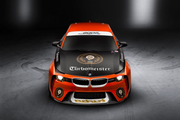
One of the biggest changes we are bringing is the use, once again, of large images. Four years ago we were featuring large images across the site and unfortunately we moved away from that for a while. But today, we are bringing the amazing BMW photography we have to the front. The site is dominated by large images, from the top to bottom, providing an eye-catching experience.
We are also design responsive now. What that means is that the design will adjust to any resolution providing the same reading experience across newer monitors or older ones.
And to top it off, the mobile version of the site is fast, beautiful and simple to use.
Those of that are into typography will probably appreciate the use of the new font and its size making reading on any small or large device an enjoyable experience.
The minimalistic menu is also less intrusive and mobile-oriented and guides through the content in an easy way.
We hope you enjoy the NEW BMWBLOG and let us know if you find any annoying bugs. Your feedback is always appreciated!
Thank you!


