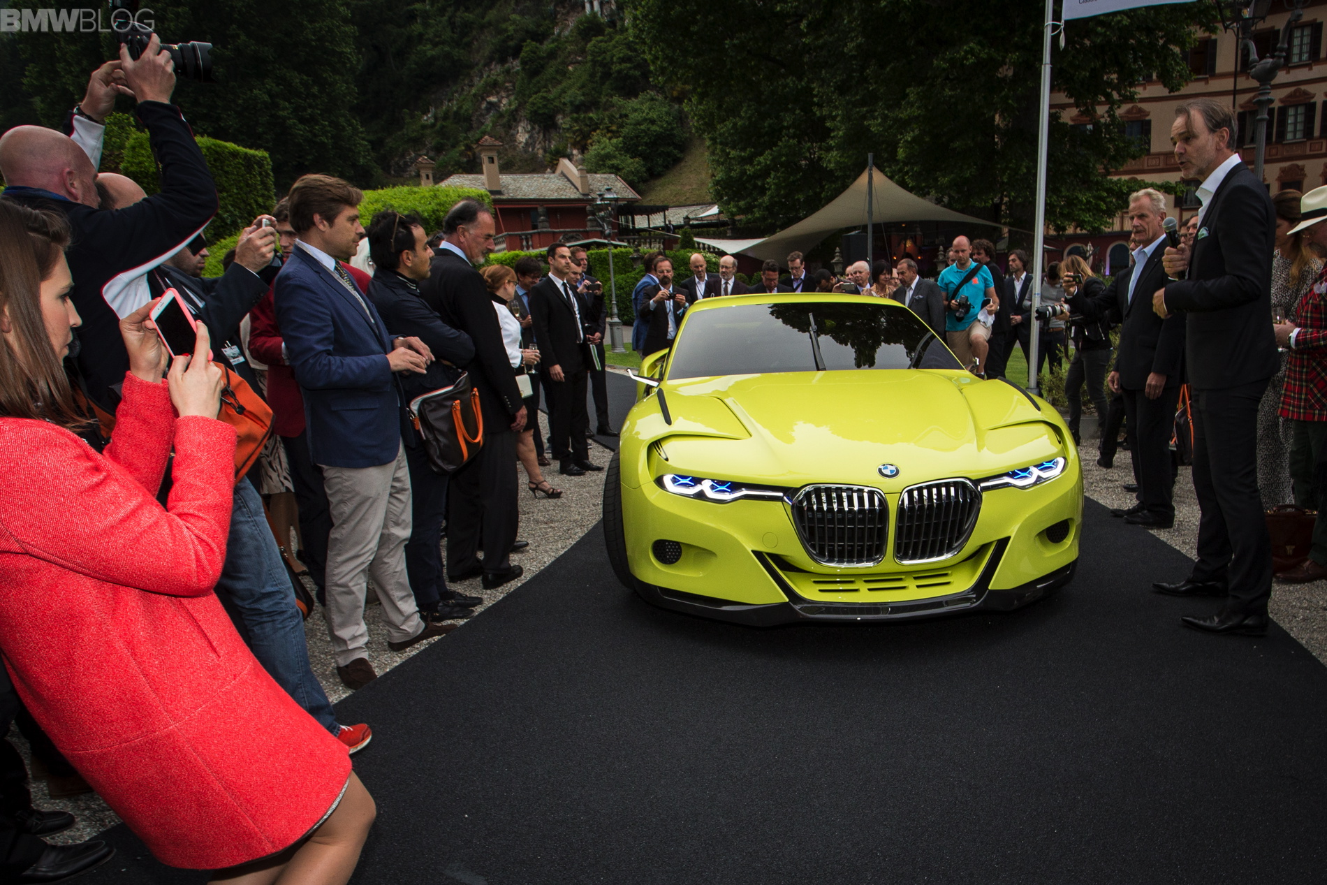
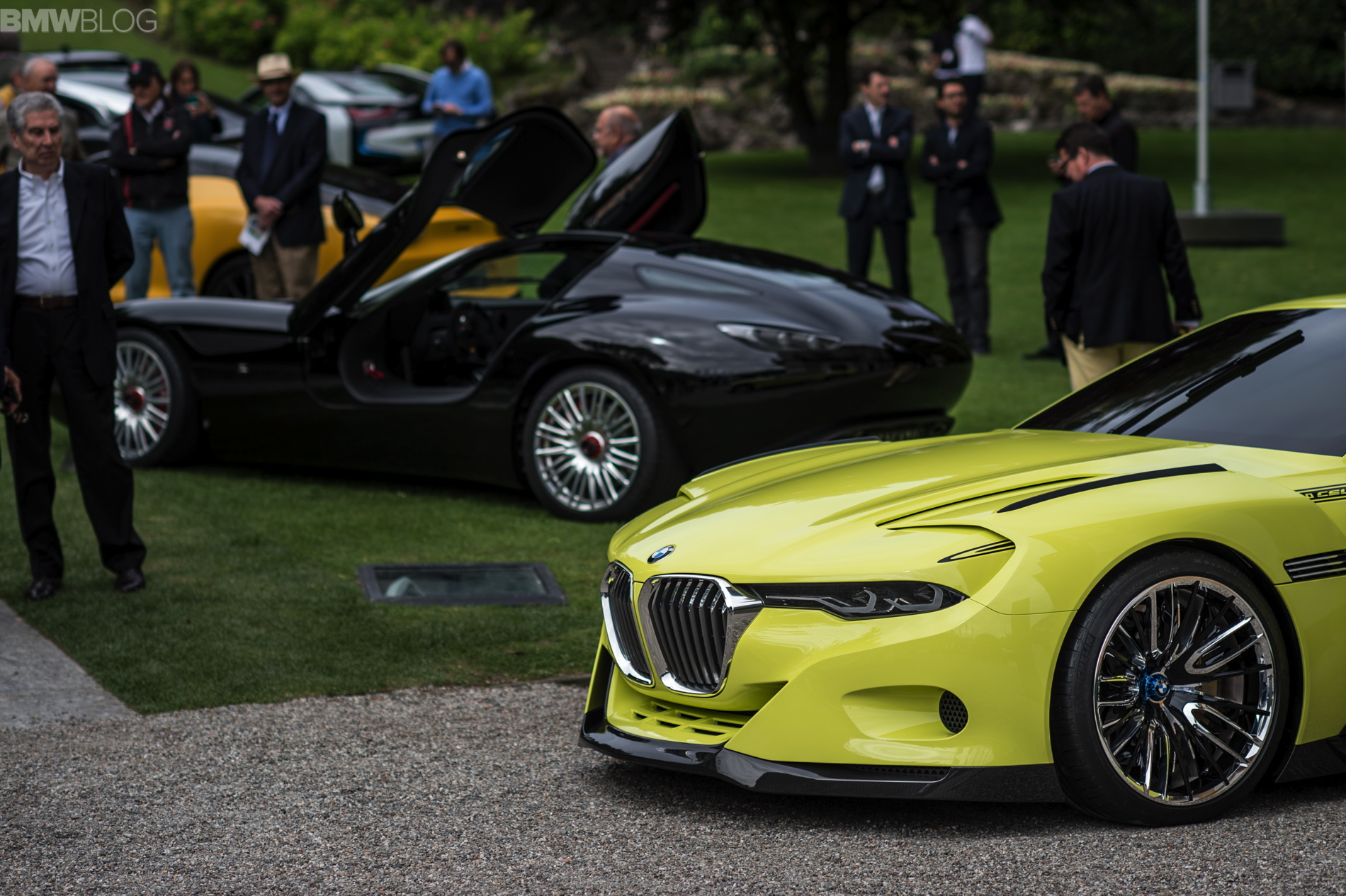
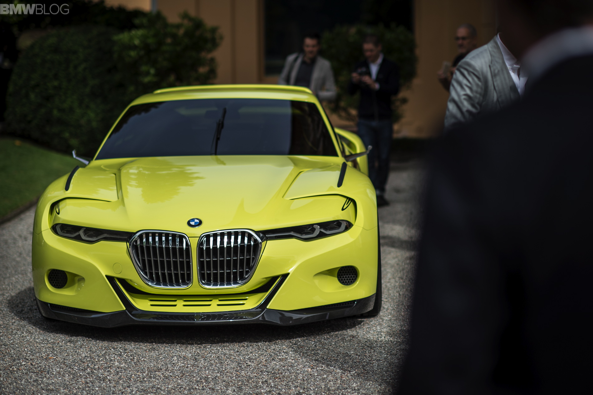
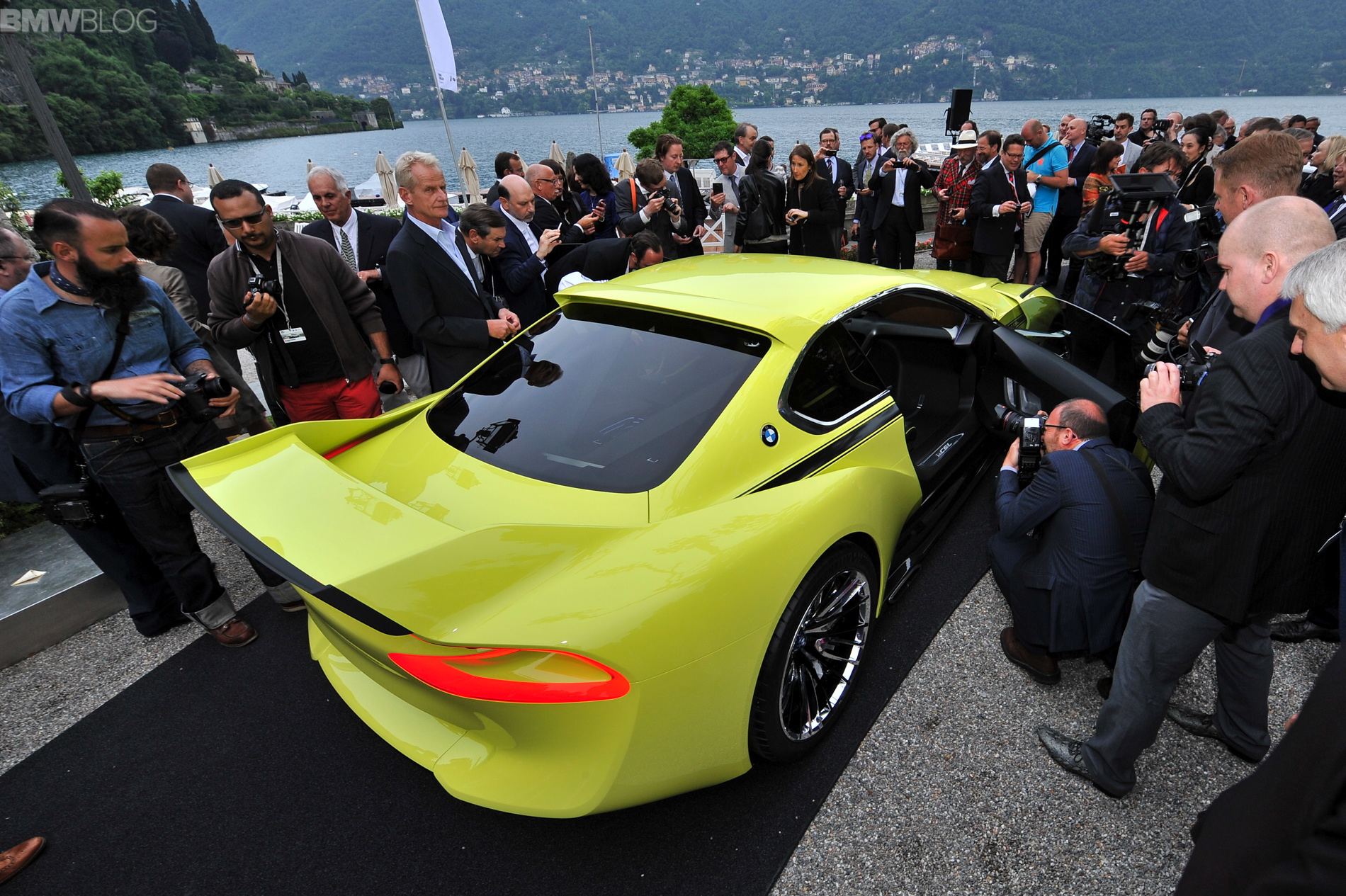
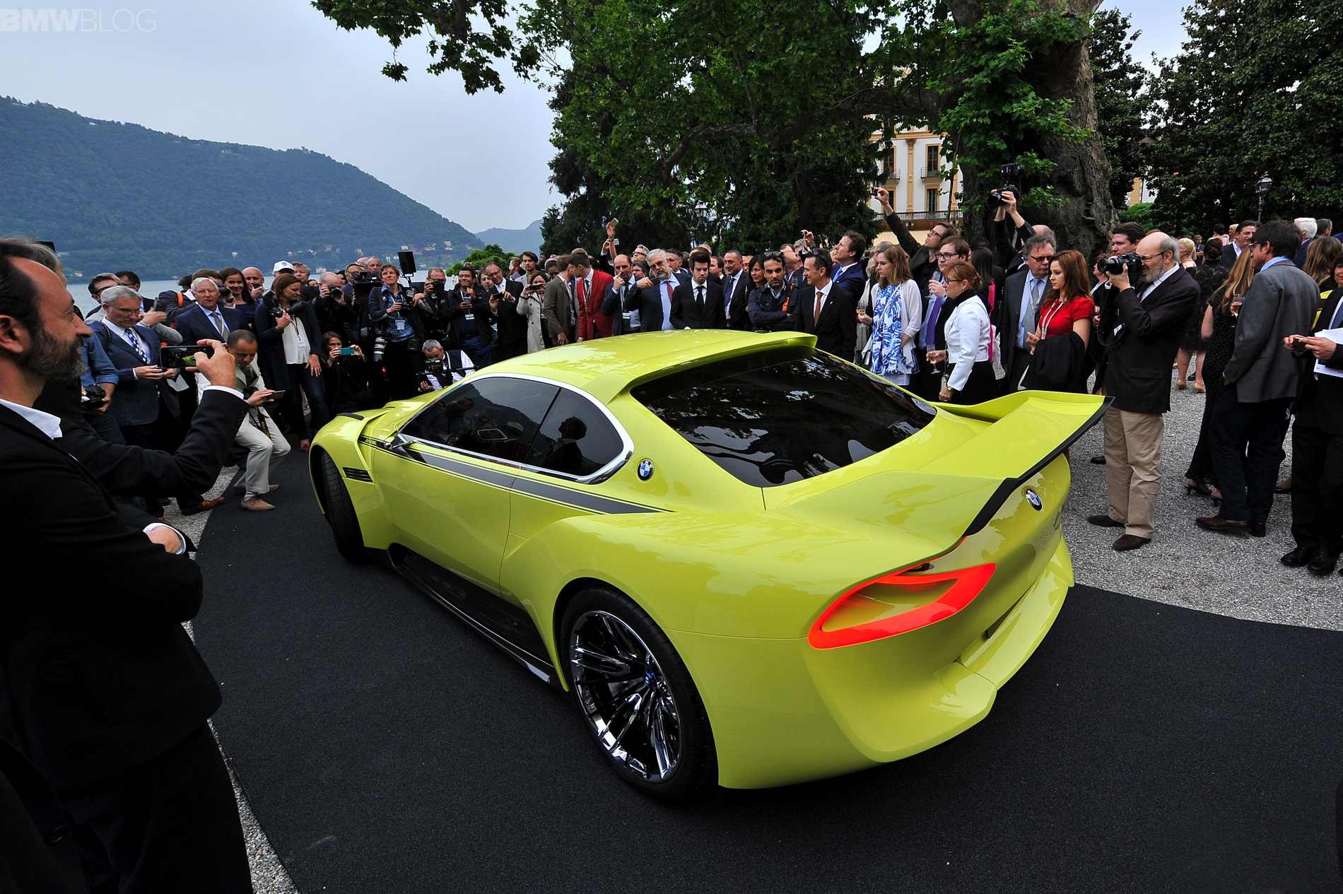
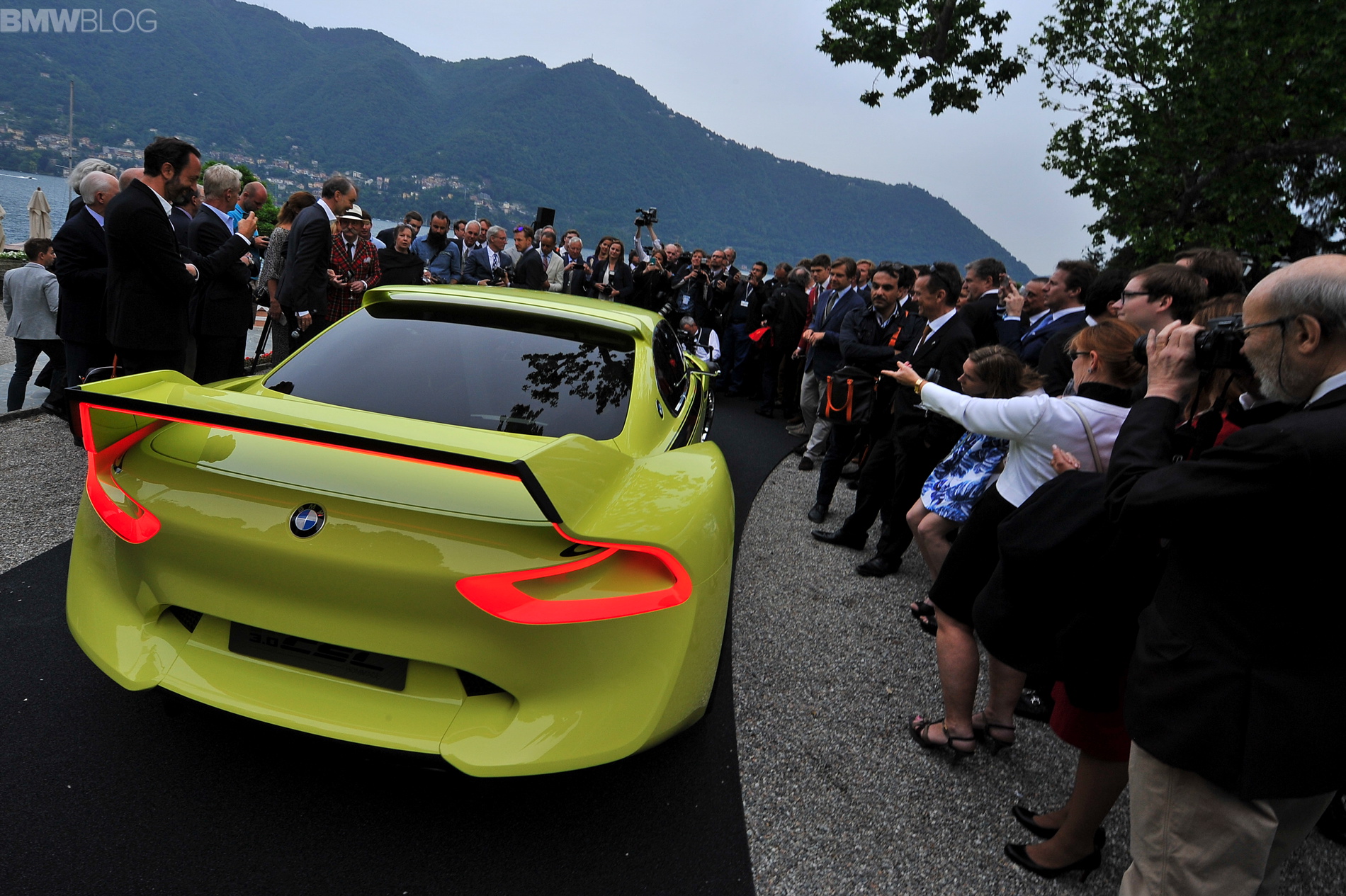
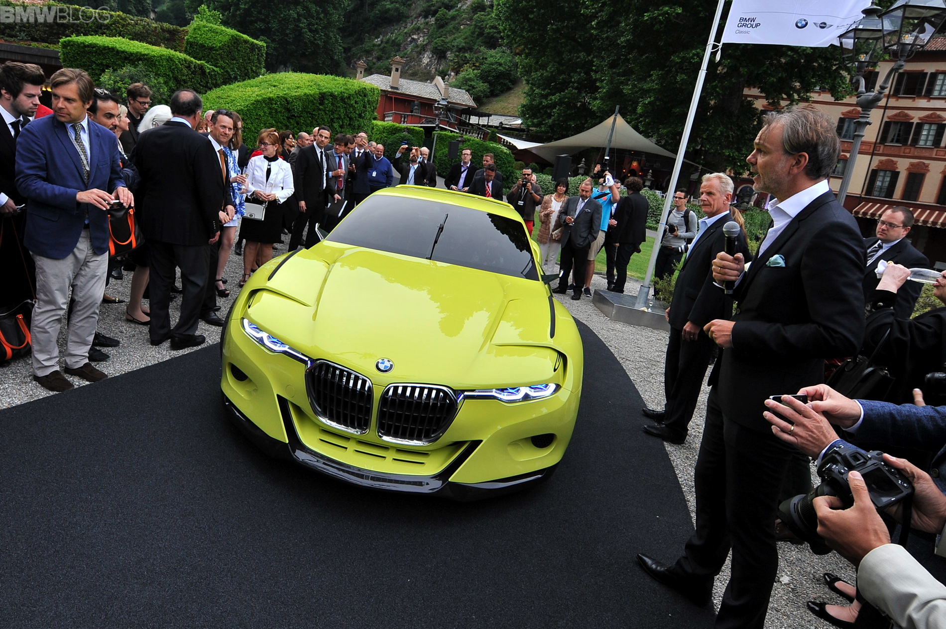
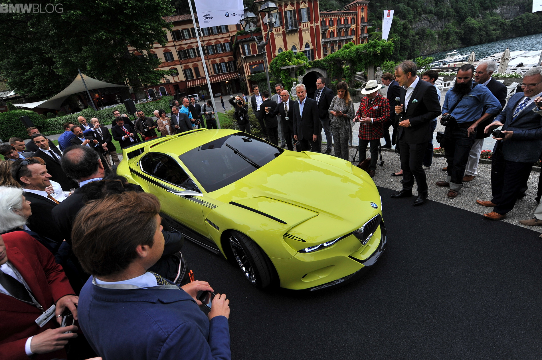
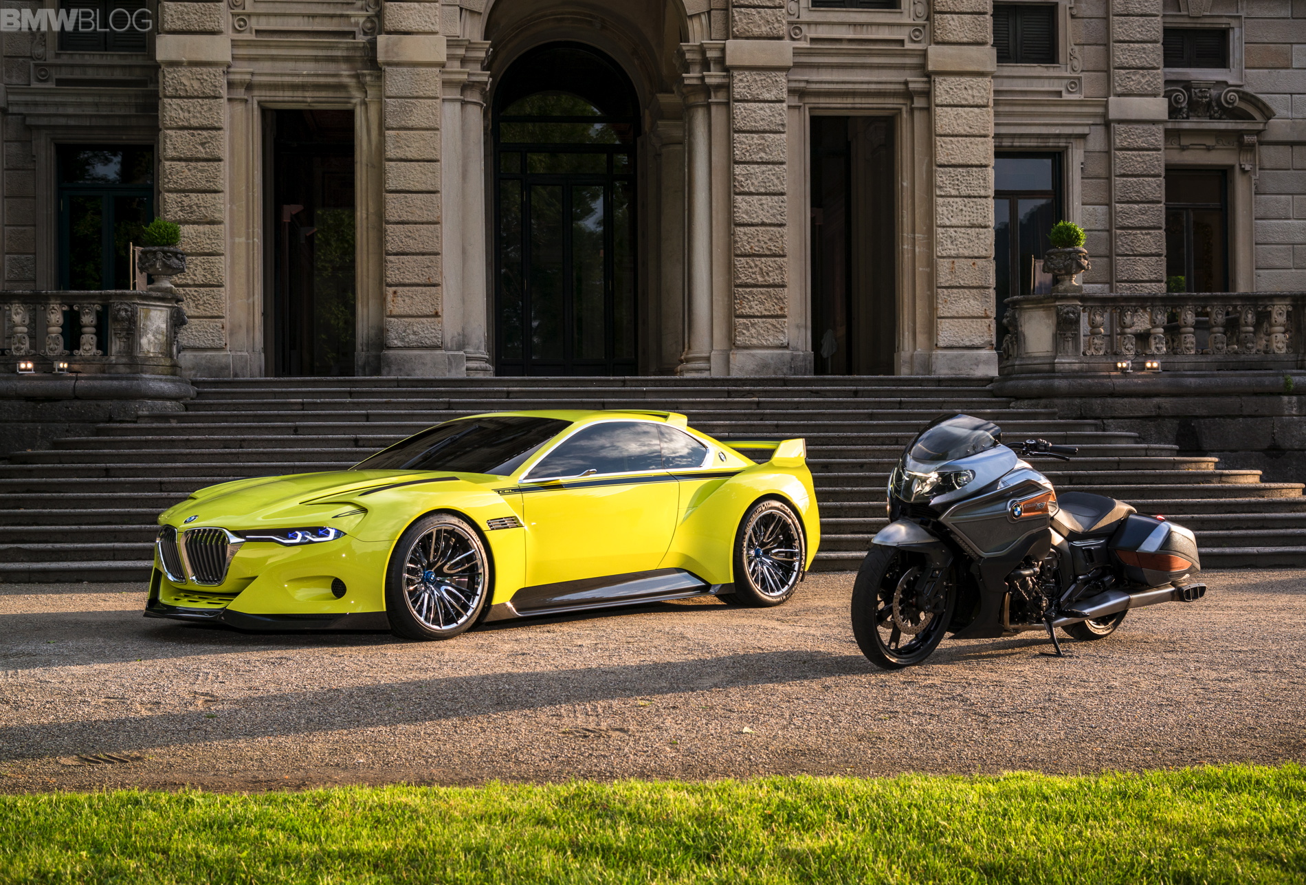
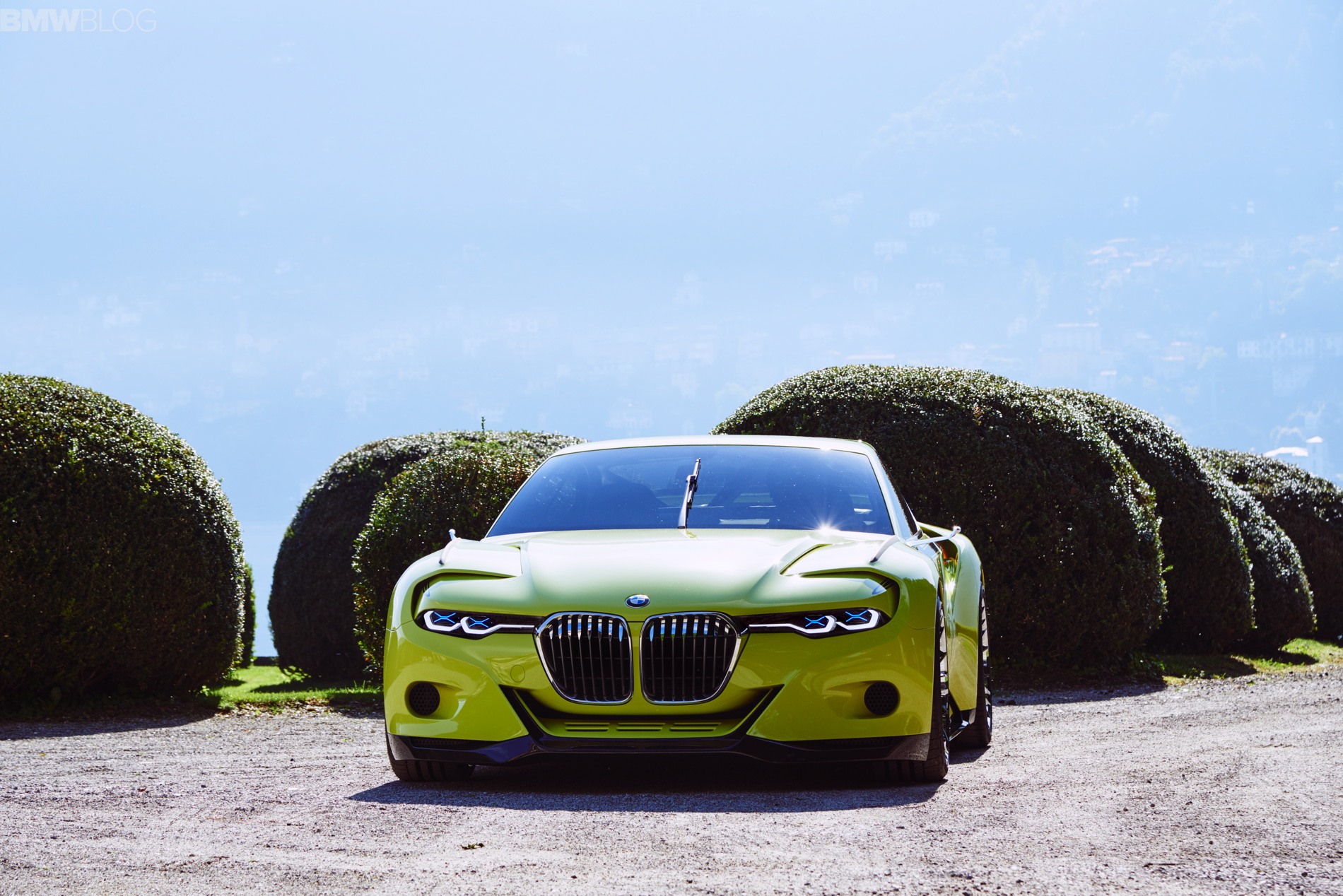
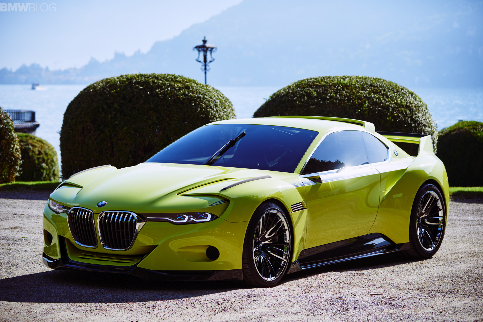
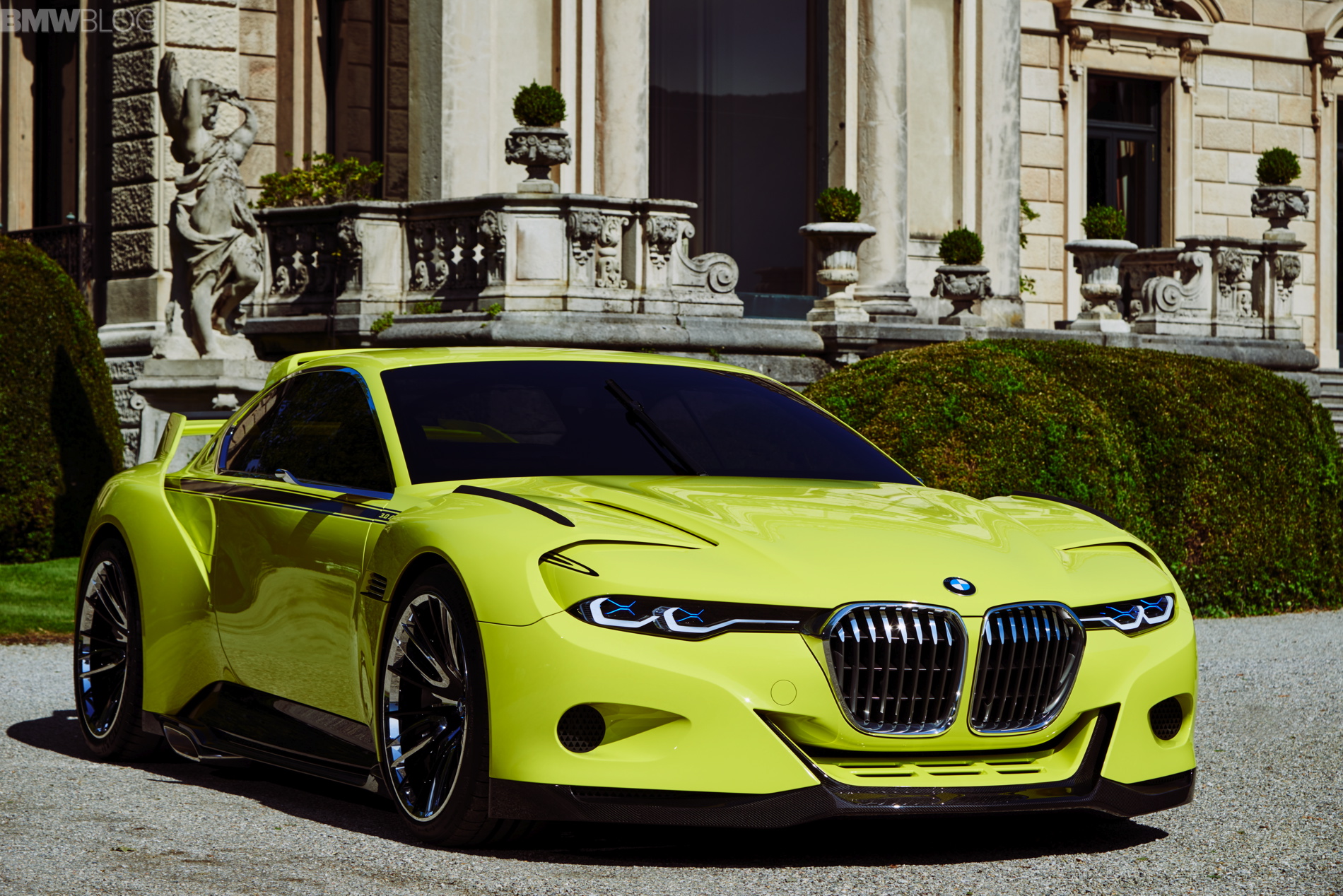
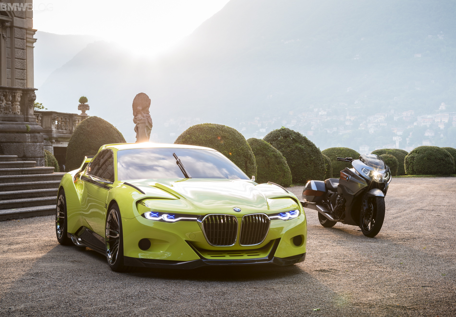
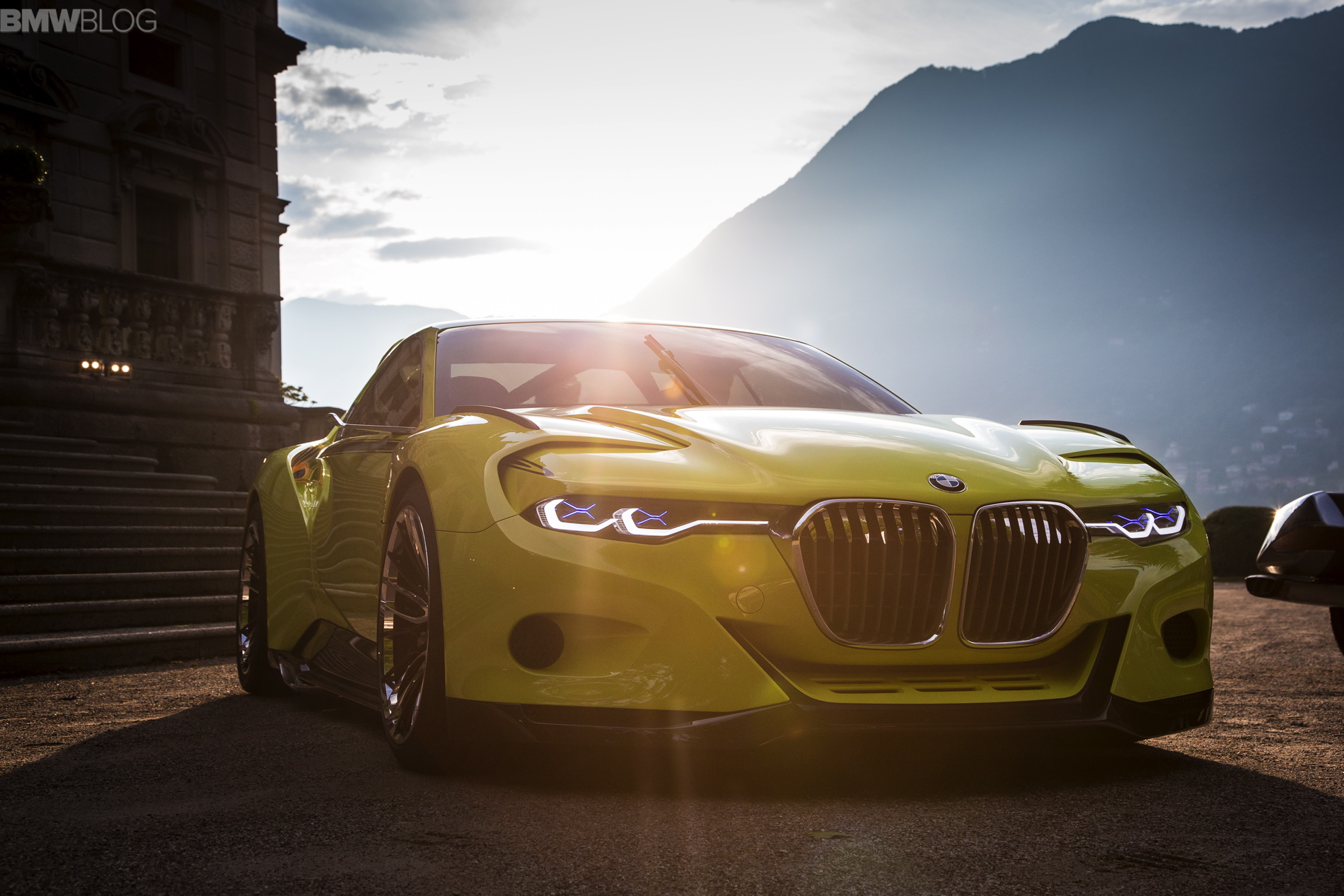
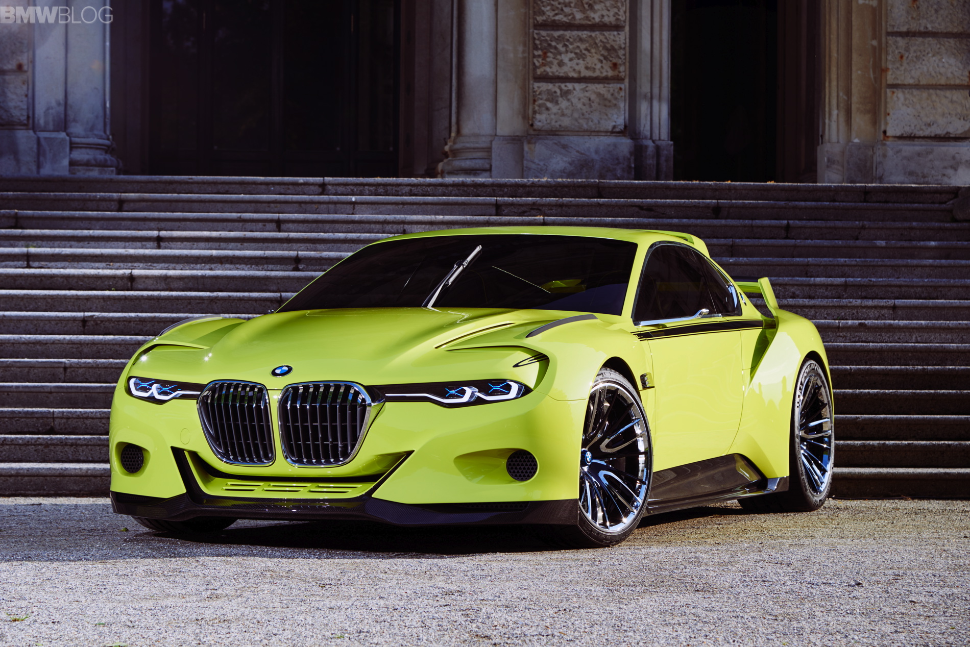
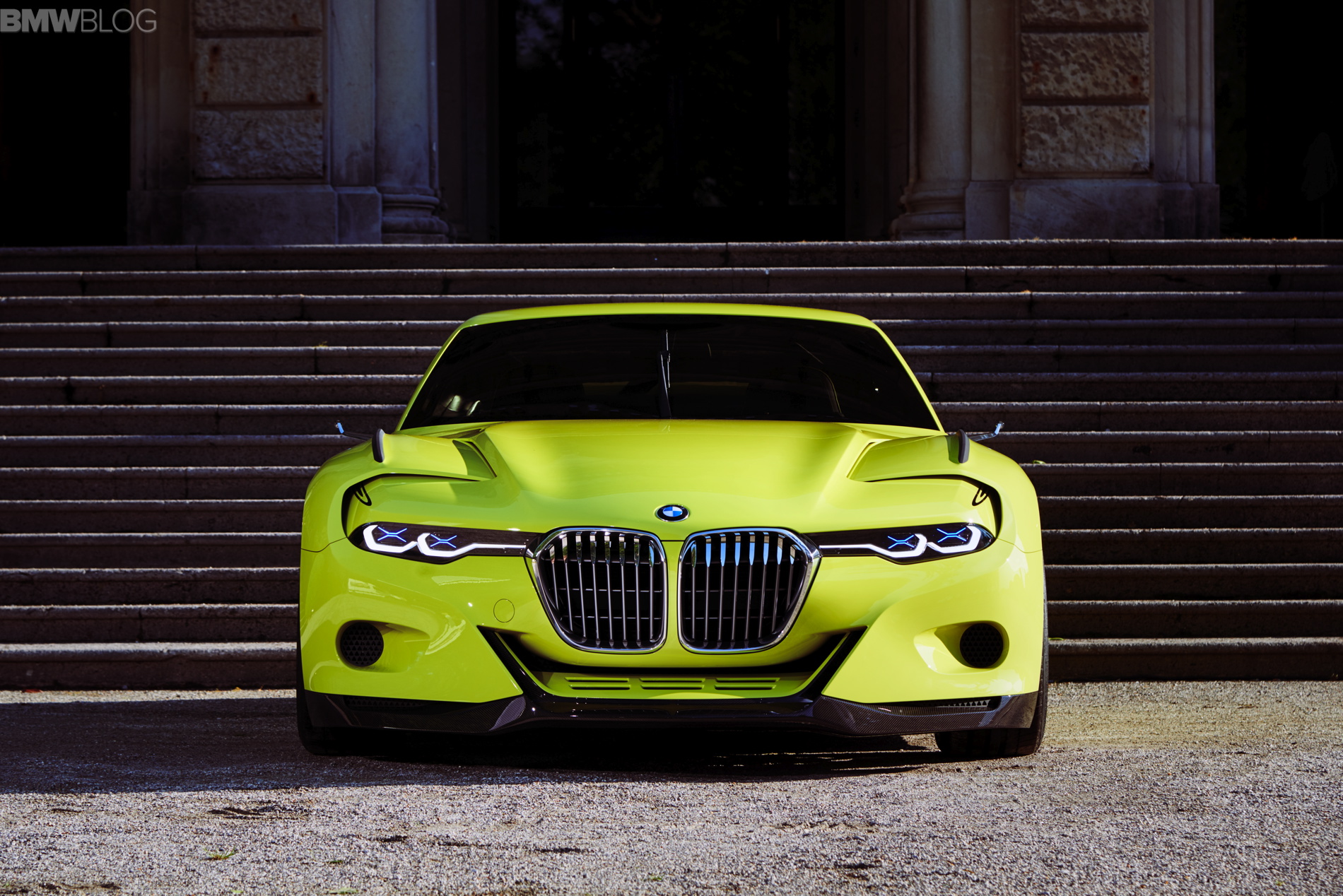
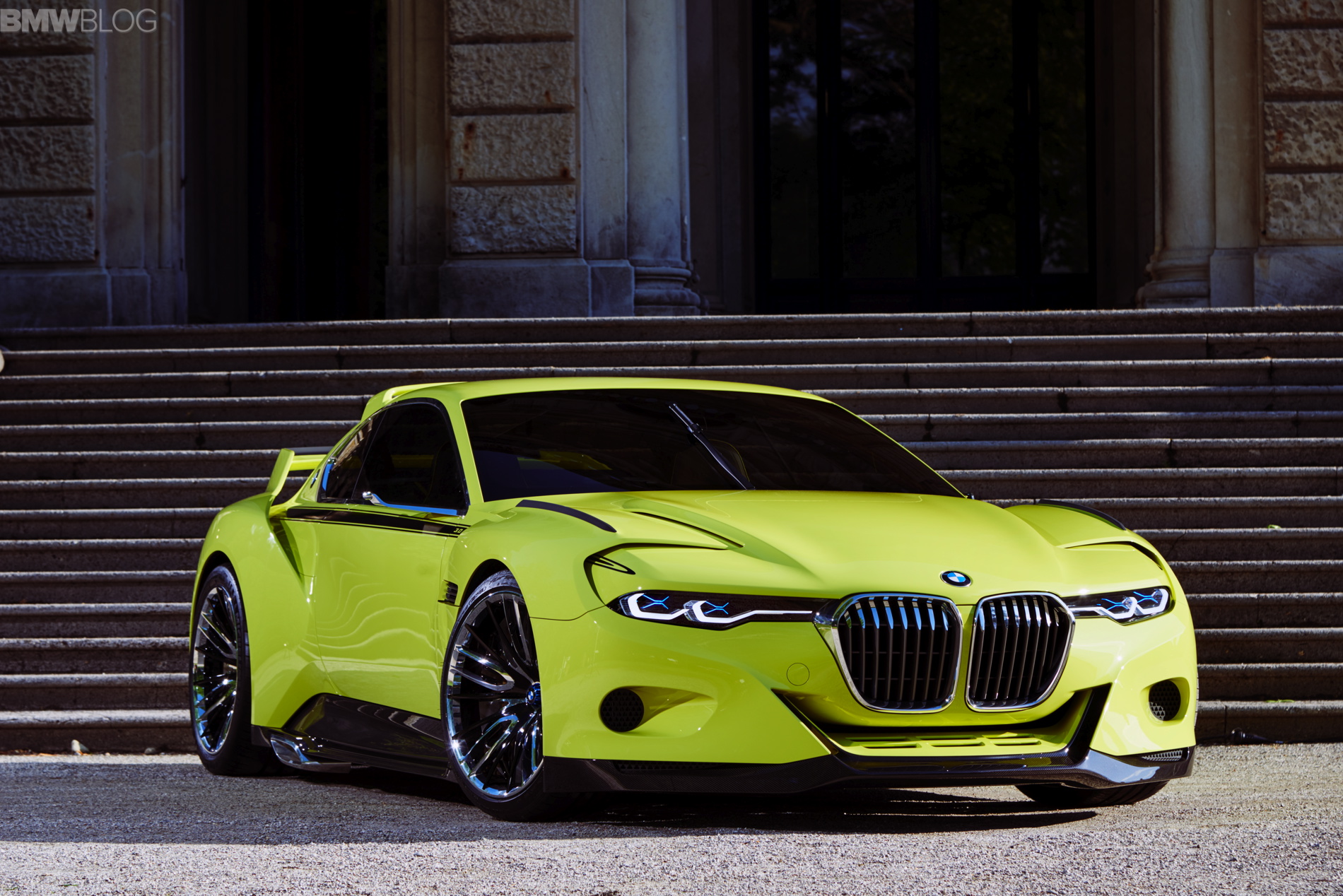
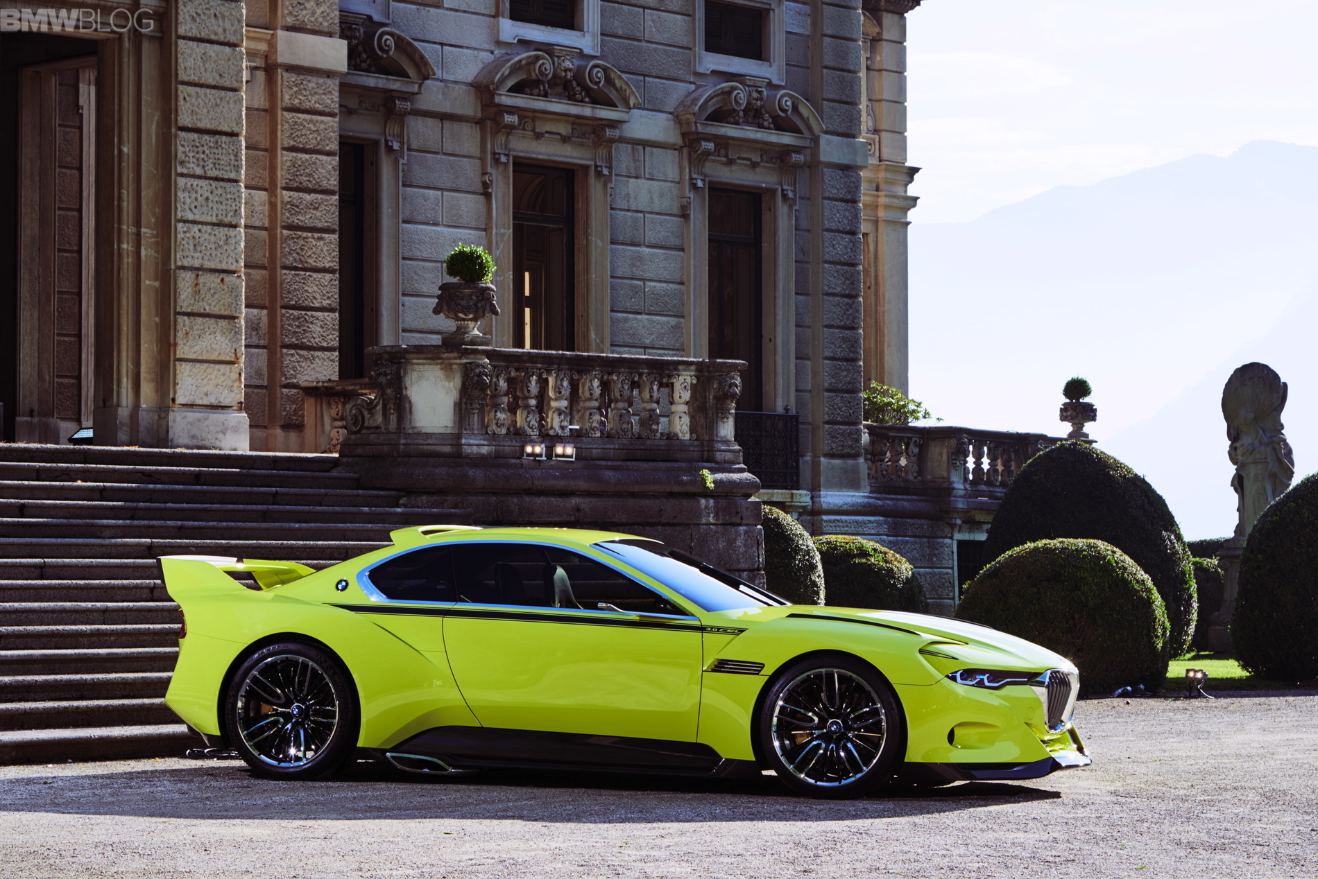
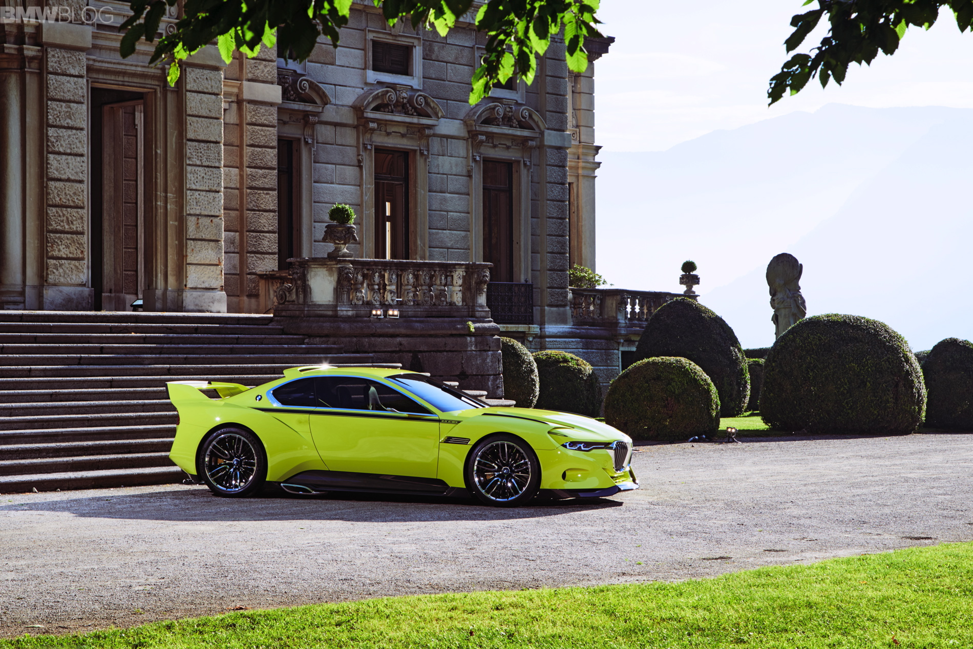
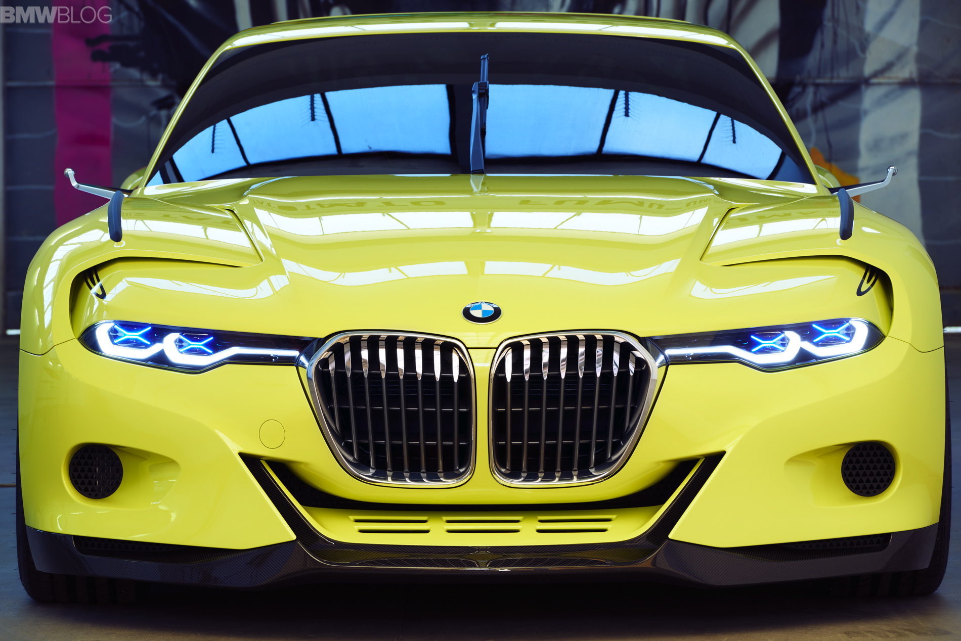
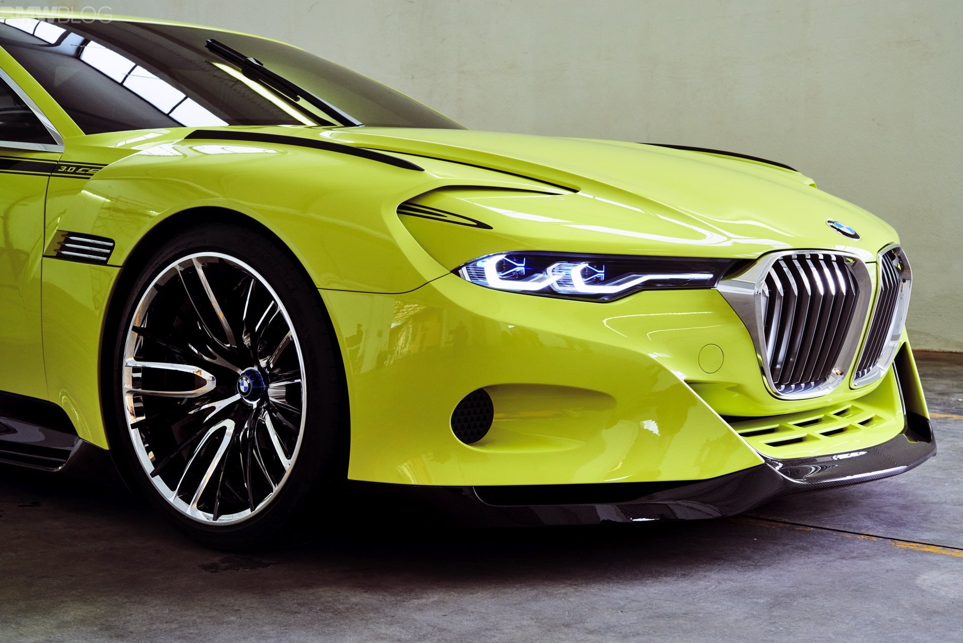
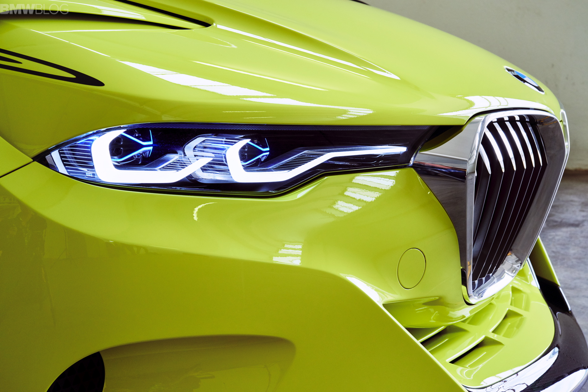
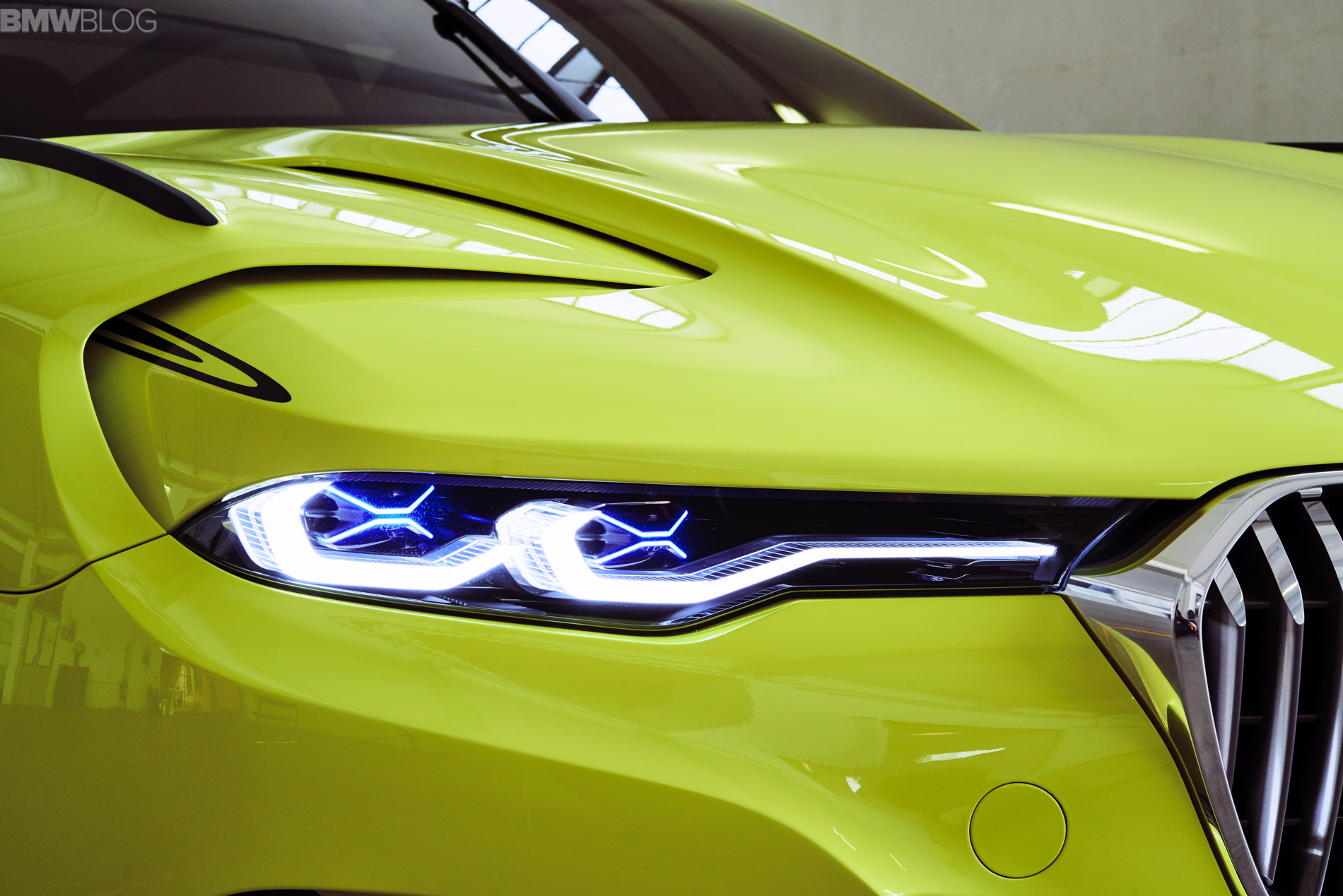
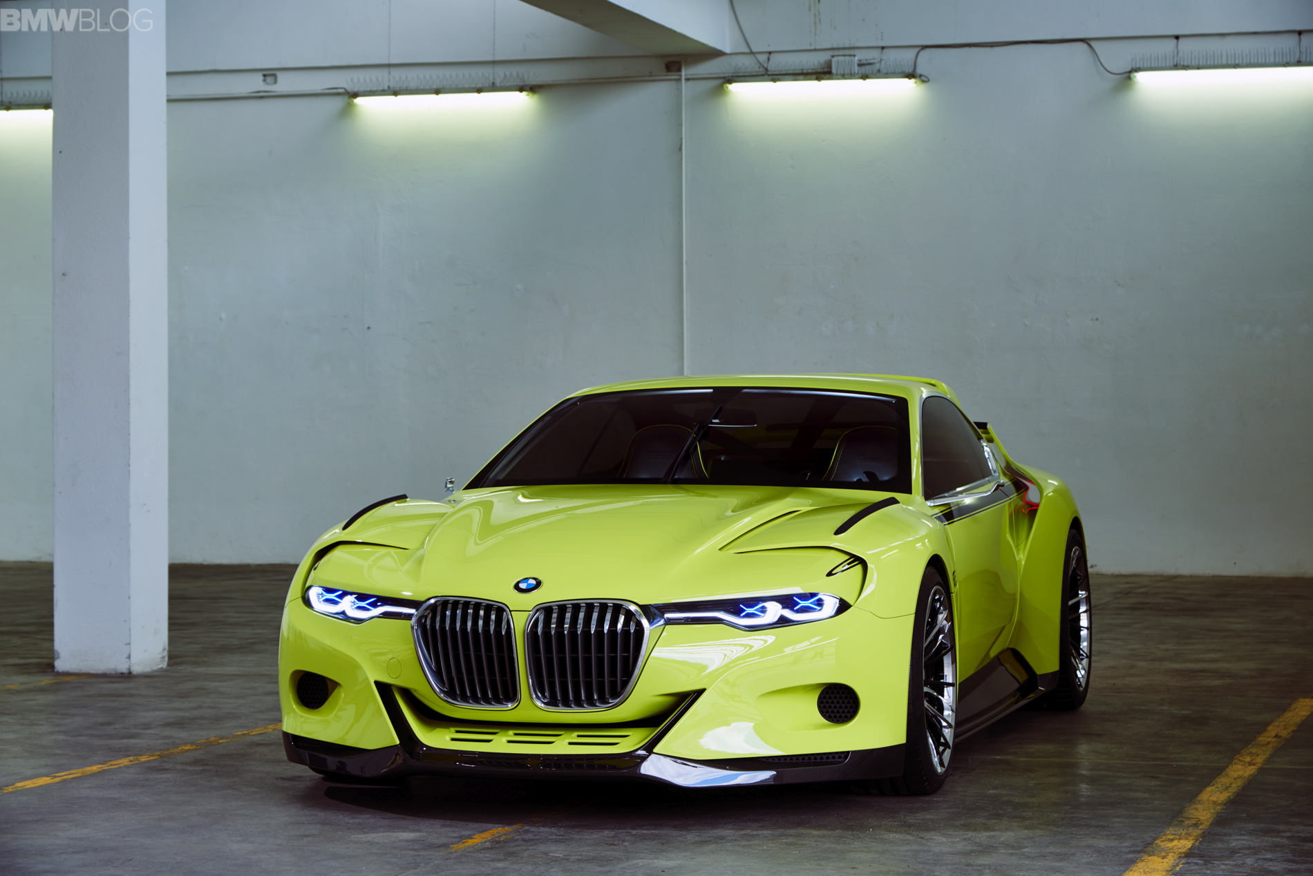
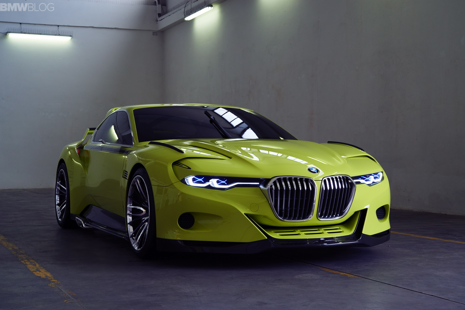
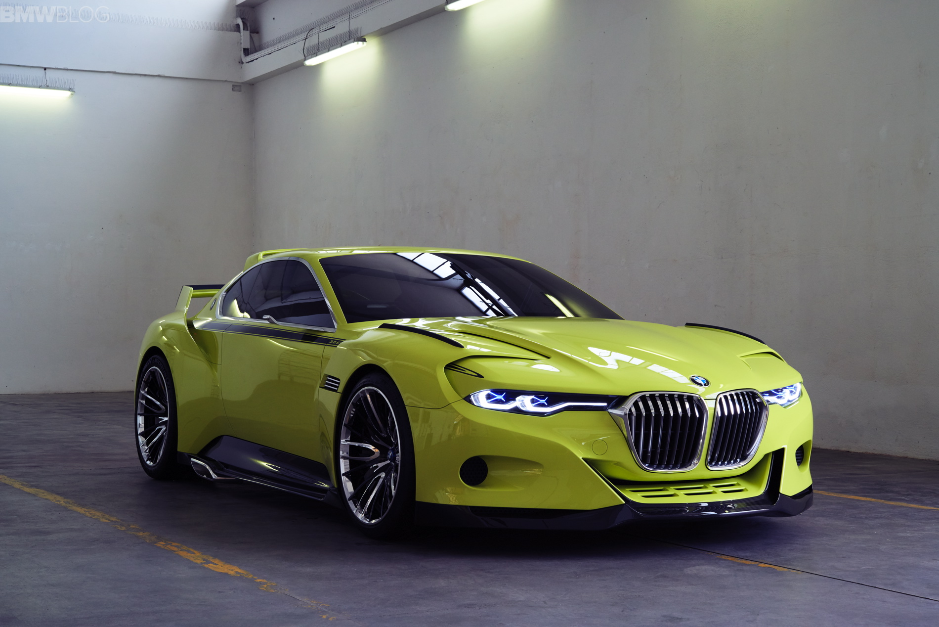
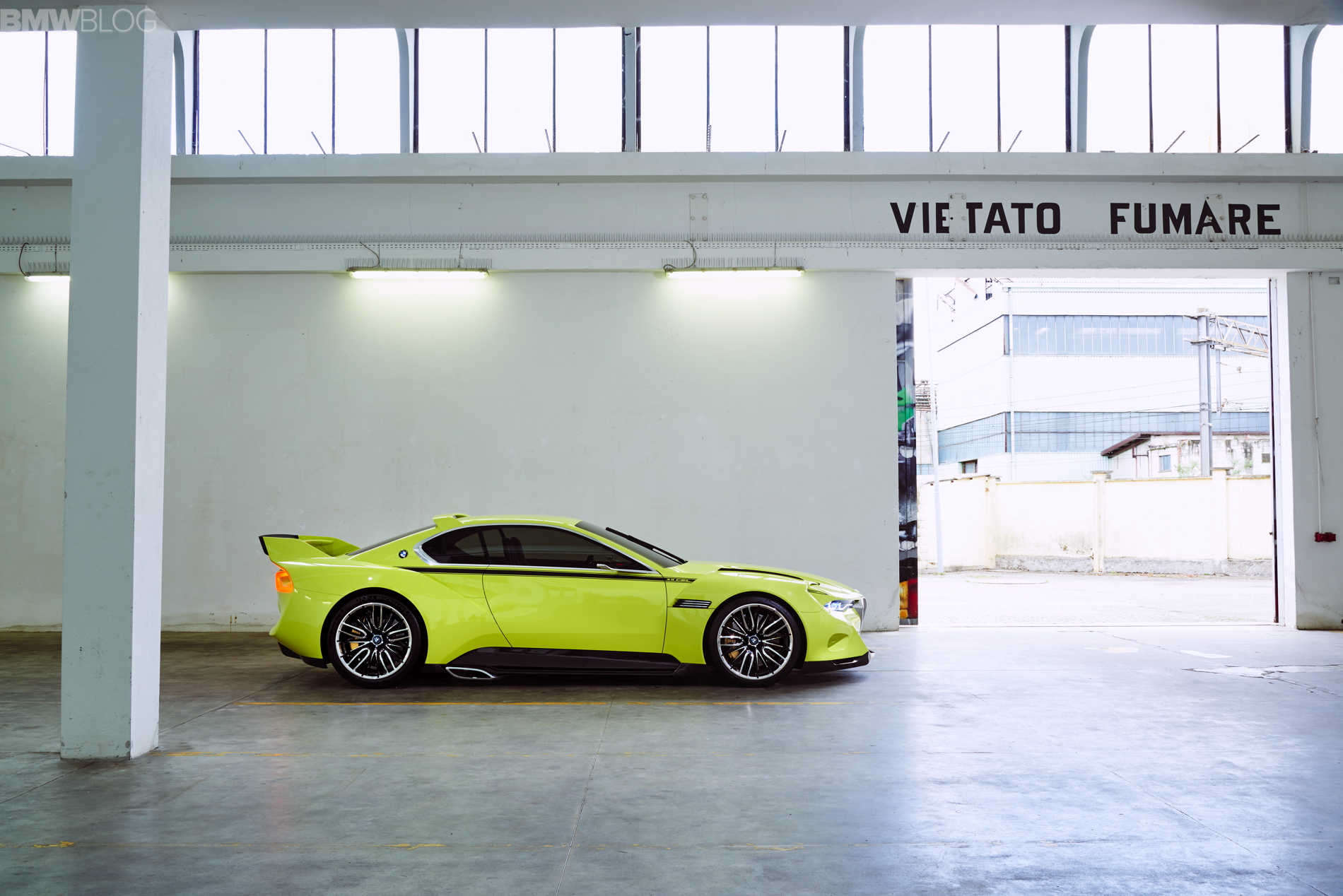
The automotive world is still buzzing a bit from BMW’s reveal of the 3.0 CSL Hommage. This Hommage could possibly be BMW’s most polarizing yet, generating gobs of attention, both good and bad. I’ve seen many readers comment on how beautiful and striking it is, and also on how hideous they think it is. It’s understandable, the mixed feelings. Concept cars often generate such feelings, as they try to push the boundaries of design and that’s never universally understood.
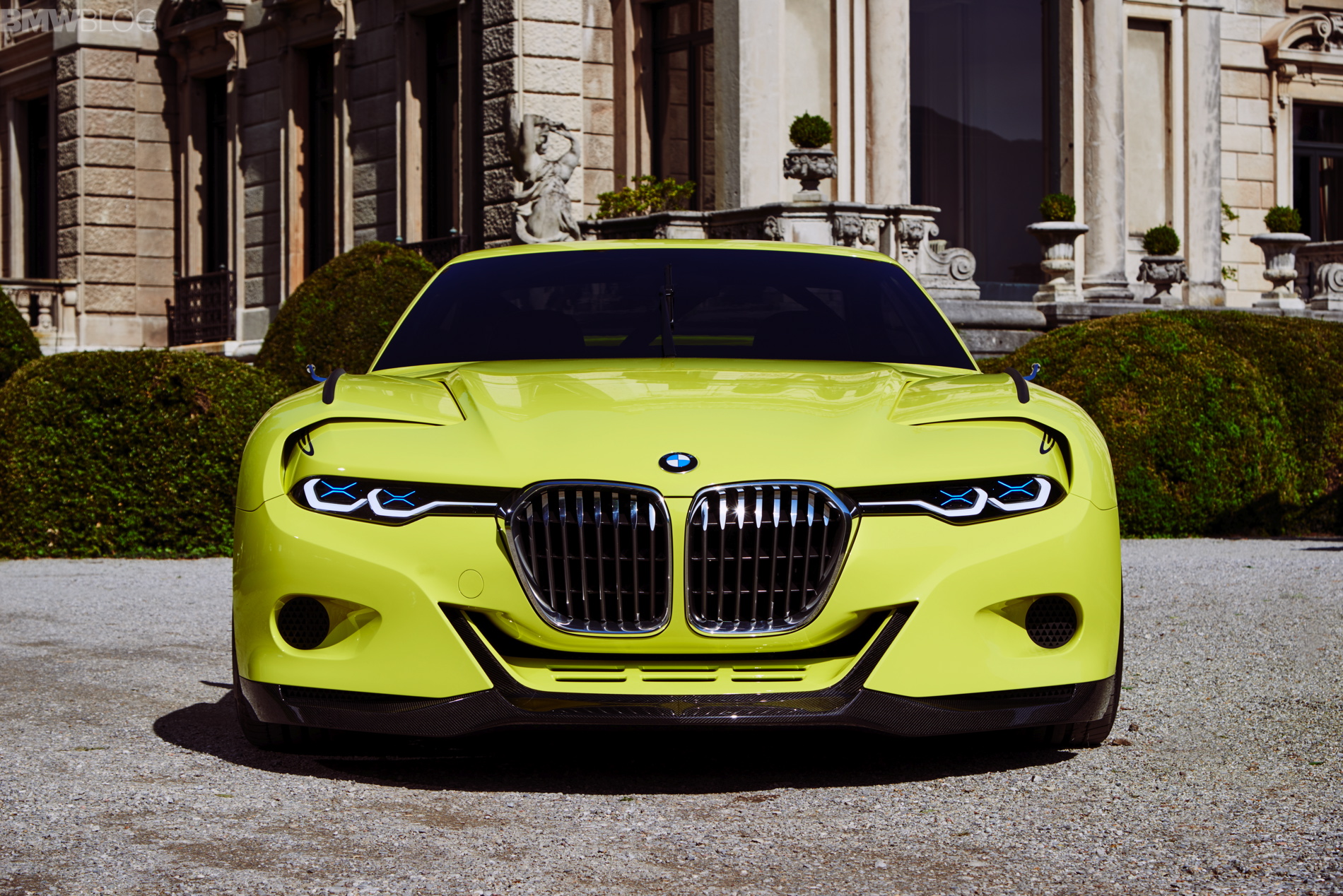
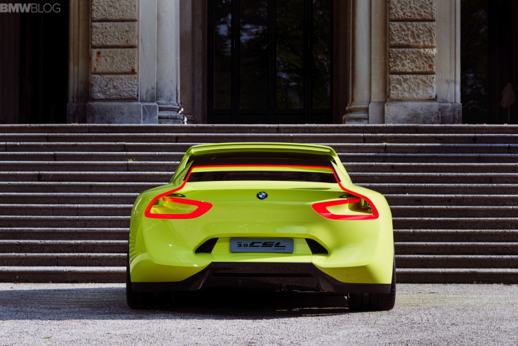
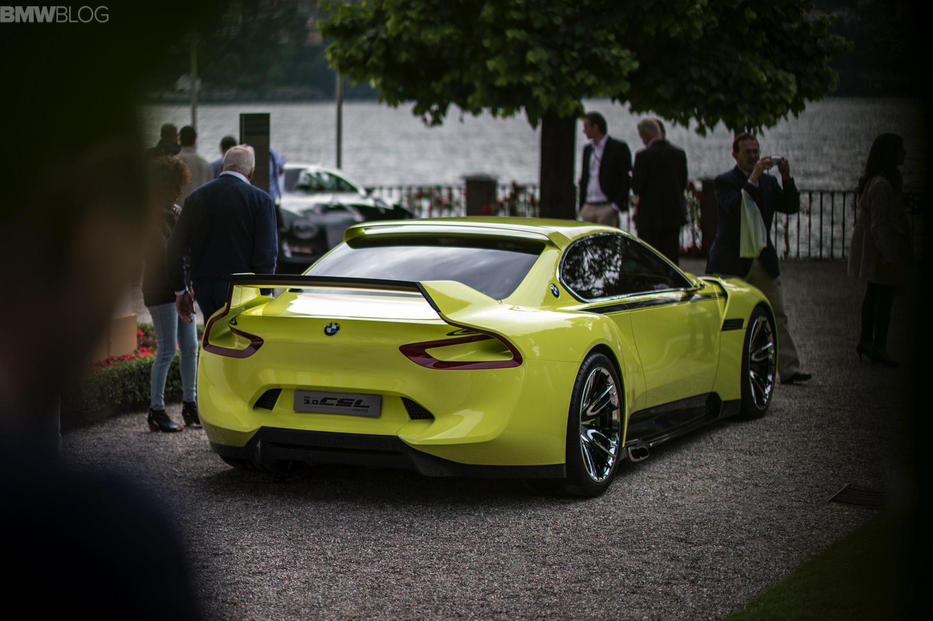
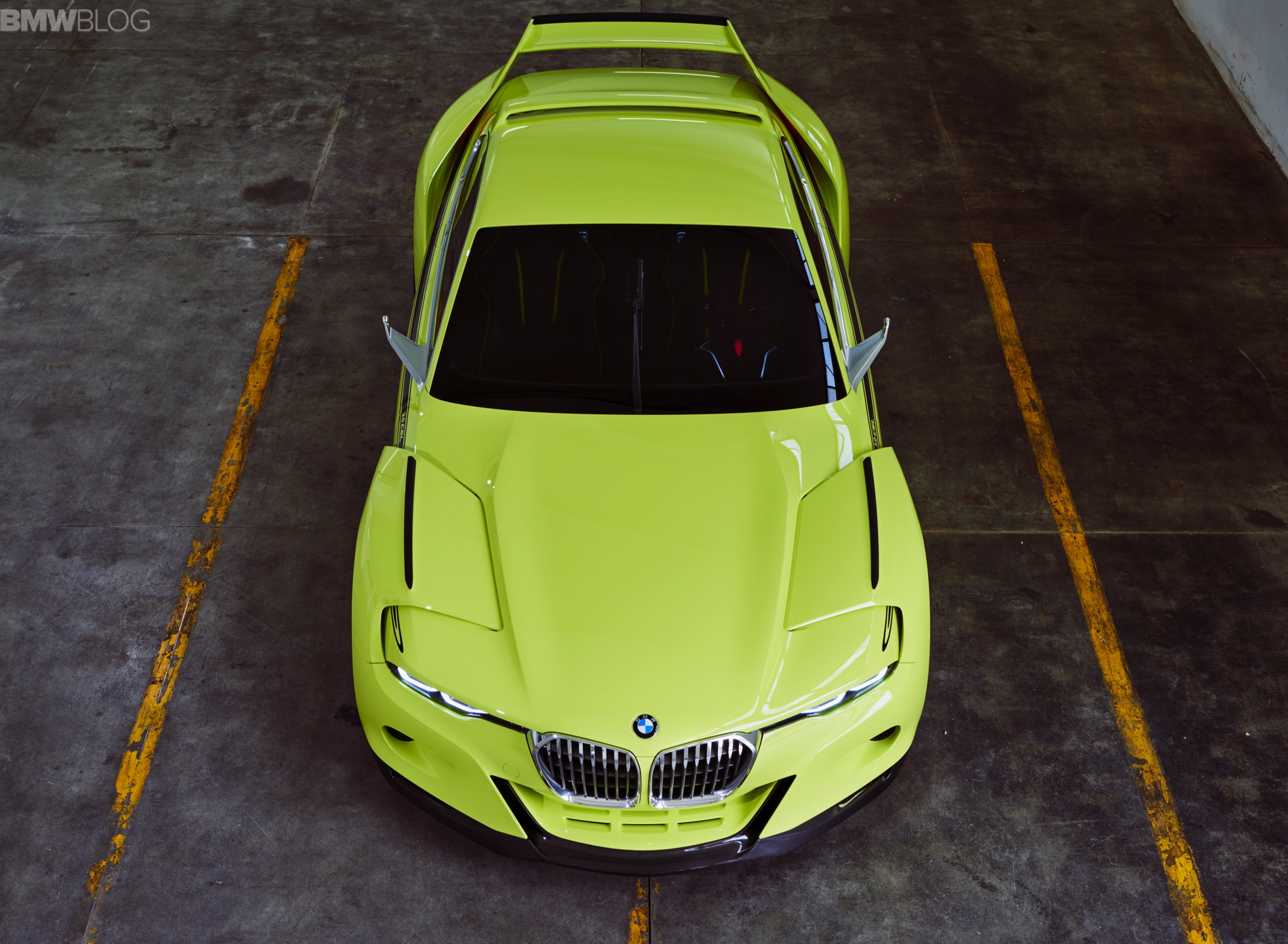
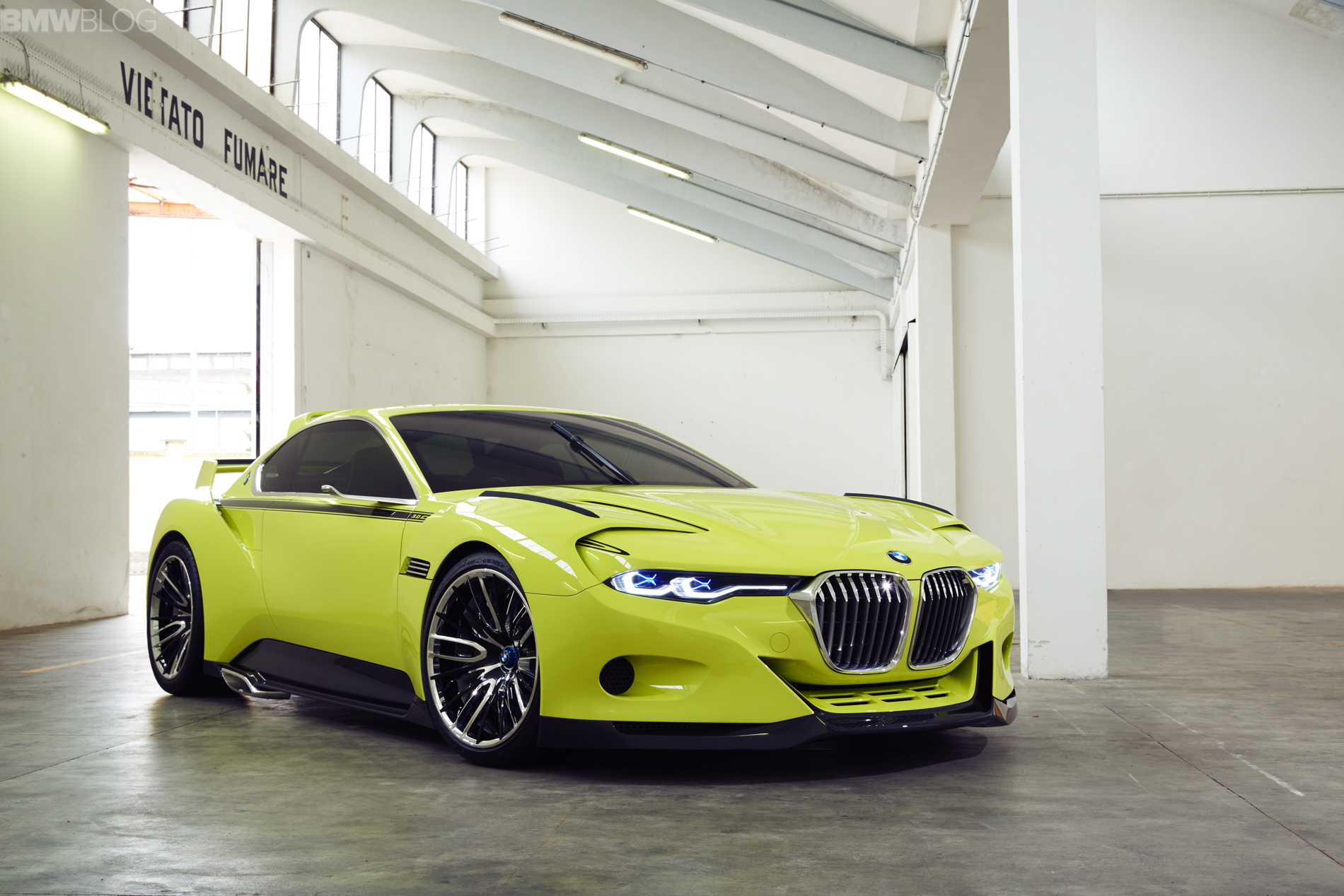
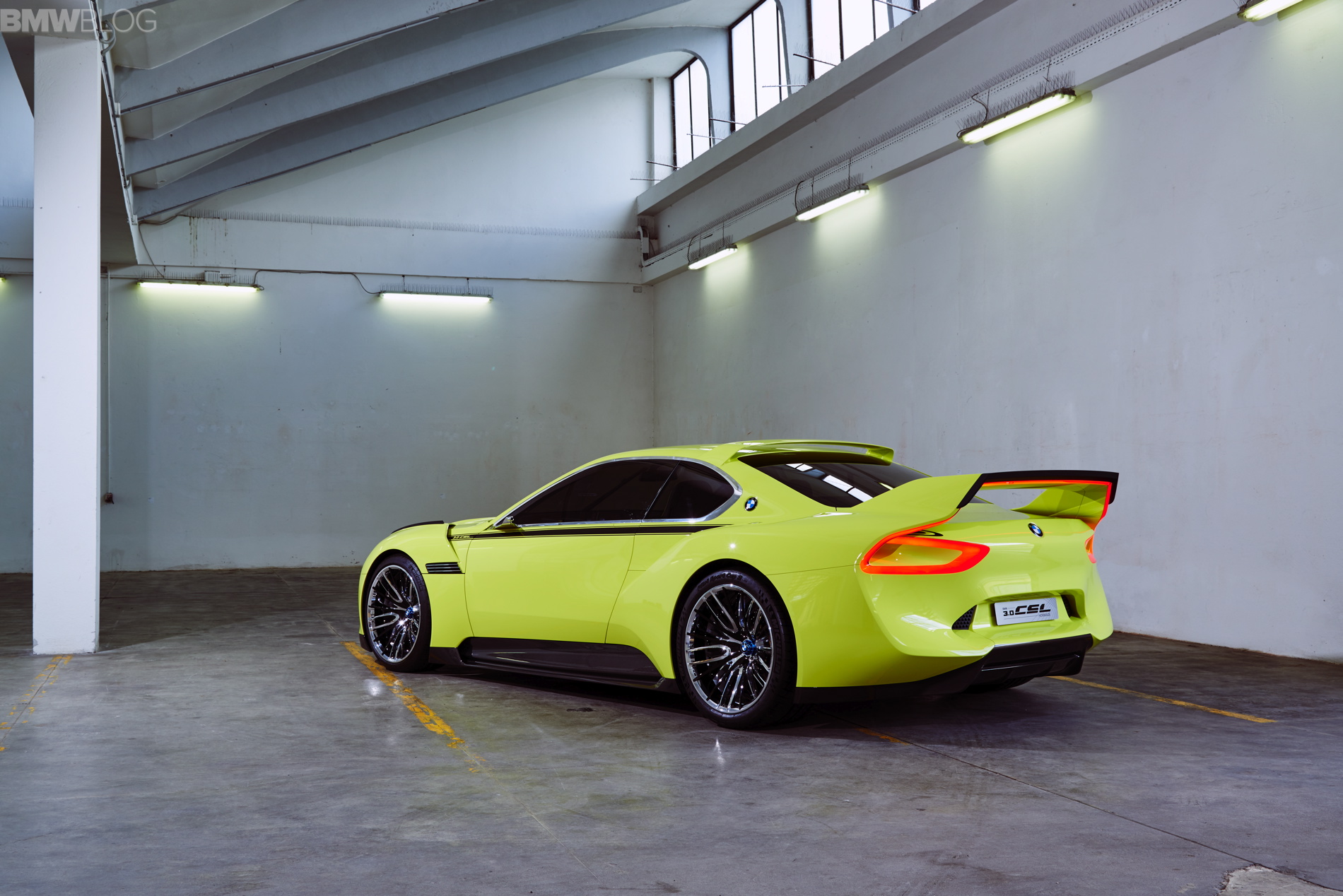
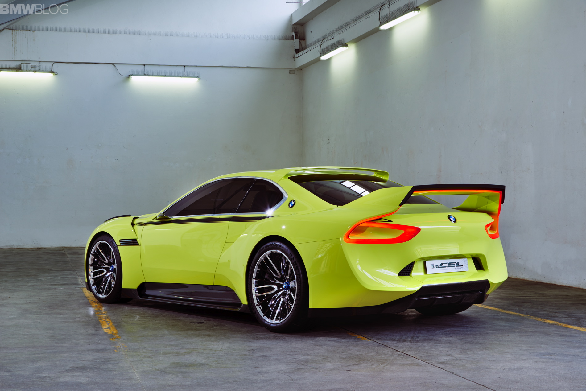
I’m of the side of beautiful and striking, when it comes to the 3.0 CSL Hommage. I really do love it. Admittedly, the front end is a bit busy looking to me, but the rest of the car is just so…right. It takes looking at it from all angles to truly appreciate it. In profile, it looks superb and is instantly recognizable as a Hommage to the original 3.0 CSL. But also from above, it looks gorgeous and perfectly balanced.
But I can tell that not everyone agrees with me, and that’s perfectly fine. Concept cars are so often met with criticisms. But it isn’t fair for anyone to criticize without having an alternative solution. The designers work tirelessly to come up with something groundbreaking, and these are some of the best designers in the business, so it isn’t fair to blindly criticize their work. And even people who genuinely like it, overall, can find some things we’d change about it. And since I think that there are a lot more people who would change things than leave them be, I’m going to list some of the things that I would do differently and then you, the reader, can join in.
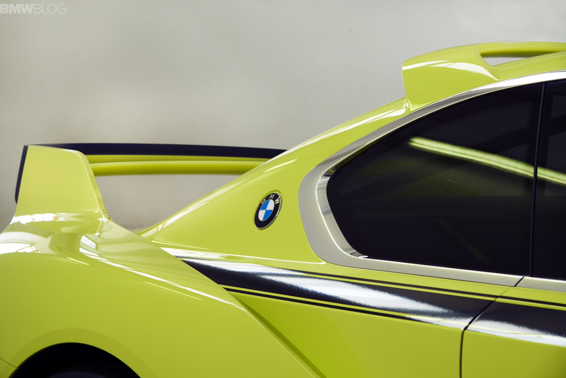
3. The Rear End – Now I like the rear end a lot (on the car, get your mind out of the gutter), the way the rear fenders form upward to make the wing is pure genius. But aside from that, the rear, as a whole, is a bit plain. When compared to the blindingly aggressive front end, the rear seems a bit too tame. Some added flair might have gone a long way in keeping the excitement going throughout the car.
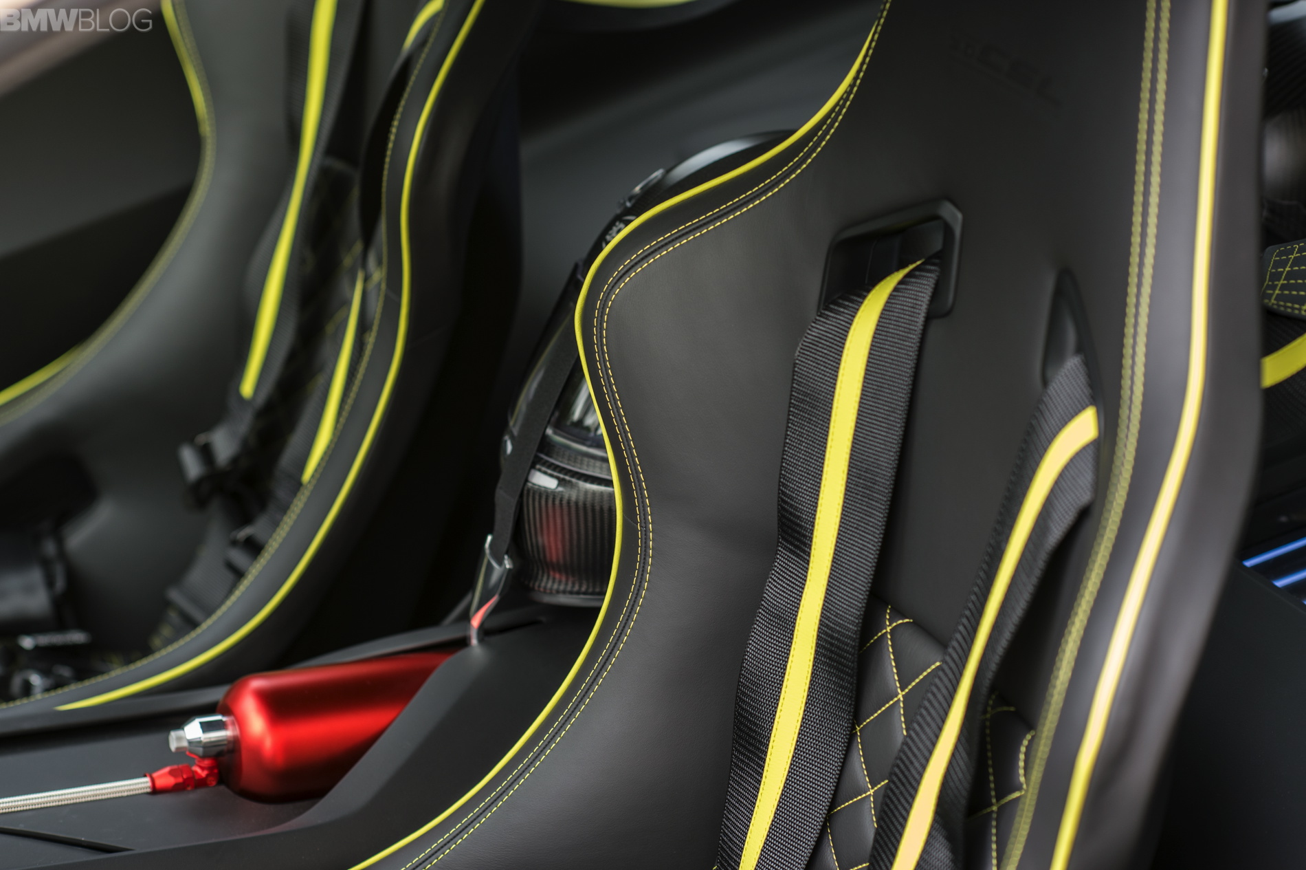
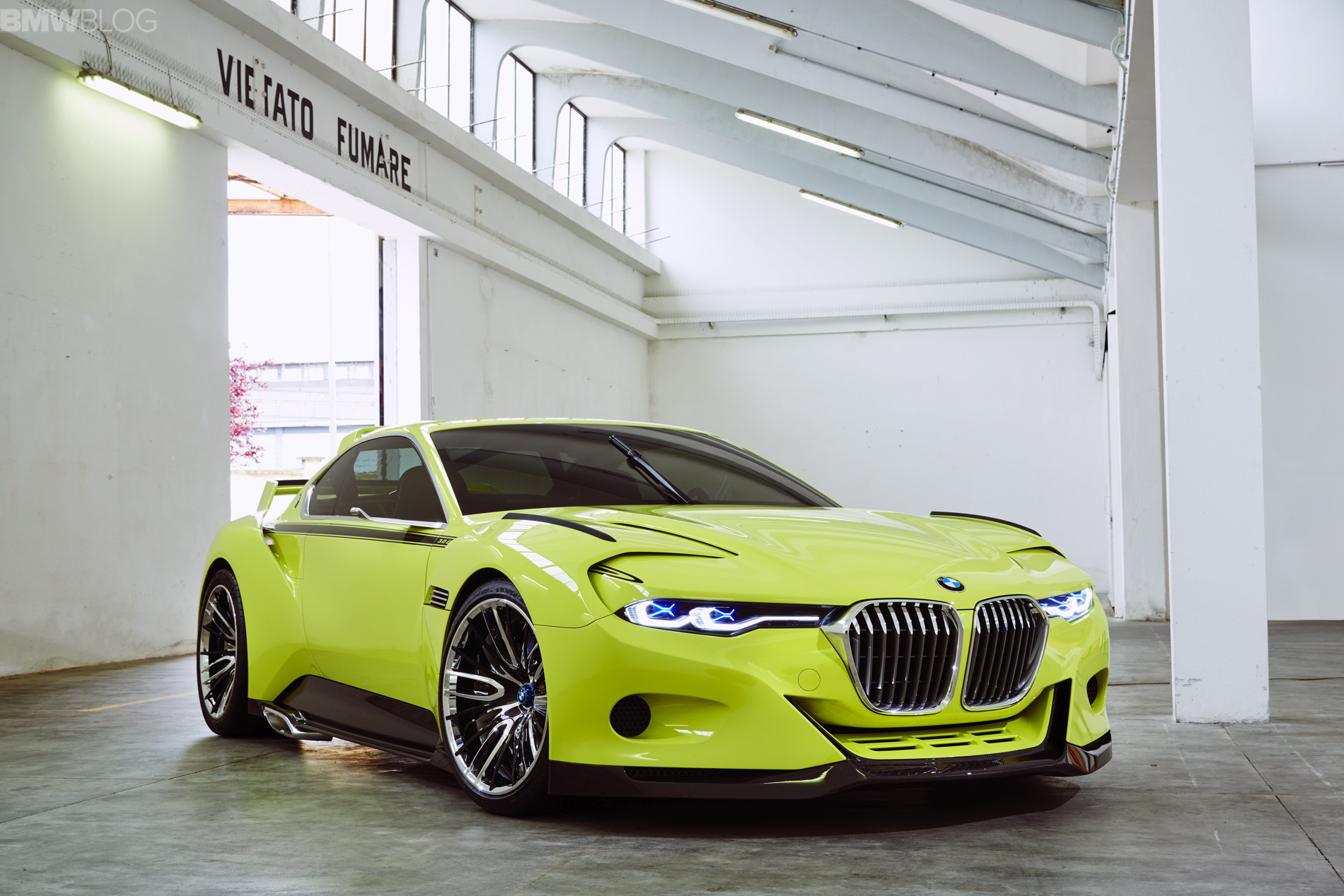
2. The Color – While the Golf Yellow color is gorgeous, I think painting it white and giving it the racing livery of the original race car would have been better. The entire point of this car is to make it a Hommage to the racer, that’s why it has ‘X’s in the headlights, has side-mounted exhaust pipes and is completely stripped out on the inside. So it just seems to me like painting it in the same livery as the breathtaking original that I saw at the NYIAS would have been a better move. Or at least in this white paint job.
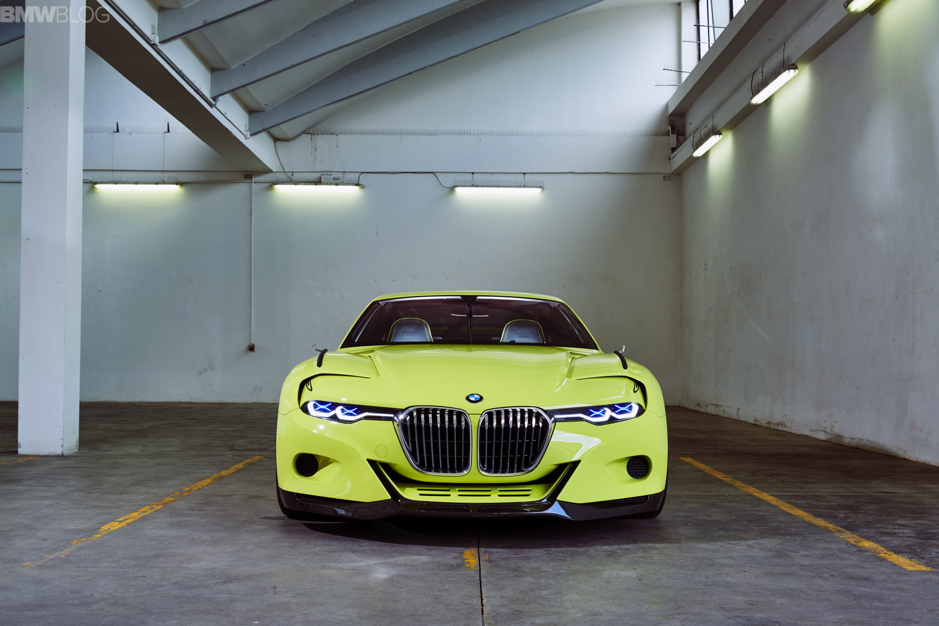
1. The Grilles – The front end in unanimously everyone’s most hated part of this Hommage. I don’t really have a problem with any of it, except for the grilles. I love how BMW brought back the sharknose style of them, and think that looks excellent.
However, the grilles seem far to large. They should be as tall as they are, but they should be skinnier, to resemble the original a bit more. That was such an iconic point of design on the original 3.0 CS and CSL cars that it seems odd to me that BMW would omit it. I think if BMW made the grilles about 30 percent skinnier, which would still give the front end a powerful image, it would pay more tribute to one of BMW’s most iconic racers. And I think more people would like it.
So those are my grievances. Admittedly, I’m just some guy who writes about BMWs on the Internet, so what the hell do I know about car design? However, these are just some things I’d like to change. What would you change?


