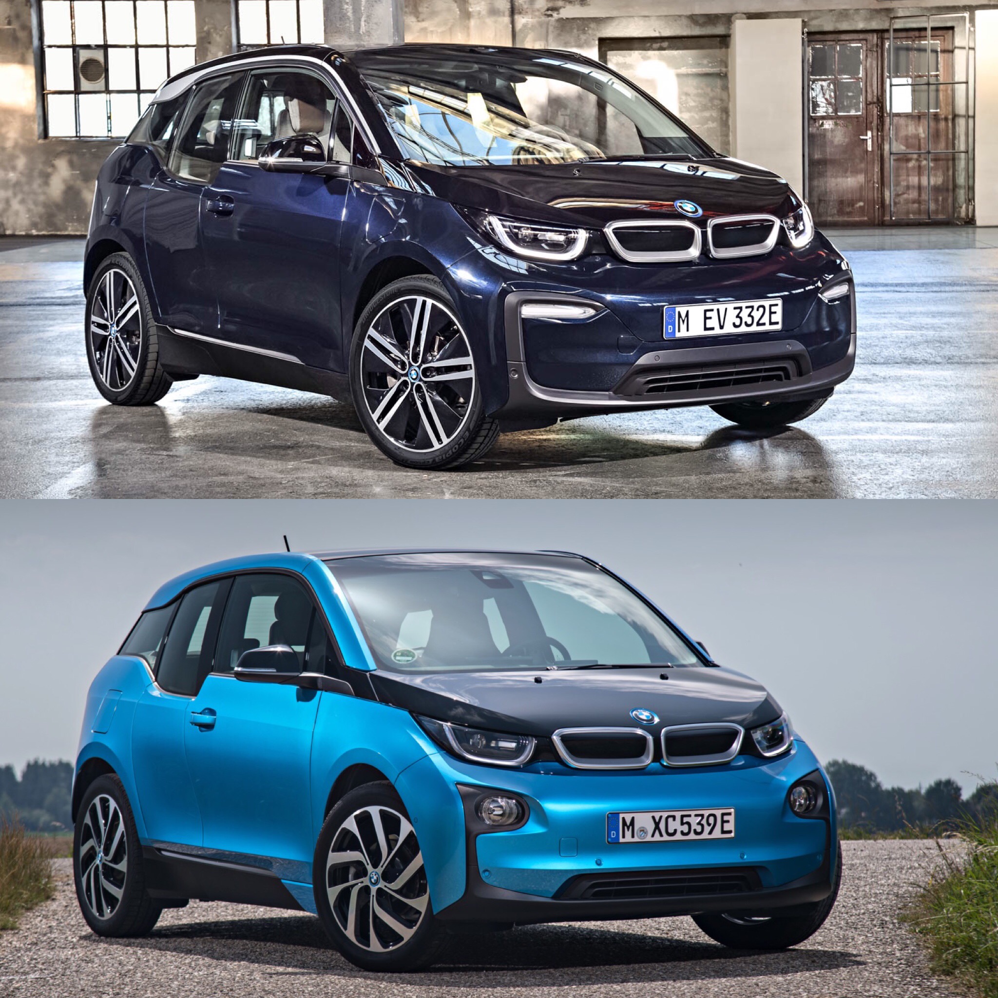
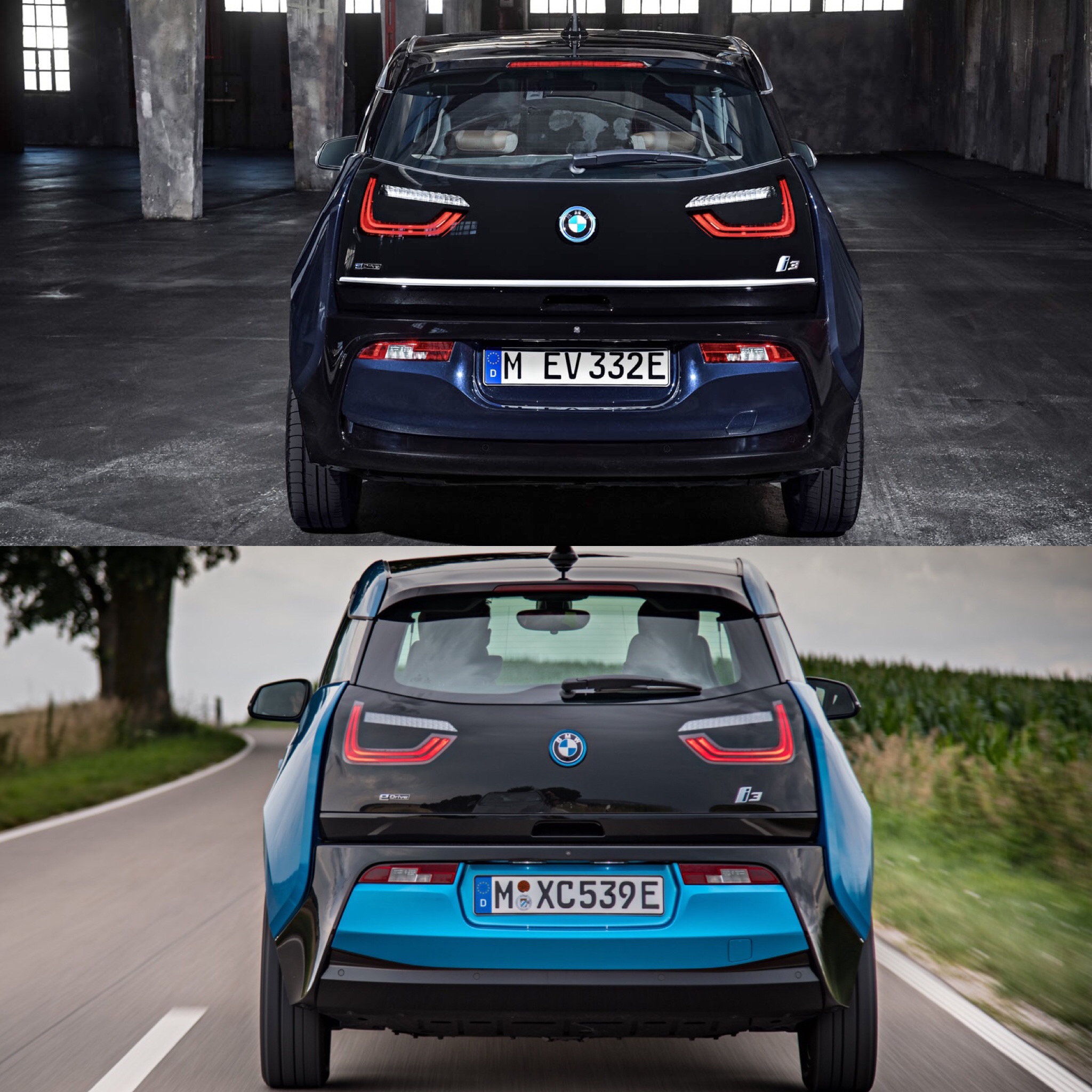
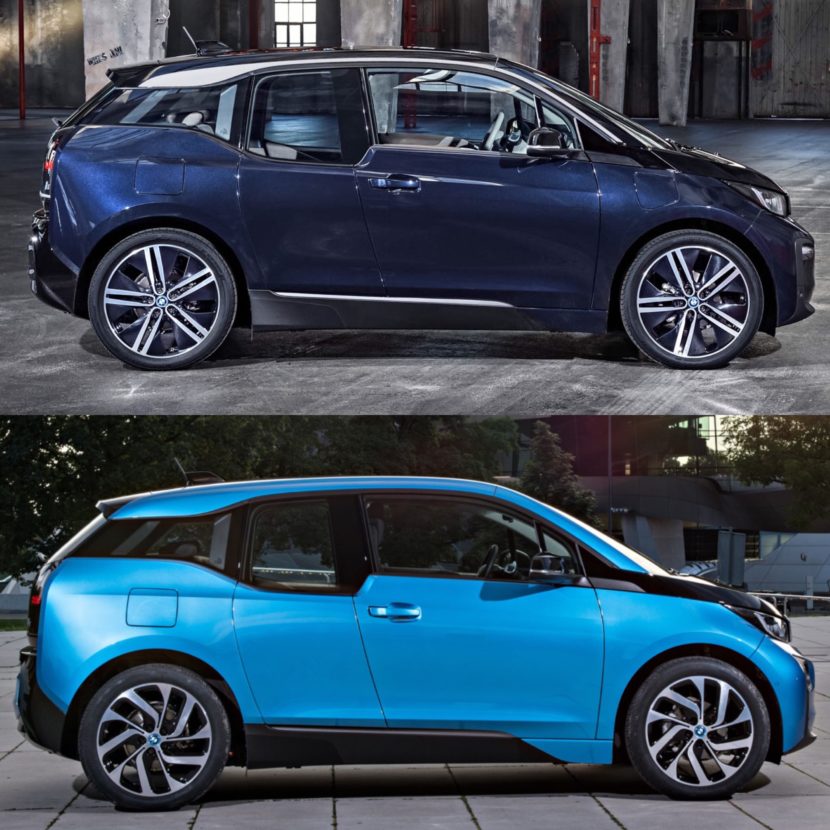
BMW’s first i Division car has finally received its first facelift. For 2018, the BMW i3 has gotten an upgrade in exterior design to keep its design as fresh looking as it did back when it debuted in 2014. While the exterior upgrades are relatively small, they actually go a long way to making a big difference. After seeing the newly LCI (Life Cycle Impulse or refresh in BMW speak) BMW i3, the old one looks odd and a bit sloppy. This newly refreshed car looks tighter, more cohesive.
We obviously haven’t seen the new BMW i3 in person but it’s going to be making its debut at the Frankfurt Motor Show next month. So we’ll have a chance to take a better look at it in person. Until then, though, we can compare the old car and the new car side-by-side and see just how different the new car looks.
From the front, the differences are most noticeable. The front bumper is considerably different on the post-LCI car than the pre-LCI car. It features new foglights that are now horizontal LEDs, which look much better than the old circular ones that seemed randomly slapped on the front end. There’s also a new trim piece that starts on top of those new foglights and wraps around them toward the bottom of the bumper. It’s just a more modern and more cohesive look.
It also gets new as-standard LED headlights, which are essentially the same shape as the older car’s. However, it looks better and more modern. Overall, the face of the i3 looks fresh again and more high-tech than before. I, personally, think that it looks more premium as well.

Down the side of the car, not much changes except for a couple of trim pieces. At the top of the i3, a new silver trim piece runs the length of the roof and gets extends toward the D-pillar. Some will like this and some won’t. I’m not entirely sure I’m sold on it, as it sort of makes the i3 look like its hair is slicked back, but it’s not bad. Some might like the way it looks and that’s fine. There also seems to be a new silver piece of trim a the bottom, that runs underneath the doors. Take it or leave it, it really doesn’t matter. It looks fine but the old i3 doesn’t look any worse without it.
At the back, not much has changed. There’s a new piece of horizontal silver trim that runs the length of the tailgate that adds some visual substance and width. There’s less of a void at the back end, now. Also, the black portion of the rear end now longer flares out at the bottom of each end. Instead, it sort of wraps around on either side and meets at the middle. It looks more cohesive and makes the old design look weird.
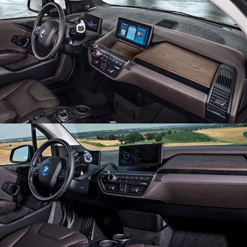
Where there are basically no changes is on the inside. The cabin of the new i3 is seemingly identical to the old one. The only real change is the updated iDrive system, which finally puts what is supposed be BMW’s most high-tech car into the 21st century, in terms of cabin tech.
Overall, the changes to the i3 aren’t remarkably different or extreme but they do all work together to make it look far better than it did. It’s just a more cohesive package and one that looks both more modern and more premium.


