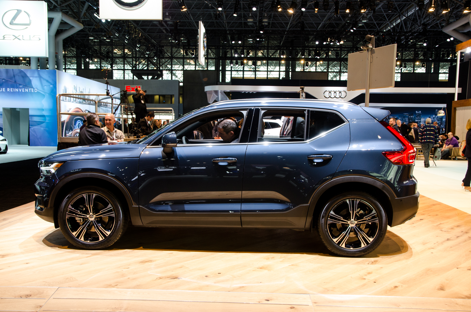
Since its reveal, the internet has been buzzing about the new Volvo XC40. Its the Swedish brand’s newest entry into the world of small, premium crossovers and it looks great. And it seems that positive opinion is a common one, as the XC40 was a huge hit at the 2018 New York International Auto Show (NYIAS), with people buzzing around it all day. In fact, it was tough to get pictures of it, because it was constantly mobbed by people looking at it. And getting some really good coffee at the Volvo stand right next to it…
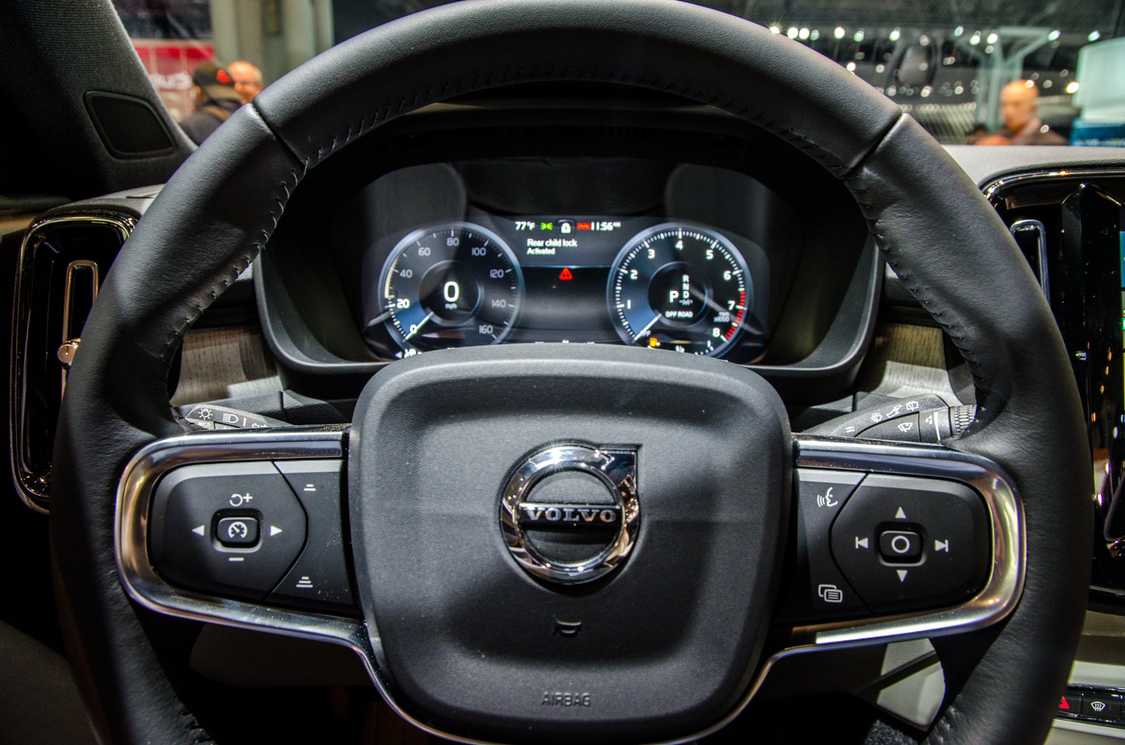
The Volvo XC40 is the brand’s smallest SUV and it’s also, in my opinion, its best looking. It’s tiny and boxy but punchy and fun looking. Everything about the way the XC40 looks screams fun and it just makes me wanna jump behind the wheel. Which I did and snagged some interior shots, which is where I revealed some delightful oddities about the cabin of the XC40.
For instance, the touchscreen infotainment system looks great and has excellent graphics but it’s absurdly confusing. I’m sure once you get used to it, it’s not so bad. But there are so many different menus and submenus that I can imagine using it while driving can be distracting and difficult. Having said that, I kept wanting to use it because the screen looks so great and works so well, with ultra slick graphics and super fast responses. As a touchscreen, it’s one of the best I’ve ever used. Volvo just needs to work on the UI a bit.
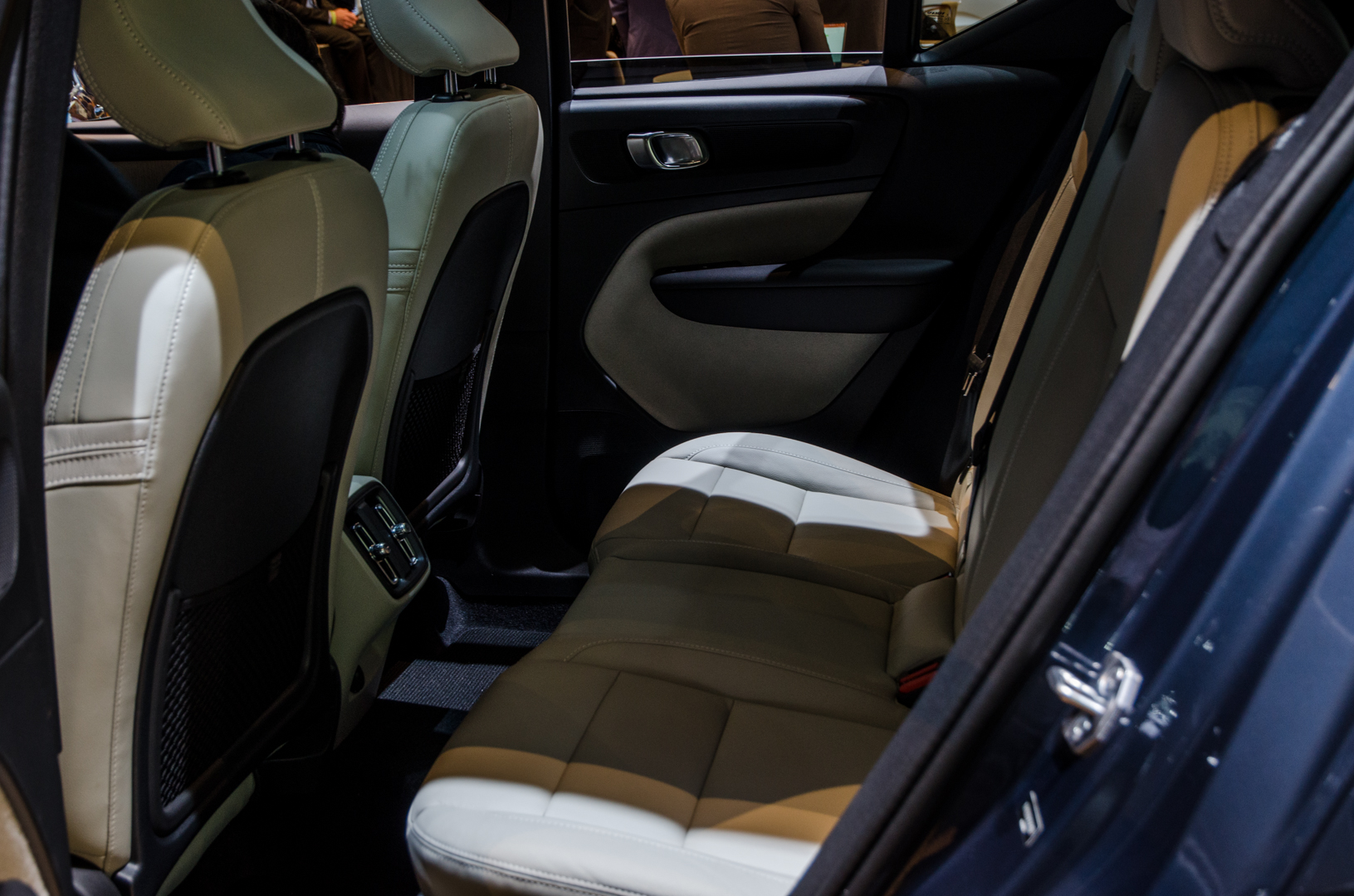
Also, the inner part of the door panels are upholstered in a sort of white, Styrofoam-looking fuzz, as if a mouse got coated in white paint. It’s odd and not actually that nice to touch but it’s funny and looks so very typically Volvo-strange. In a market where every car company seems to be copying each other, Volvo stands out as the delightful weirdo and we love it.


