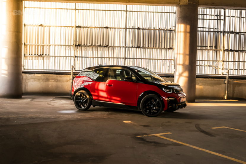
It’s a known fact that the biggest flaw of the BMW i3, as far as old-school fans are concerned, is that it doesn’t really look like a traditional BMW from the outside. The boxy, tall figure of the i3 never grew on certain people, who find it odd, to say the least. At the same time, everyone agreed that the interior was exactly what it should be, with a minimalistic approach and new-age materials being used inside the cabin. So why did the car turn out this way? Domagoj Dukec explains in the video below.
Dukec is the Vice President for Design at BMW M and BMW i and he explains the reasoning behind why the i3 looks like it does rather simply. The research performed by BMW before launching the BMW i brand altogether showed that people’s priorities changed over the years. Their findings show that, on average, a car only transports the equivalent of 1.3 passengers. Therefore, the room inside was adjusted accordingly. That doesn’t meant that four people won’t fit comfortably inside though.
That also prompted a new take on the exterior dimensions, making the car shorter and taller in the process, giving the i3 that ‘boxy’ look. Even so, the interior will play a more central part in the future according to Dukec so innovative materials were used inside, to offer a better experience. From recycled materials to Eucalyptus wood and naturally tanned leather, everything was put together to show appreciation for the environment.
He also explains that, while for some old-school fans of the brand the i3 doesn’t look right, it may appeal to other potential customers, which may have never noticed the brand otherwise. Therefore, if you want to win new customers you might have to rethink your strategy. One thing’s for sure though: no other electric car out there comes with a carbon fiber chassis, similar to the approach used on supercars and that makes the i3 noteworthy.
https://www.youtube.com/watch?v=8w3EiPADBeI


