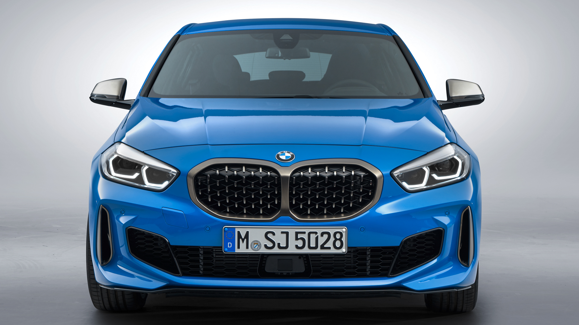
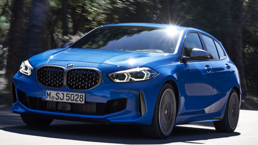
It’s not exactly a secret that a lot of BMW enthusiasts, and just car enthusiasts in general, are unhappy with the design of the new 1 Series. Personally, I don’t hate it but there’s no denying that it’s not exactly pretty. Many enthusiasts have opinions on how it could be better but it’s always interesting to see someone actually change the design.
In this new video, we get to see a designer use Photoshop to walk us through the car’s design. He points out a lot of the design’s issues and oddities, which all combine to make it just a bit of a mess. One other thing he does, which proves a lot of enthusiasts’ claims right, is replace the Bimmer’s face with those from several other hatchbacks, premium and otherwise. It’s shocking how well other car faces, including even a KIA’s, work on the BMW M135i, proving it’s not the most unique design we’ve ever seen.
After some discussion, he gets to work changing up the front-end design on the BMW M135i using photoshop. After a bit of tinkering, the Photoshop version looks better; less fussy and simpler. Some of the key points of his design changes were the Kindey Grilles and lower front air intakes. With the former, he made them smaller and separates them at the middle. While the grille is still massive, it looks better and more sorted than the production car.
As for the latter, he changes the front air intakes to look more like older BMWs from just a few years ago, cars like the BMW M4. After he’s done, I still don’t love it but it’s better than the face from beofre it.
There’s no getting around the fact that the new BMW 1 Series isn’t very good looking. It should be a very fun car to drive, especially the M135i, but it’s just not pretty. In this video, we see why.


