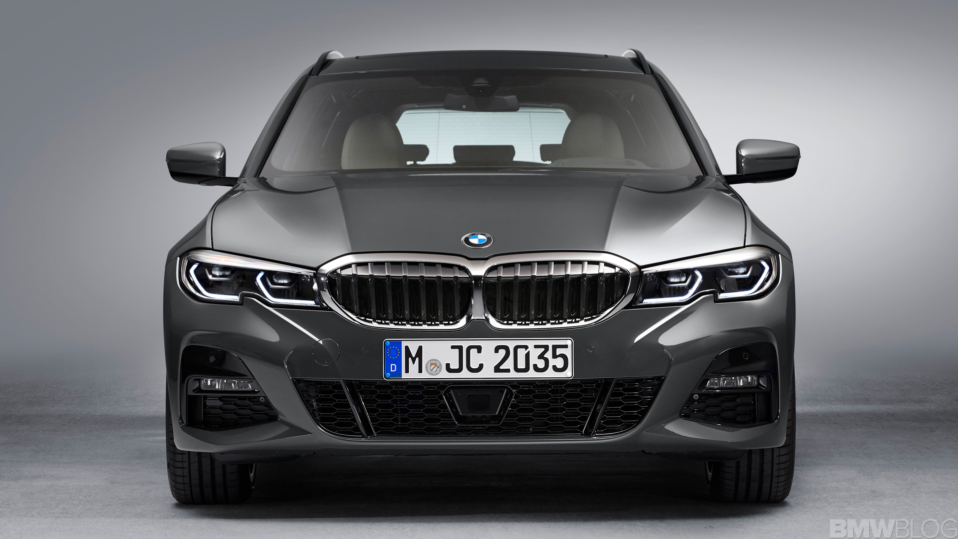
Up until today, the new generation of 3 Series lacked a proper wagon body style, which hurt its sales figures in Europe where wagons are preferable. Despite being all-new, the G20 3 Series struggled to steal sales from its rivals, the Mercedes-Benz C-Class and Audi A4, as both of those cars have wagon variants on sale. Now, though, the all-new G21 BMW 3 Series Touring has debuted and it puts the 3er right back in the hunt. So let’s take a look at how it compares to one of the most popular premium wagons on the market — the Audi A4 Avant.
Unfortunately, neither the Audi A4 Avant nor BMW 3 Series Touring will make it ‘Stateside. Both are destined to stay east of the Atlantic and that means we’ll likely never drive either. So, since we can’t actually test drive them and compare them back-to-back (although we suspect testing the sedans back-to-back will suffice), we can only judge them on their style. So how do they stack up in terms of looks? Well, since styling is subjective, I can only judge these cars based on my own taste. You may agree, you may not. But it’s a fun discussion either way.
[twenty20 img1=”341731″ img2=”341735″ offset=”0.5″]
From the front, I personally don’t love either car. The Audi A4 Avant’s facelift isn’t great and looks too fussy. Although, it’s growing on me and I like it more than I did when I first saw it. Still, its overly aggressive headlights and over-styled front air intakes are a bit too much. Though, the BMW 3 Series isn’t much better. I do like its headlights, which have little notches in them to harken back to the E46-gen 3 Series. Though, I like the way the front end of the Audi seems to point lower, making it look sportier and its new Singleframe grille looks more aggressive than the 3 Series’ Kindeys. So I’m going to take the A4 in a reluctant win, here.
[twenty20 img1=”341733″ img2=”341739″ offset=”0.5″]
In profile, the two cars couldn’t be more different. The Audi A4 is based on a front-wheel drive architecture and it shows, while the 3 Series is rear-wheel drive-based and it also shows. Because of that, the 3 Series Touring looks sportier and more muscular. Also, the Touring version fixed the odd Hofmeister Kink of the sedan, so it looks quite good. The Audi A4 Avant is cleaner, though, with crisper lines and a nicely blistered rear wheel arch. This is a tough one for me because I really like both cars in profile but I think I’d have to choose the BMW for its more muscular stance.
[twenty20 img1=”341745″ img2=”341737″ offset=”0.5″]
Out back, it’s an easy win for the Audi A4 Avant for me. Audi has always had great back ends on its wagons and this new A4 is no different. Its new taillights have the same great shape but now feature nicer LED lighting inside, making them look more premium. Also, its little faux diffuser is kind of cool and its roof spoiler looks very good. Whereas the BMW 3 Series Touring is a bit too blah from behind. Its taillights also still look too much like the Lexus IS’ (even though they look better on the wagon than on the sedan) and the rest of it is just a bit too flat. So the Audi A4 Avant has the nicer looking rump.
[twenty20 img1=”341727″ img2=”341723″ offset=”0.5″]
Inside, this comparison test isn’t very fair because of the color scheme each manufacturer used in their photos. The Audi A4 Avant’s red/black color scheme looks so sporty and exciting, while the 3 Series’ blandish tan/black looks drab. Having driven the new 3 Series with a black interior, I can say that it’s very good. I do think the A4’s looks nicer, though, even with the new facelift’s massive screen sticking out of the dash. Its horizontal air vent bar, stylish door panel design and simplistic climate controls all make it look sleeker and a bit more interesting than the 3 Series’, even if I do like both.
[twenty20 img1=”341725″ img2=”341741″ offset=”0.5″]
In the end, I have to give the nod to the Audi A4 Avant. The new BMW 3 Series Touring is a good looking car and I do like it but Audi has always been great at making smart looking wagons and it’s no different here. I don’t like the face of either but I think the A4, as a whole looks better.
[twenty20 img1=”341729″ img2=”341743″ offset=”0.5″]


