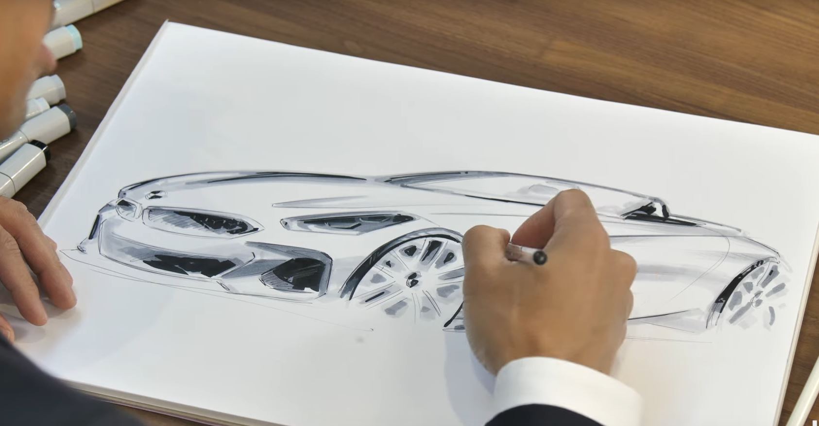
The BMW Z4 is one of the most beautiful cars in the current BMW range. As least in my humble opinion. I know not everybody agrees on this, but having driven the Z4 on numerous occasions, I have fallen in love with its shape. To me, the proportions of the Z4 and the overall shape of that car are simply stunning, and you really need to see it in real life to appreciate it.
We’ve seen that happen on a number of times with recent BMWs. Somehow, they looks different in pictures than in real life. The same could be said about the Z4 as pictures just don’t do it justice. The long hood, the short overhangs and the wide hips make it a truly sexy appearance on the road. In the metal, the car is smaller than you’d expect and yet all the proportions are just right.
Let’s not forget this is a roadster after all.
The Z4 also got a lot of flack for its mesh grille up front, at least on the Z4 M40i model. Purists have been furious about the departure from the trademark bars, but it really works on the M Performance model. The headlamps have also been under fire as the classic side-to-side setup of the corona rings has been changed. On the Z4, the rings are now positioned vertically and that’s a bold move.
Yet, there’s no better way to understand how the shape of the Z4 came to life than from the man who penned it in the first place. In the video below we get to see Calvin Luk, the man behind the new roadster, drawing it for Car Advice. It’s well worth a look.


