When the BMW Concept 4 debuted, not a single pundit kept their opinion about its grille design to themselves. With good reason, too. The Concept 4 launched with a grille that only a mother could love and, immediately after the criticism, the Bavarians doubled down by claiming its design to be the design for the upcoming BMW 4 Series. Fans were not happy, to put it lightly.
Now that it’s here, we have a chance to examine the actual design, not just a speculative design based on the render of an angry fan. So was all the fuss for no reason or is the new 4 Series’ design really all that bad? Let’s break it down.
Let’s Start with the Grille
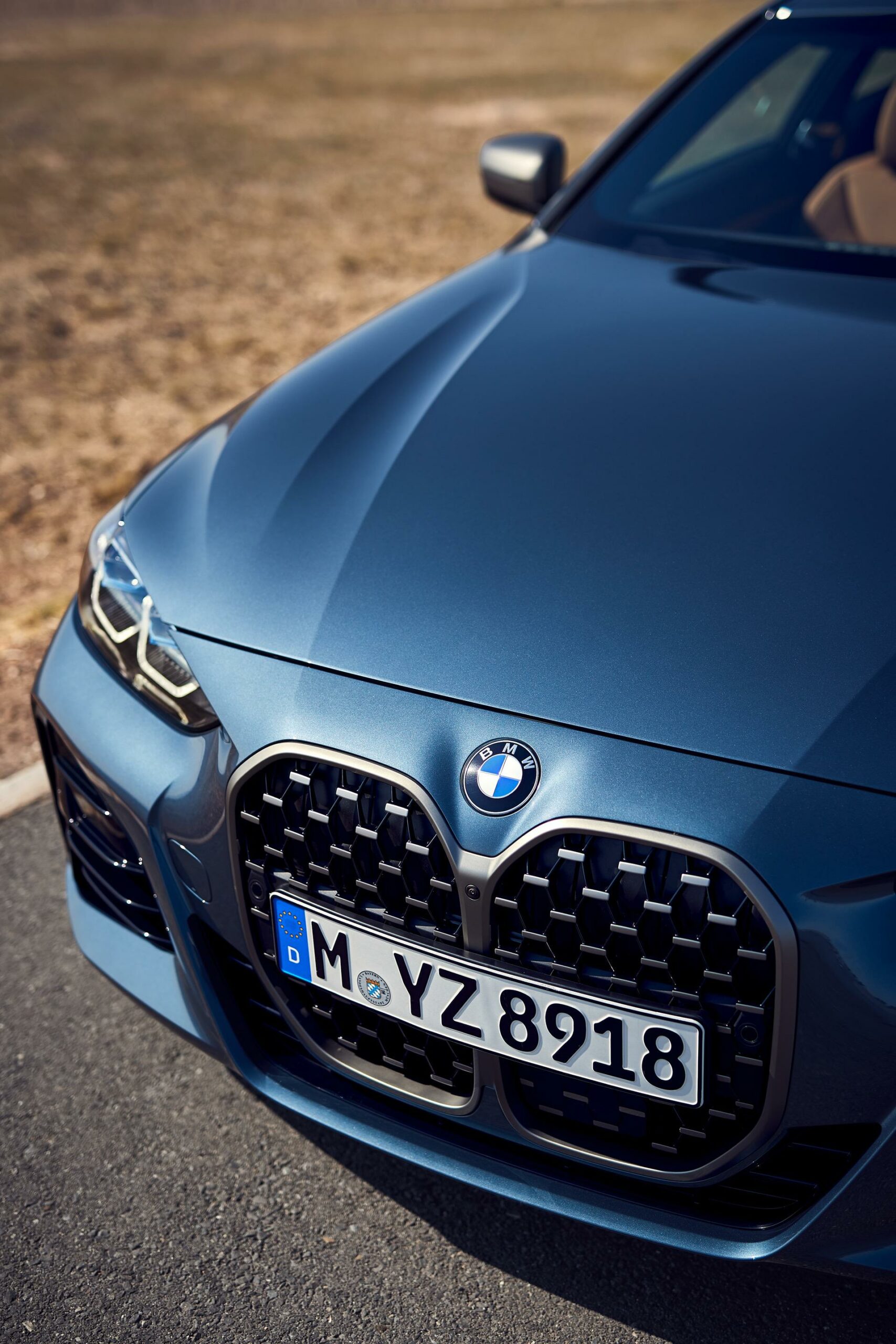
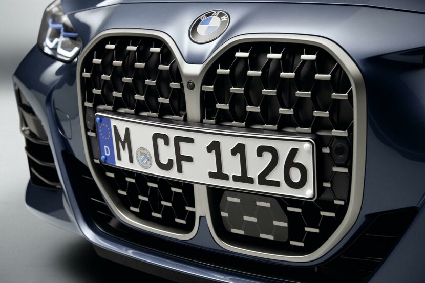
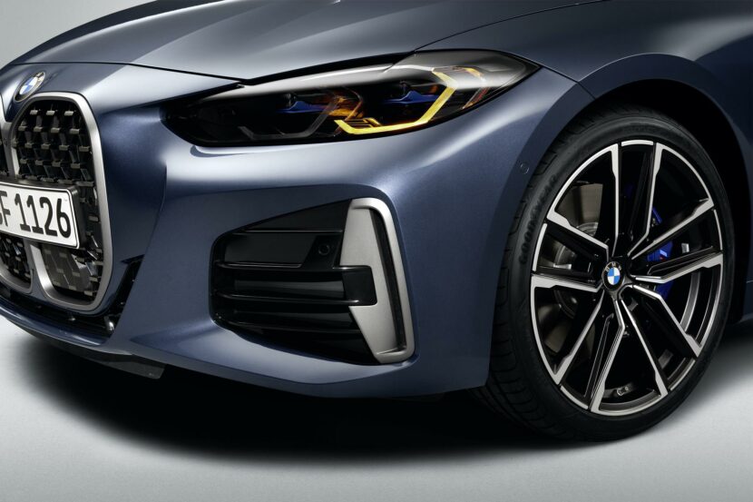
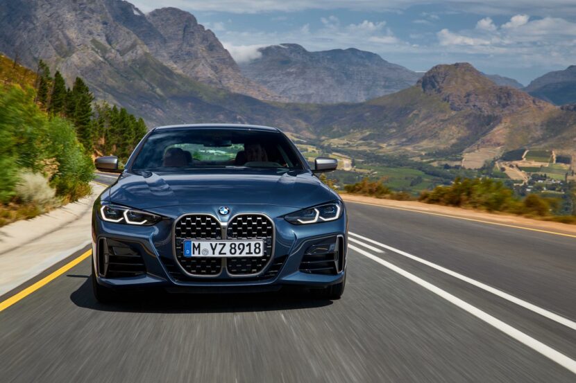
We won’t waste any time and get straight to the point — the kidney grilles are flippin’ enormous. Each grille can fit both of the kidney grilles from a normal BMW inside of it. That said, it’s actually not as bad looking as we had imagined it would look. When you add in the lower front bumper, front air intakes, squinty headlights and the creased hood, the new grilles don’t look so bad anymore.
However, there are a couple of caveats.
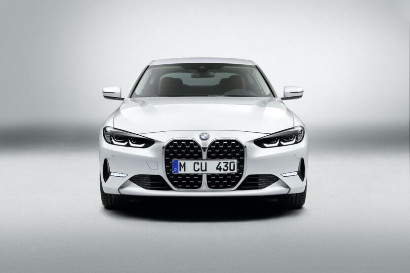
First, all of those aforementioned design elements only exist on the M Sport model. If you get the standard BMW 4 Series, the front air intakes and lower front bumper look similar to the ones you’ll find on the standard 3 Series. They look fine on the 3 Series but that’s because the 3 Series doesn’t have grilles the size of Rhode Island.
On the 4 Series, its tiny air intakes look hilariously disproportionate and it looks flat-out wrong.
The other caveat is the fact that, while the front end actually looks better than we would have thought, it’s also disproportionate to the rest of the car. So while the grille looks fine, it’s so much bigger, bolder and more in your face than any other part of the car.
The front end looks imposing but the rest of the car is calm, reserved and actually quite beautifully done. So it seems like the 4 Series was designed by two different teams — one for just the front end and one for the rest of the car — and neither of them discussed anything with each other.
We had a Zoom chat with HRE Wheels president Alan Peltier a little while back and he brought up that very notion; the front has a lot of crazy but the back has none. In fact, his thought was that it needed aftermarket upgrades (not only wheels), such as diffusers and spoilers, to sort of even out the crazy. He’s most likely right.
A Silhouette can be a Beautiful Thing
There’s something about a silhouette of anything that can be incredibly evocative. Think of all the old-school Bond movie intros, with the silhouettes of women; you never saw what they actually looked like but the outlines of their body shapes brought about all sorts of emotions, however creepy they were. The same goes for cars. Just a car’s silhouette can make enthusiasts swoon. The 4 Series is one such car.
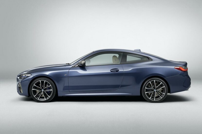
Its proportions are absolutely spot-on, with a long hood, short overhangs and a low, sweeping roofline that blends into a lovely subtle trunk spoiler.
Dig deeper into its profile and you’ll see a subtle shoulder line that steps up and creates a muscular rear wheel arch. The Hofmeister Kink is sharp and sporty as well and, while it’s not exactly old-school, it’s far more traditional than the one seen on the G20 3 Series.
Back End is the Best End
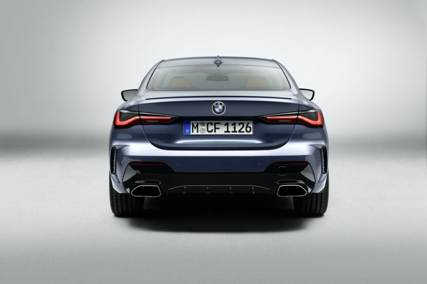
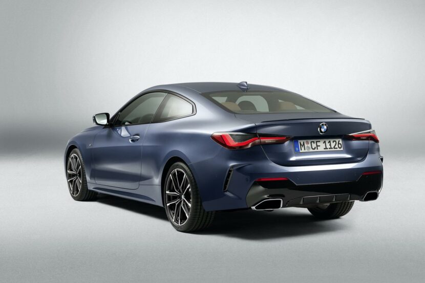
The front end might not be the most attractive of front ends but its back end is rather nice. Out back, slim taillights with sharp lighting elements give the rear end an almost angry design and the subtle sculpted decklid spoiler gives it a sporty look. In M Sport trim, the vertical air “vents” (they’re fake) look good and the dual trapezoidal exhausts are not only good looking but also real.
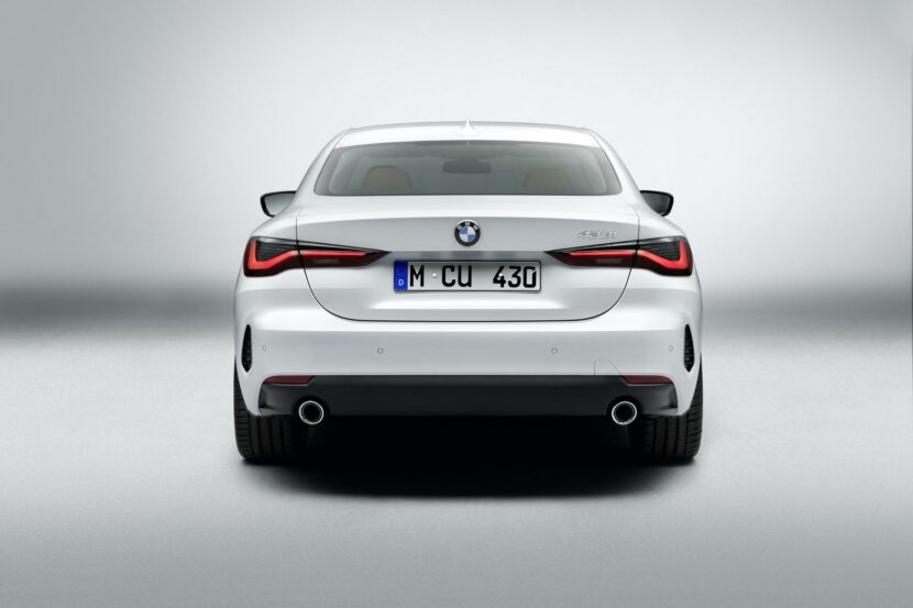
Without the M Sport trim, though, it starts to lose its luster. While it’s not as drastic as the front end, which falls apart without M Sport treatments, it certainly looks better the sportier it gets out back. In fact, without the M Sport package, the vertical “vents” become far too small and look out of place.
Still, the back end as a whole, even in standard-spec, looks good.
The Devil’s in the Details
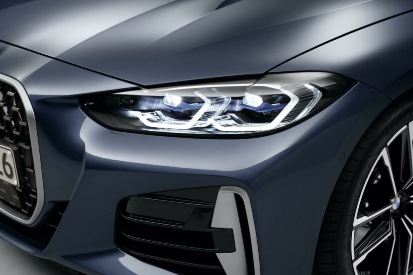
At first glance, the new squinty headlights look sharp and modern but, upon closer inspection, you’ll see that they’re really quite beautiful pieces. The signature dual-circle BMW headlight design has been modernized to a sort of half-hexagonal design and the side indicator lights have a slick three prong design.
The light housings themselves are also set back a bit into the front end of the car, giving them a deep-set eye look. Not only are its eyes set deeper than the surface but they’re also upturned, giving the front end a sexier, sportier look. The new grille will divide a lot of enthusiasts but the headlights are the best parts of the front end.
In M Sport-guise, the front bumper design comes up and wraps the sides of kidney grilles, accentuating its size. Flanking those grilles are large front air intakes that feature vertical brake cooling vents and they both go a long way to making the front end sportier.
Better Than Expected but Still Polarizing
Now that we’ve seen the new BMW 4 Series and run through its design with a comb, it’s actually much better looking than we had initially expected. However, it’s still not perfect and we still won’t say that the new grille design is good looking. But it’s not terrible and the rest of the car is so good looking that we think a lot of customers will overlook its front end.


