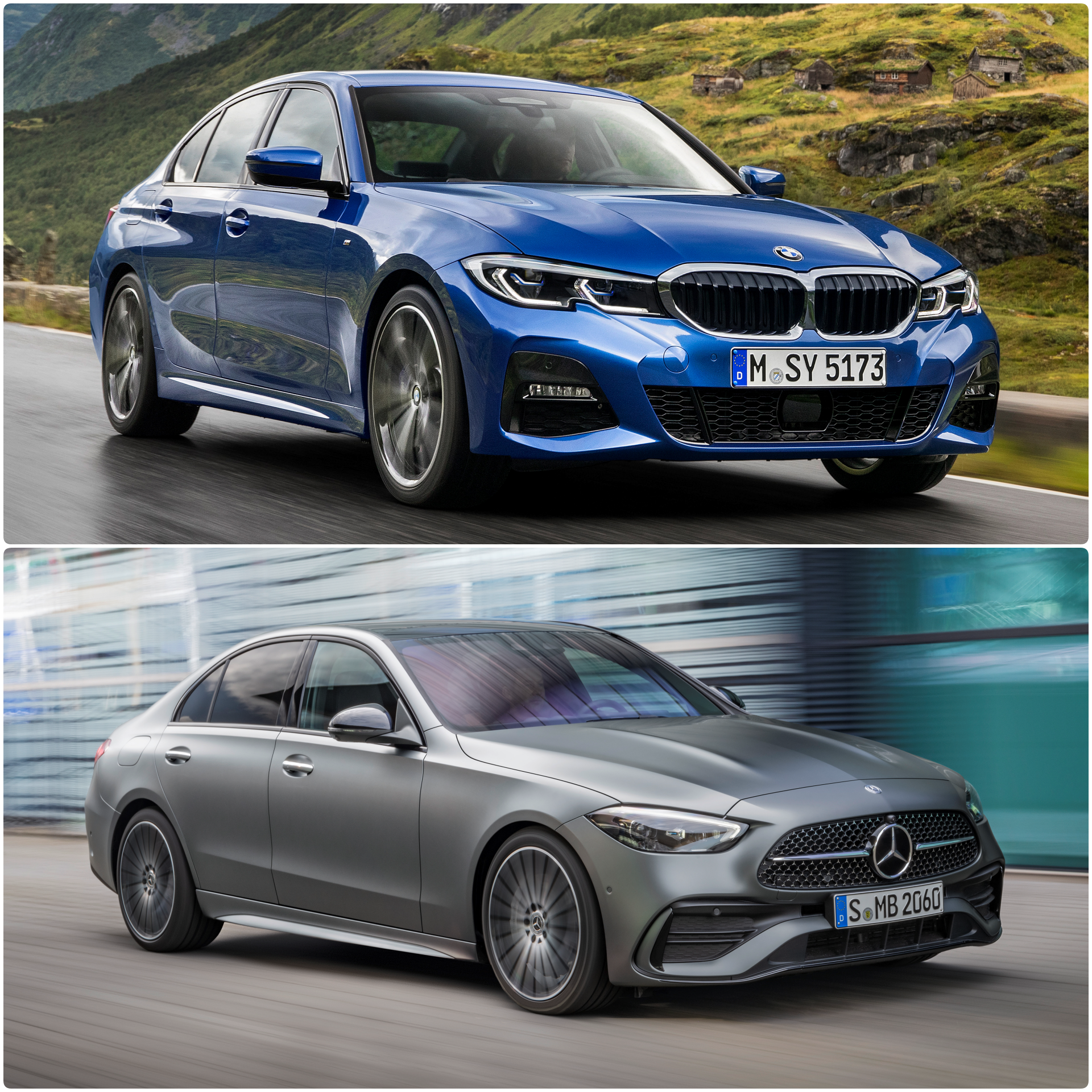
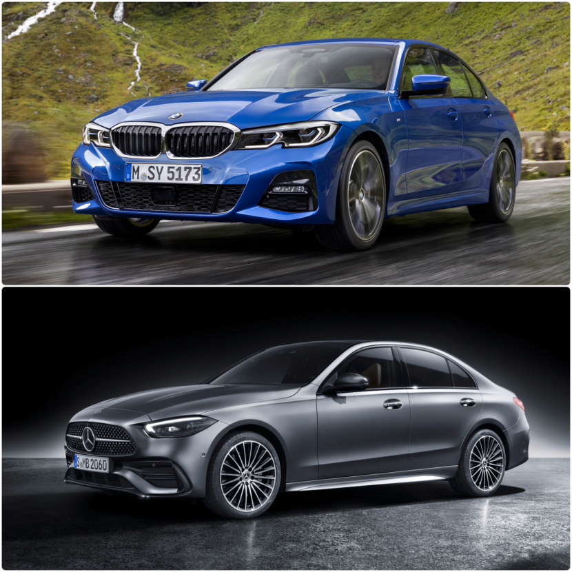
The new generation of the Mercedes-Benz C-Class (W 206) launches with updated looks and tons of new technology. Let’s see how it compares in terms of design to its main competitor in the class – the G20 BMW 3 Series. Mercedes-Benz took the chance to launch both Sedan and Wagon body styles at the same time. The new premium mid-class range from Stuttgart follows and further evolves the Sensual Purity theme, becoming even more minimal in terms of exterior styling. We were a bit intrigued by the plain metal sheet appearance of the refreshed C-Class, with very few design accents and details. In fact, some might see it as a bit too conservative and much too similar to E-Class and S-Class.
For starters, it is quite obvious from the beginning that for Merc aficionados, the top choice will be the AMG Line model as it manages to look more attractive than the AVANTGARDE model. No info on the EXCLUSIVE trim line with its classic chrome grille was disclosed, so there’s a chance Mercedes-Benz has given up on that model. The new C-Class comes with a load of technology borrowed from the new S-Class, such as the DIGITAL LIGHT, the new digital screen dashboard setup and the all-wheel steering, and will be powered solely by 4-cylinder powerplants. Diesel, petrol-fed and plug-in hybrid choice will be all on the list.
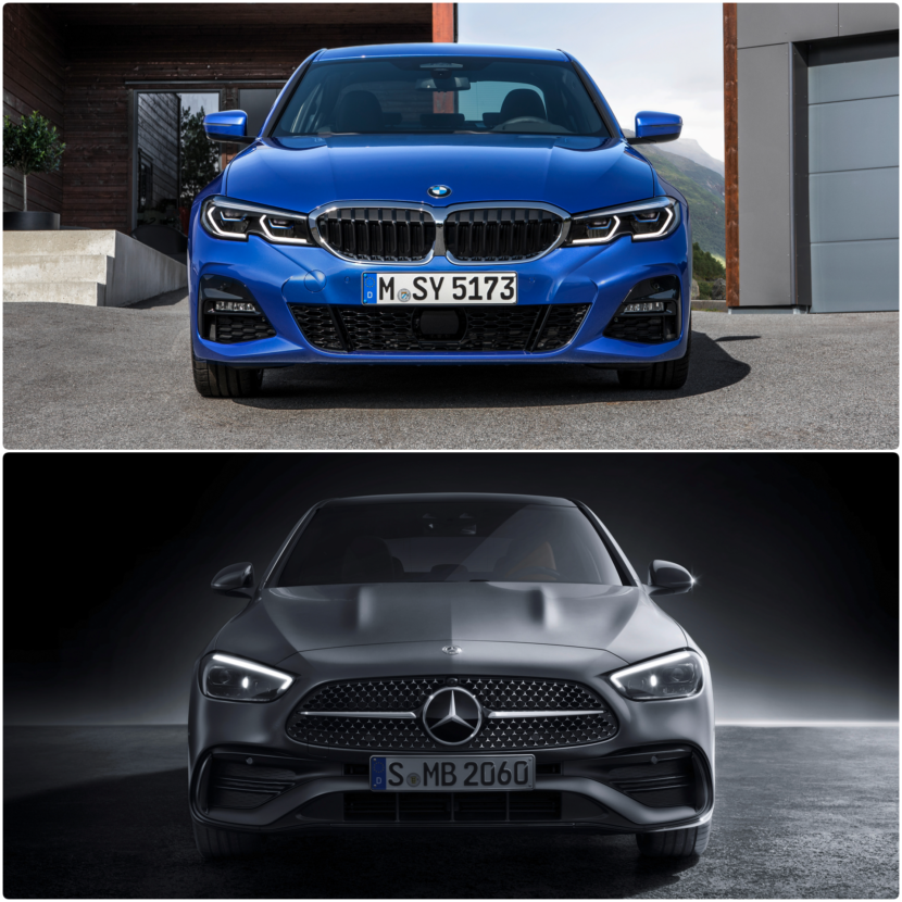
Front-End Comparison
Before we get going, it’s always good to remind ourselves that styling is subjective, so opinions will vary from one person to the next one. Starting with the front end of the Merc, we are faced with a beautiful, cohesive styling, which has one problem: it lacks personality. Of course, the Mercedes brand is instantly recognizable, thanks to its big Star logo on the grille. But, other than that, those new headlights with digital LED technology blend together with the shapes of the headlights from the current E-Class facelift and new S-Class.
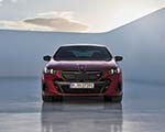
There are really no signature inner graphics to make them stand apart and scream “I am a Merc”. On the contrary, the front of the 3 Series is like always a familiar sight, albeit new from generation to generation. The G20 model series is defined by the iconic kidneys and the hallmark light signature with four “eyes”.
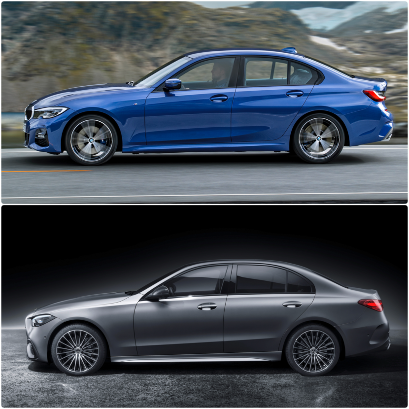
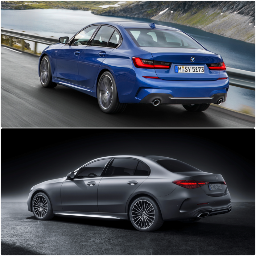
All in all, the Bimmer really feels more rooted into tradition, whereas the new C-Class seems a bit lost in the quest of finding a new identity. Naturally, the mini three-pointed stars adorning the radiator grille are a welcome addition, and quite unique in the segment. The silhouettes of the two opponents stay true to their respective brands. The 3 Series comes with a revised Hofmeister kink and less creases, retaining a few character lines. On the other side, the limousine from Stuttgart evokes a puristic design based on a consistent reduction of surfacing and detailing, together with highlighting plain metal sheet forms and shapes.
Rear-End Comparison
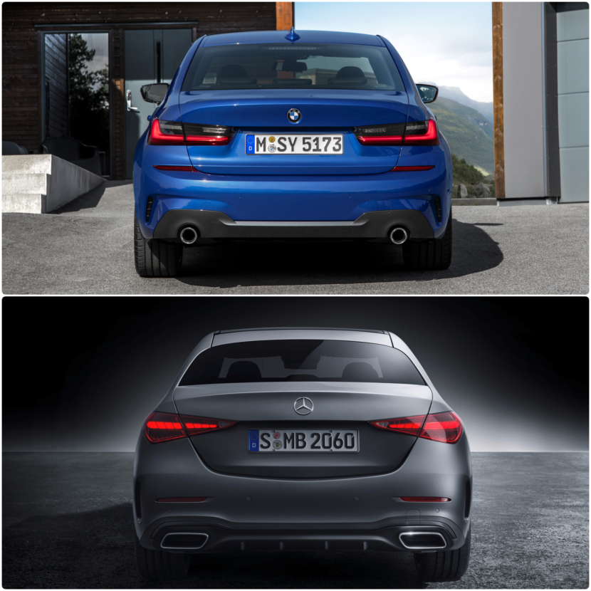
When the rear end comes into question, we’re once again faced with some raised eyebrows seeing Merc’s new 3 Series competitor. The triangular tail lamps might look fancy, glossy, stylish or whatever you may call them, but again, they come too close to the E-Class and S-Class. In fact, as many know, Mercedes-Benz has always had a hidden pleasure of entitling its C-Class “a mini S-Class”. In the case of the 3 Series, tradition makes its presence felt once again, as the G20 exposes its reinterpreted “L” shaped tail lamps. They look modern and attractive, beautifully rounding off the exterior design of the Bavarian model.
All New Interior
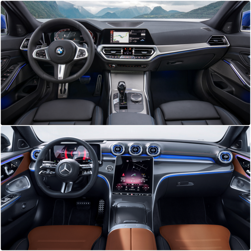
The new Mercedes-Benz C-Class certainly wins big with its brand new interior. Almost fully grafted from the W 223 generation S-Class, the W 206 comes with two large screens, one for the instrument cluster and one covering the area of the central console. While the AMG Line steering wheel may look a bit odd with its 6-spoke design, the new dashboard certainly feels more tech than what we get in the 3 Series.
The Munich contender was careful in adopting a revolutionary approach with respect to cabin and dashboard architecture. Come 2022 and the LCI generation, the 3 Series will receive a whole infotainment architecture, with likely two big screens joined together like the ones seen in the new iX. If BMW was inspired by Merc’s previous tablet, the Stuttgart-based constructor also took some lessons from Munich. The central screen of the new C-Class is angled at 6 degrees towards the driver, thus mimicking the center console layout in every Bimmer.
So in the end, both cars have their own qualities, but clearly, the C-Class is the newer looking one and the most advanced one in terms of technology. But we would love to hear your opinion on the two competitors.


