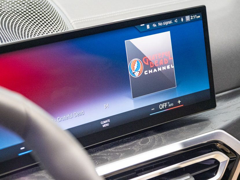
Yesterday we attended the official launch of the new BMW i4 and iX electric vehicles. The event took place in Los Angeles where a handful of journalists were allowed to experience the features of the new EVs. We covered the i4 and iX here and here, but while on site, we also decided to demo and review the all-new BMW iDrive 8 infotainment system.
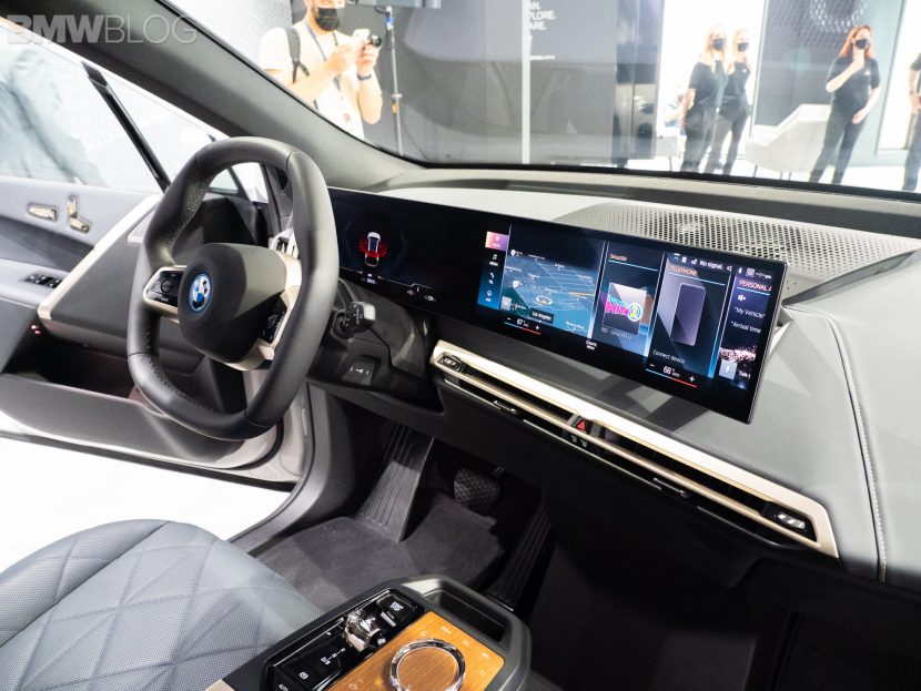
So let’s start first with the physical layout of the new infotainment system. Instead of BMW’s current driver’s display and iDrive screen setup, BMW has now combined both into on giant panel, with two separate digital screens built in. The driver’s display looks similar to the gauges you’ll see in any other current Bimmer but it features more futuristic graphics, a bit more customization, and a cleaner design.

While the new iDrive system is a complete overhaul, featuring an entirely new UI, added functionality, fantastic looking graphics, and a revised menu system. This is the biggest iDrive jump to date and it looks like it could also be the best. BMW iDrive 8 powers the entire infotainment system.
The new BMW iDrive 8 was designed with a focus on dialogue-based interaction using natural language and on touch operation. There are also new features which expanded capabilities of the BMW Intelligent Personal Assistant, which uses a new graphic to communicate with the vehicle’s occupants.

Additionally, BMW added Apple and Google Maps to the head-up display, which is a wonderful new feature. It also gets BMW IconicSounds for the powertrain sound, co-developed by Hans Zimmer and Renz Vitale.
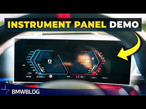
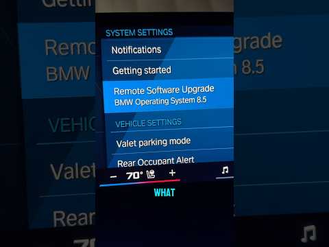
To learn more about iDrive 8 and what its interface looks like, take a look at the video below and don’t forget to subscribe to our Youtube channel.


