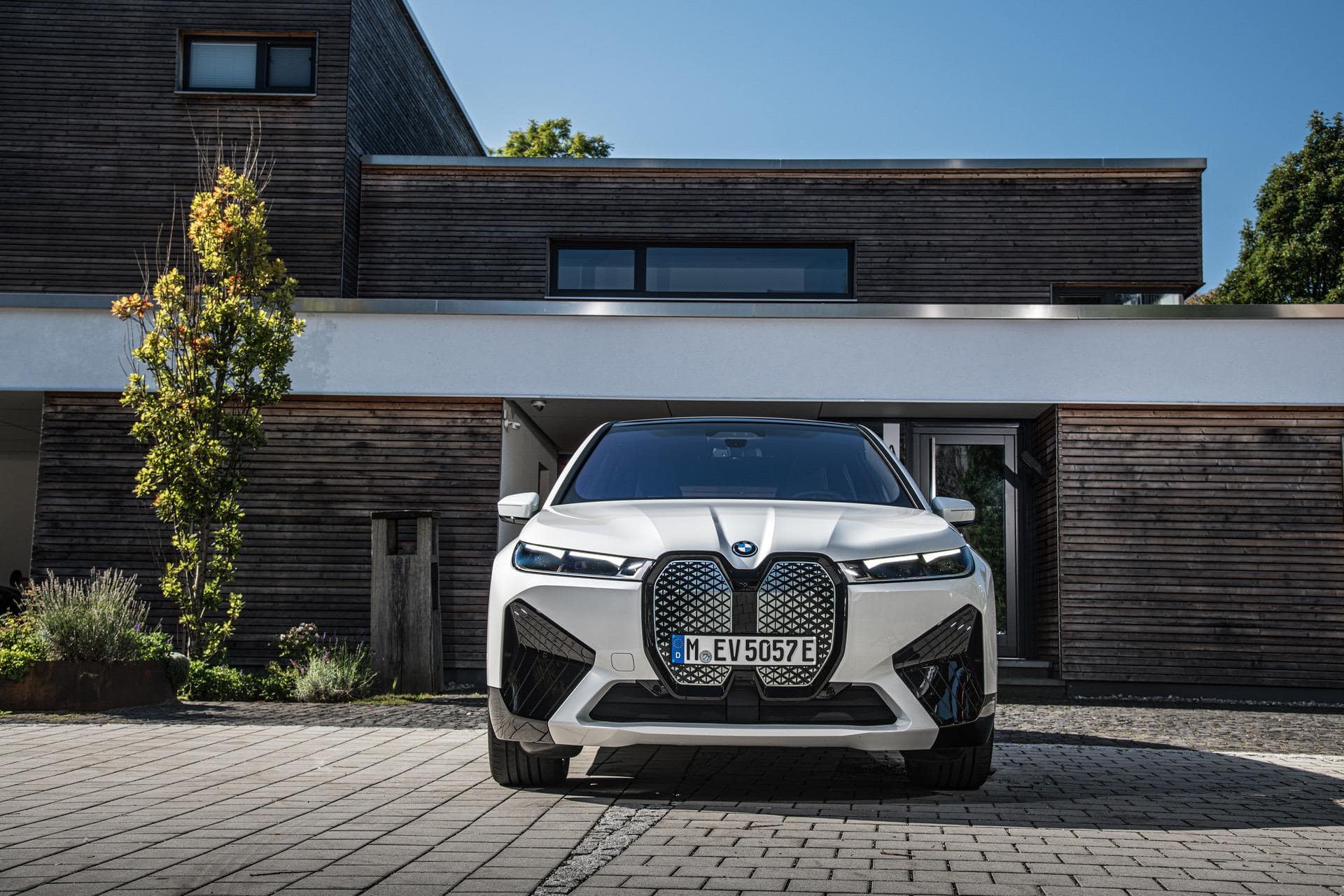
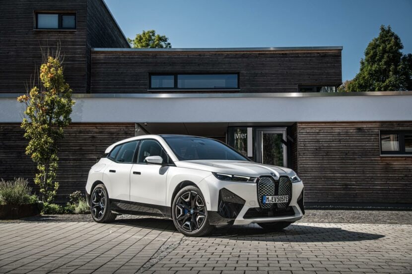
BMW has been under some heavy fire recently due to some of its designs. Admittedly, some of the latest models the Bavarian brand launched do have a bit of a peculiar, compared to the brand’s traditional designs. They are… let’s say an acquired taste. In the case of the BMW iX, the huge grille up front is just part of the equation. The electric SUV is also quite massive and has a lot of big, clean shapes that are meant to improve its aerodynamic profile.
We can understand that, obviously, as most electric cars have this approach. When range anxiety is as big of a problem as it is, you’ll cling to any trick in the book to try and squeeze every single mile possible out of the battery pack. Most reviews have actually said that, in real life, the iX isn’t all that bad and they are right. This is, anyway, a car that’s more bout essence than looks. But what if you simply can’t make peace with its design?
The Sketch Monkey decided to give it a go and try to change the appearance of the BMW iX, using some design cues from the i4. The video below shows exactly how the process went down. According to him, “fixing” the face of the BMW iX took just 4 minutes, at least if we’re to believe him. The clip starts off with a critique of the iX’s design as it is and highlighting some of the things that make it stand out.
So, what’s the solution? Apparently, sticking the front end of the i4 in there. With this approach, I have to say it does look … different. Is it better? That’s a very subjective topic. Design as a whole is very subjective. Due to the i4 headlamps, it looks more familiar, mostly due to the corona rings that feel like and old-school BMW. Don’t be afraid to tell us what you think in the comments below.


