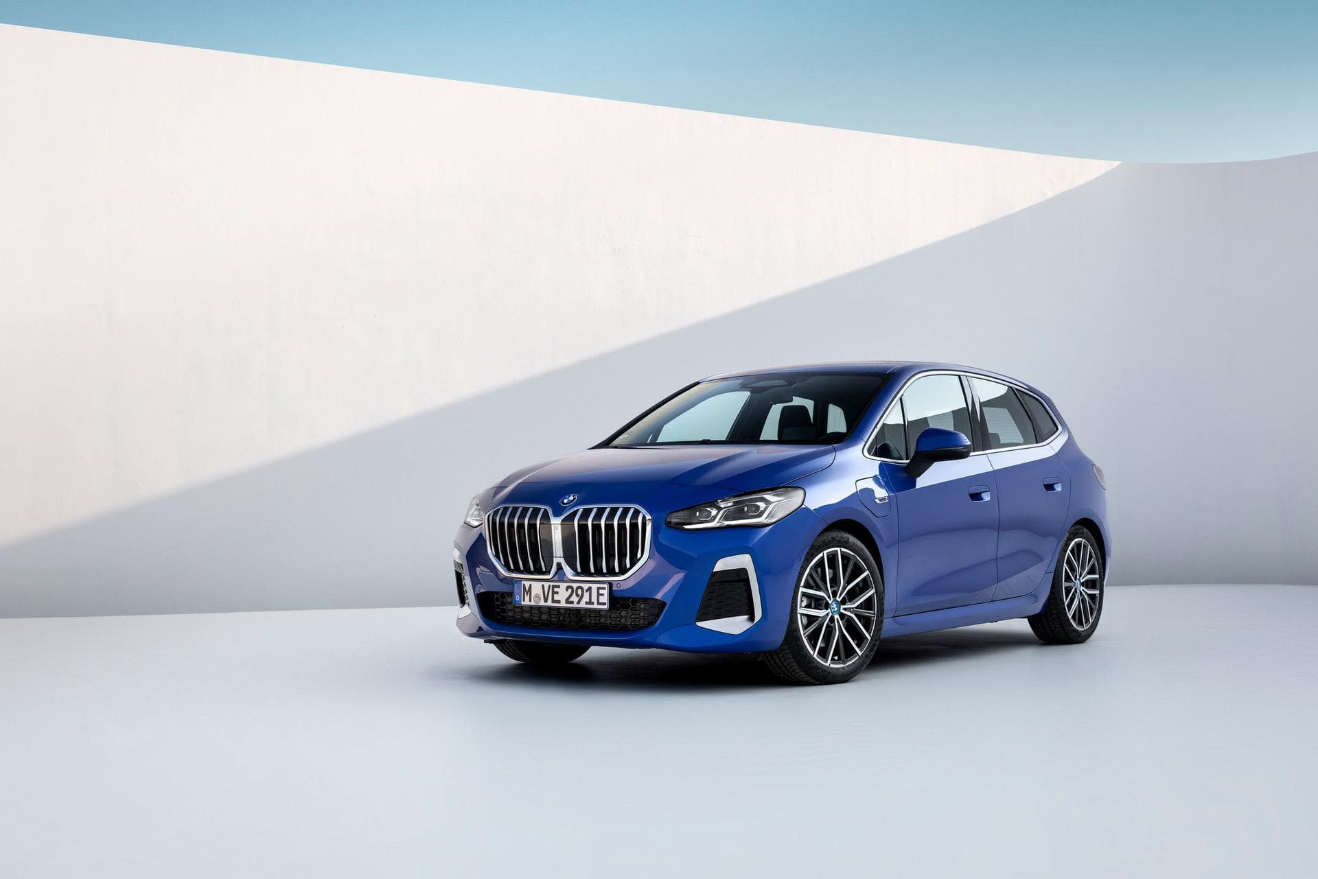
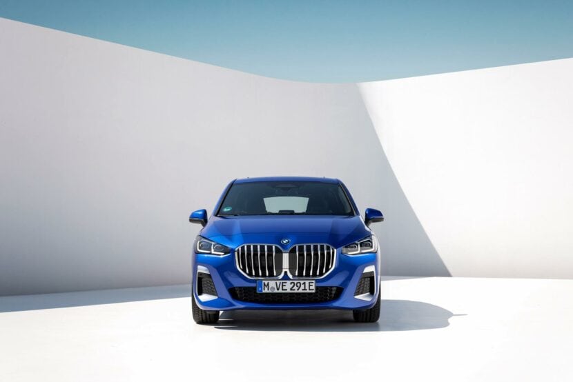
Even as BMWBLOG’s resident curmudgeon, I find the complaining about the new BMW 2 Series Active Tourer to be a bit much. Sure, its grille is pretty wonky looking and it lacks an iDrive rotary dial inside, but it’s a handsome little people mover for people who want to… move people. It does exactly what it’s supposed to do and complaining about the lack of exciting design on such a car seems misguided. However, there’s no denying that it could be a bit better looking and this video tries to fix the new design.
In this new video from The Sketch Monkey, he tries to fix the new 2 Series Active Tourer’s design, while also taking a look at the larger BMW Group design. His biggest issue with the 2AT’s design is its grille and the visual mass at the front end. But his next biggest issue is that its face looks nothing like any other BMW, which he also feels is a problem with BMW as a whole; no cohesion across its designs. Ironically, there was a time when enthusiasts complained that BMWs looked too similar; same sausage, different lengths. Still, his point is valid.
To go about fixing the 2 Series Active Tourer, he mainly replaces the front grille with the same grille as the new 2 Series Coupe. That does two things; it removes the monstrosity that is the enormous front grille but it also creates some familial design. While I wasn’t sure how that’d look before seeing it, after seeing it I think it was a good idea. The 2 Series AT looks quite a bit better with the 2 Series Coupe grille.
He also changes a few other things, such as front air intakes, wheel size, and shoulder lines, to make it look more like a proper BMW and it works quite well. Personally, the 2 Series Active Tourer doesn’t offend me with its design; it’s a comfy people mover and I honestly lack object permanence with it; when I’m not looking at it, I forget it exists. However, these design changes actually do make it a better looking car.


