Ford Escort RS Cosworth, Maserati MC12, Ferrari 612 Scaglietti, and the McLaren P1 – these are some of the cars Frank Stephenson had the opportunity to work on. More relevant to BMWBLOG’s audience are the original BMW X5 (E53) and the first generation of the modern MINI. For nearly three years, he has been dissecting the design of new cars on his personal YouTube channel. Now, the time has come to analyze the Concept XM.
To say he doesn’t like how the boldly styled plug-in hybrid SUV looks would be a massive understatement. The Casablanca-born designer says the first dedicated M car since the M1 is terrible from just about every angle, adding the front fascia “doesn’t make any sense.” He is not a fan of the illuminated grille contour or of the small headlights.
A general criticism regarding the XM’s design is the overuse of lines going in different directions. Frank Stephenson says “each line has a mind of its own” and that putting lines near a round surface such as the wheel arches “makes no sense” from a design perspective. Described by Motor Trend as being one of the most influential designers of our time, the now industrial designer claims the polarizing SUV has one of the most “ridiculous side views” he has ever seen.
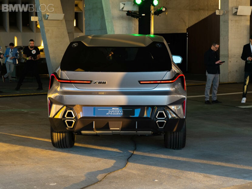
He goes on to say the front overhang is “almost cartoonishly short” and the profile is overly angular for no logical reason. Stephenson, who also designed the Ferrari F430 in collaboration with Pininfarina, says the XM’s rear end “physically hurts to look at.” The dual logo serving as a tribute to the mid-engined M1 is not his cup of tea, and the same can be said about the pair of stacked exhausts as well as the thin taillights.
It’s not all negative as he does like the hood and how the black line on the profile does a good job at decluttering the vehicle’s sides by masking the door handles. The Moroccan designer – who allegedly spent a lot of time in his mother’s BMW 2002 – also had nice things to see about the interior. He mentioned the front half is very modern and the rear compartment has an interesting look with its different colors and a parametric theme for the headliner.
Stephenson has a couple of theories about why it looks the way it does. The gist of the first one is that BMW’s subsequent production version of the XM won’t be as aggressively styled as the concept, which he says was intentionally exaggerated.
Theory number two revolves around the idea of BMW being the “modern martyr of design” with huge grilles, lines that don’t go anywhere, and upsized proportions. The German luxury brand could be deliberately taking “the least desirable design” choices to show car designers they are “not walking down the righteous path of design.” In other words, the XM is an example of how an SUV should not look. For all these reasons, the vehicle’s appearance gets an “F” from Stephenson.
[Source: Frank Stephenson / YouTube]


