The easy comparison to make for the BMW i7 is the Tesla Model S, what with it being the most famous electric luxury sedan. However, most Tesla Model S customers aren’t going to cross-shop the i7. Instead, the BMW i7’s more natural competition will be the Mercedes-Benz EQS.
For starters, Mercedes-Benz is BMW’s main rival, which on its own makes the EQS the i7’s closest competitor. However, they also both offer equal levels of luxury, far beyond what the Model S offers. With that said, now that the BMW i7 is finally here, let’s take a look at how the two designs compare.
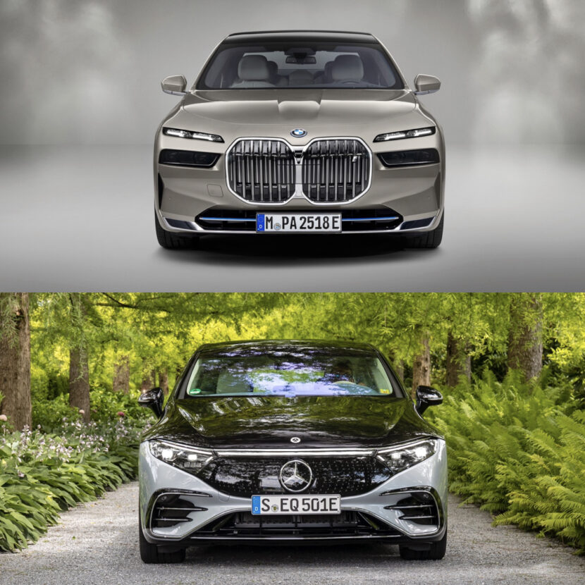
Front-End
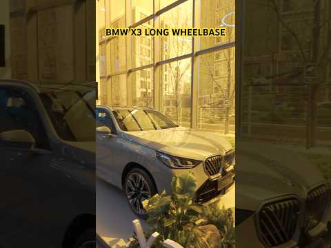
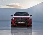
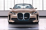
Up front, the two cars couldn’t be more different. The BMW i7 is big, bold, and brash, with massively imposing kidney grilles, flashy split headlights, and LED backlit grille trim. On the flip side, the Mercedes-Benz EQS Sedan is far more traditional looking, at least as far as EVs go. Its grille, while not actually a grille, is more traditionally shaped and its headlights look like headlights. Honestly, I like the EQS’ face but it’s also pretty boring, so I’d probably choose the Bimmer.
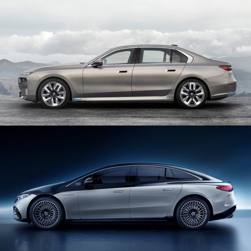
Profile View
In profile, the BMW i7 definitely takes it. While the i7 isn’t exactly a supermodel, the EQS has the silhouette of a melted jelly bean. The BMW i7 looks more like a traditional BMW sedan, with its three-box shape, tall roofline, and Hofmeister Kink. That might not sound sexy but it’s handsome and sophisticated, while the EQS just looks dull.
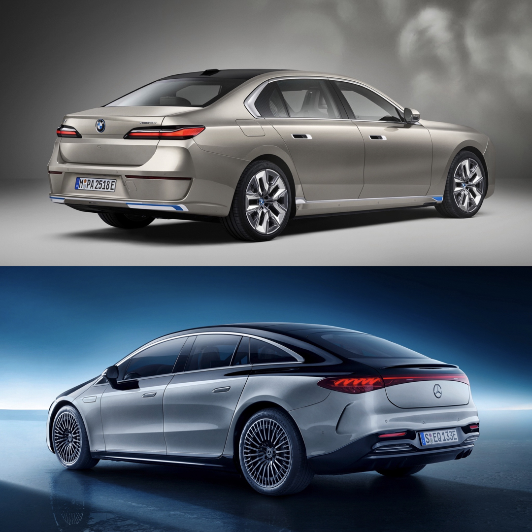
Rear-End
Out back, I think the EQS looks a bit better. Its rear light bar is more visually interesting than the normal 7 Series lights of the i7 and the way its rear haunches flare out past its pillars gives it real presence. The BMW i7 is so inoffensive from the rear it’s actually boring. There’s nothing wrong with it, just nothing particularly interesting, either.
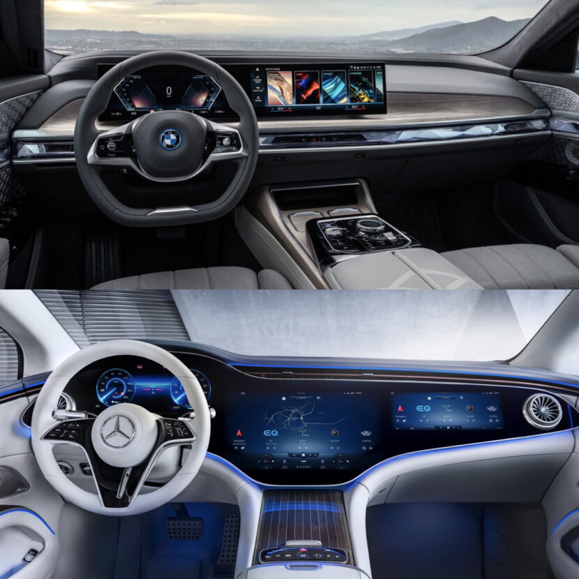
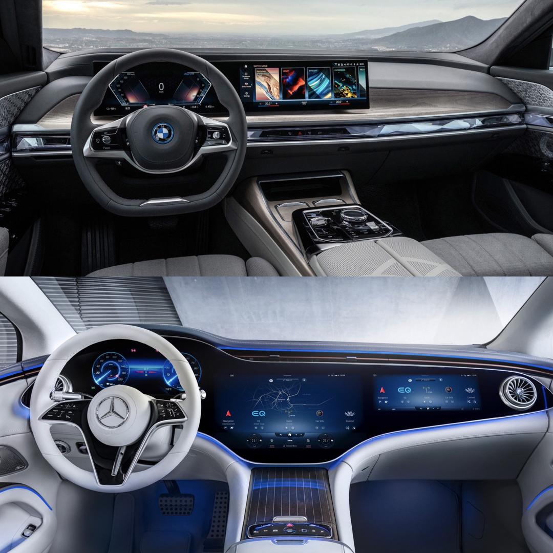
However, their exterior looks take a back seat to their interiors. Just look at them. Both cars sport absolutely fabulous looking cabins, filled with sci-fi-looking tech, enough ambient lighting to shame a German night club, and simply absurd levels of luxury.
Interior Design
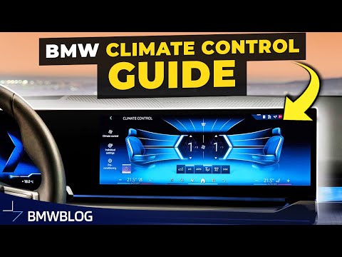
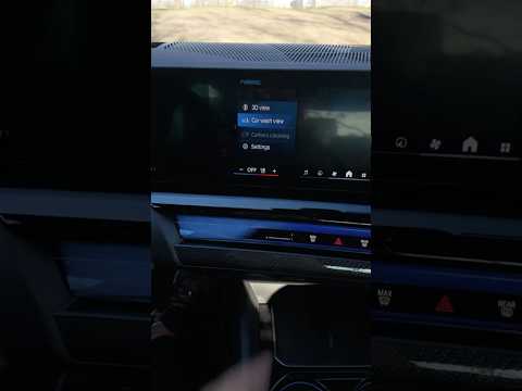
From the front passenger compartment, the EQS’ Hyperscreen is far more impressive looking than BMW’s iDrive 8 (I hear Hyperscreen can be annoying to use but I’ve never used it, so I can’t compare their usability, only their looks). Though, taking up all of that real estate with a massive screen does make it seem a bit less premium. Whereas the i7 seems to have a nice mix of old-school luxury and futuristic tech. The way BMW replaced the traditional dash and door panel trim with a crystal-effect light bar is a neat idea and it works beautifully with the natural wood trim higher on the dash.
In the back seat, the BMW i7 — and I can’t believe I’m saying this about a 7 Series/S-Class comparison — beats the EQS hands down. As nice as it is in the back of an EQS, it isn’t even close to as exciting as the back seat of the i7. Not only do both rear seat passengers in the i7 get their own little screens built into their door panels, to control everything from their ambient lighting to their climate, but there’s an optional 8k theater screen that drops down. It’s so overly opulent and impressive, you’d think it was the back of an S-Class…
I’ve done what feels like a thousand 7 Series vs S-Class photo comparisons and the S-Class has won every single one of them. Until today. Not only is the BMW i7 more visually interesting, it actually has a better interior. There, I said it.


