I’ll stick my neck out and say that I like BMW’s new split headlight design on both the new 7 Series and X7 LCI. I think splitting the headlights creates more verticality to the design, which helps to fill out the massive space up front. If the headlights were single lamps, like on all other Bimmers, and thinner, they’d look out of proportion with the rest of the cars, especially the monstrous grilles. Just look at the pre-LCI X7 for proof. However, this new BMW M8 rendered with the new split headlight design? Nope.
There are a few flaws with the BMW M8 as a car but its looks aren’t one of them. It’s a great looking car and one that will remain great looking for many years to come. Its headlights aren’t its best quality, as they’re just sort of “meh” but they’re far from bad. So replacing them with these new split headlight just looks wrong. In fact, it looks like a catfish, with little whiskers hanging down. No thank you. Also, there was nothing wrong with the M8’s grille, don’t replace it with this shrunken 7 Series grille.
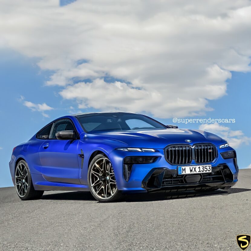
Ironically, I think this render might really work if it just kept the top half of the split headlights and ditched the bottom half, while keeping the stock grille. Those slim, angular LED lights would look pretty cool next to the normal 8 Series kidney grille and would accentuate how wide and low the front end of the car is, giving it a sportier look.
I get it, render artists always try and mash brand new designs up with older designs, one way or another, to see if they can make something cool. It’s fun, it’s interesting, and it gets some clicks. But sometimes render artists are so preoccupied with whether or not they can, they don’t stop to think if they should.
[Render by instagram.com/superrenderscars]


