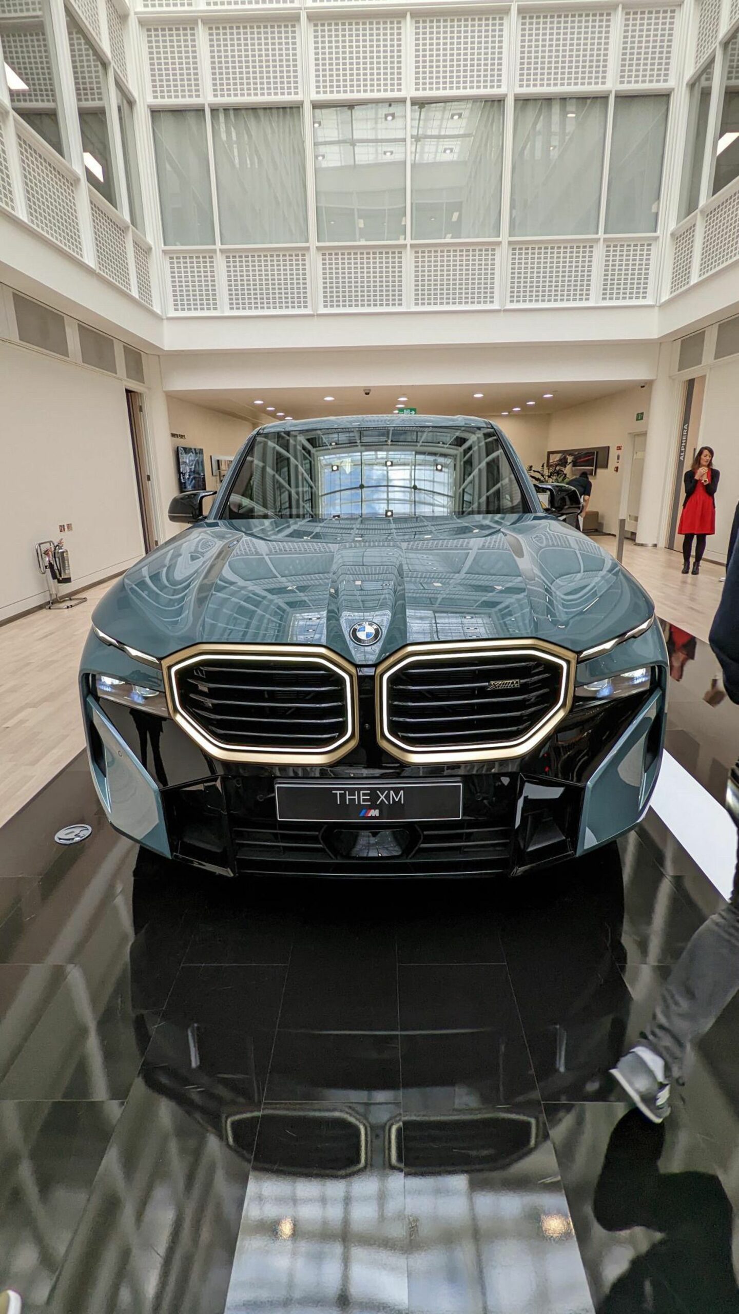
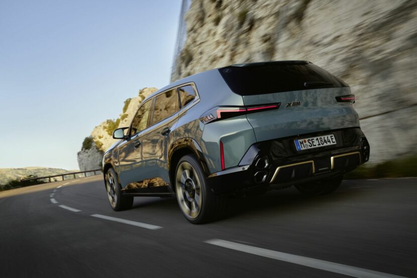
As with most new BMW designs, especially those from the M Division, the new BMW XM is being heavily criticized by fans and enthusiasts of the brand. However, it might not be as bad of a design as some say and it could be fixed with just a few simple tweaks, as seen in this new video by The Sketch Monkey.
According to The Sketch Monkey, the BMW XM is actually a pretty cool looking car. He likes the way most of the XM looks and appreciates BMW going in such an interesting direction. He also points out just how much different it looks than the freaky looking XM Concept, which was an absolute design mess.
That doesn’t mean there isn’t anything to try and improve on, though. The BMW XM is still very busy up front. While its grilles actually look fine, and its split headlights are pretty normal now, the lower front fascia is a bit of a mess. There are too many lines, in different directions, in too many different places. So he grafts on the lower front fascia from a BMW X7 and blends it in, while also shortening the grilles slightly, and it does look a bit cleaner, even though it looks like an XM with an X7’s chin.
He also cleans up some of the lines on the side of the car, such as near the side skirt and rear haunches. Most importantly, though, he gets rid of the absurd piece of trim that mimics the shoulder line and window trim of the car. It’s such an odd piece of design that adds nothing to the car and the XM looks significantly better without it.
When he’s done, the BMW XM does look quite a bit better overall, after just some simple tweaks. I still wouldn’t call it pretty, and it’s still a 6,000 lb SUV (yuck), but it does look better than before, proving it can be fixed.


