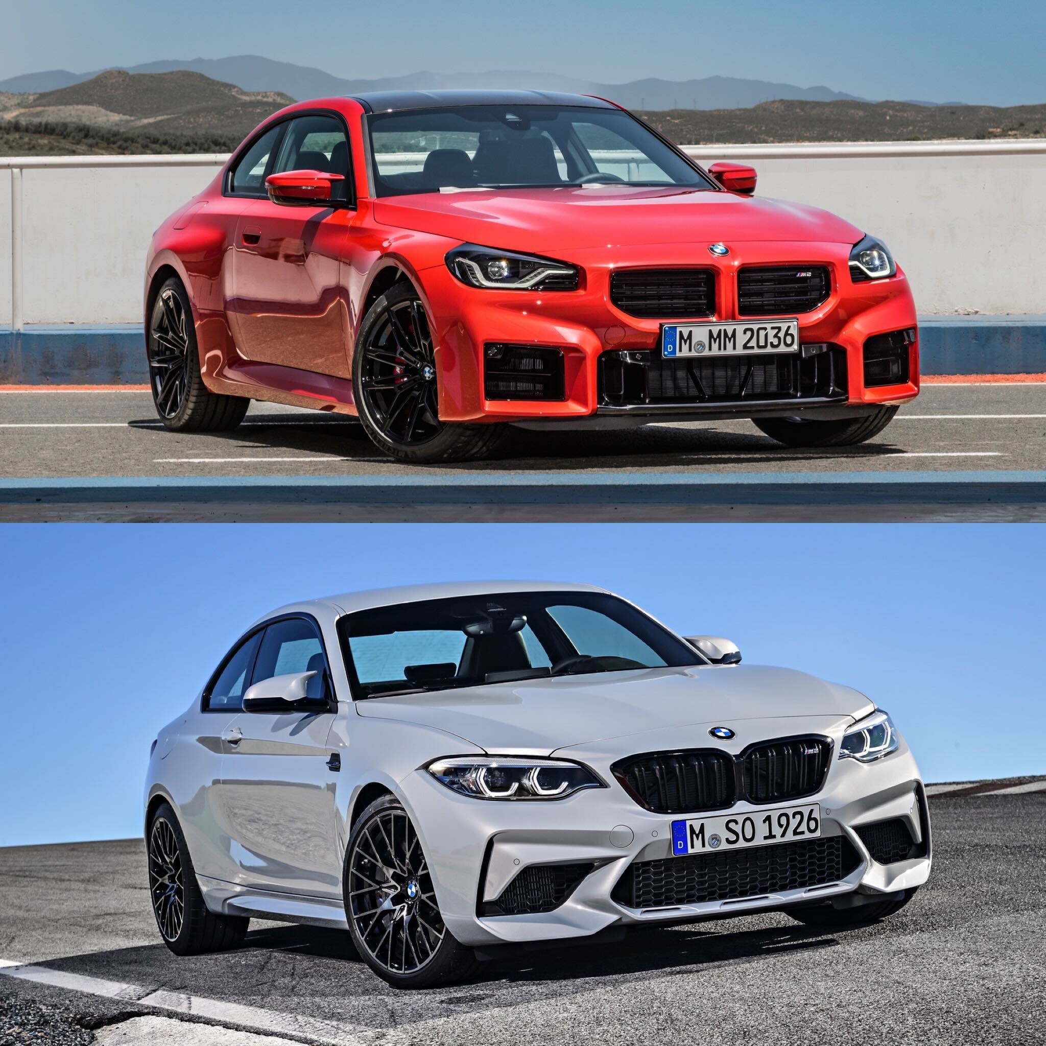
Now that the 2023 BMW M2 G87 is here, it’s time to see how it stacks up against its predecessor. After all, the previous-gen M2 was a beloved car, one that not only drive brilliantly (especially in CS form) but also looked great (especially in CS form). So can this new car top the last-gen car’s design? Let’s take a look.
Up Front
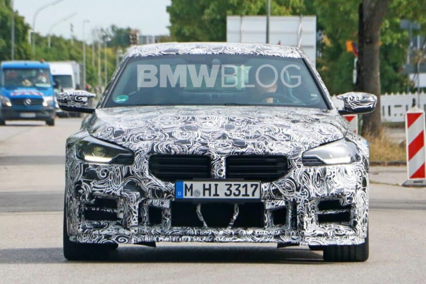
This is where the real comparison is going to happen and, ultimately, where customers will judge both cars. The F87 M2 was, and still is, a great looking Bimmer and its simple, handsome front end is a big part of why. Its grilles are sensibly sized, its headlights feature the classic double halo design, and its air intakes fit the front end properly. This new car, though, is a bit different. While it’s grilles are sized properly, their weird rectangular shape, with their harsh 90-degree angles, look odd and don’t really fit the car. And the almost perfectly rectangular air intakes look wrong. It’s not bad looking but it just seems to lack cohesion, especially compared to the F87. So the older car wins here.
Down the Side
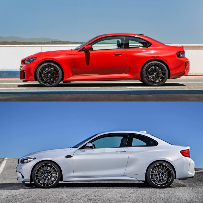
The new G87 BMW M2 looks good in profile. Looking at it from the side, you can see boxiness of the flared fenders, similar to the E30 M3’s. Admittedly, the abruptness of the fender flares with more harsh right angles, looks a bit odd on the 2 Series’ body style. However, it works better than at the front. Even still, it cant’ match the F87 M2. The more I look at the G87, the more I appreciate the F87. The latter is just so smooth and cohesive looking, with muscular hips that look natural, not forced. I like how low the G87 looks, and I always felt the F87 looked a bit too tall, but the F87’s profile is just better to these eyes overall.
From the Back
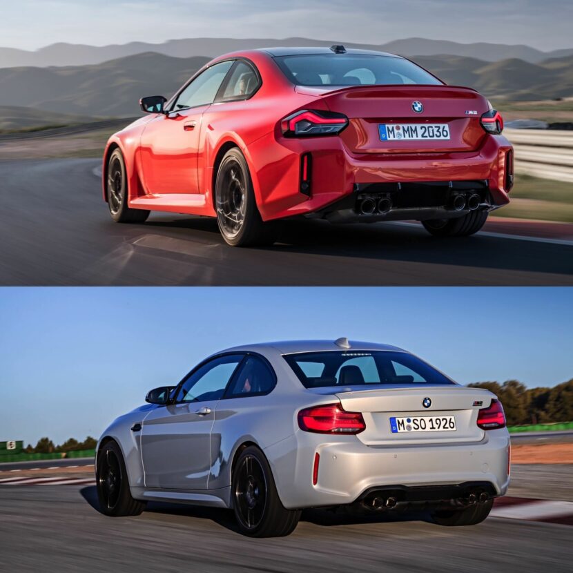
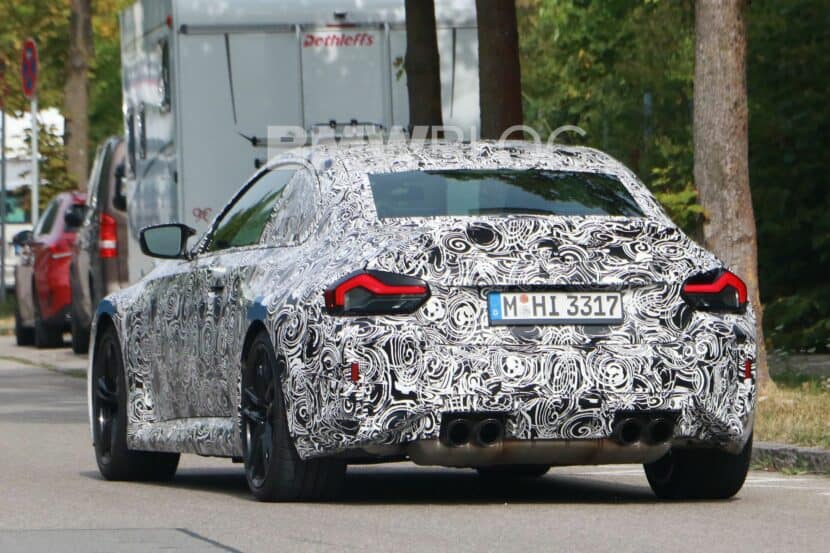
From this angle, the G87 really works. Its taillights are starting to grow on me, and I think on many enthusiasts, and its quad exhaust setup looks good. It also looks great from the rear three-quarters angle, where you can see the muscularity of its rear fenders. It looks low, wide, and aggressive. Whereas the rear is the F87’s worst angle. It isn’t bad, in fact it’s still good looking, but the rear end is where it’s the most boring, with kind of blah taillights. The G87 wins here.
Inside
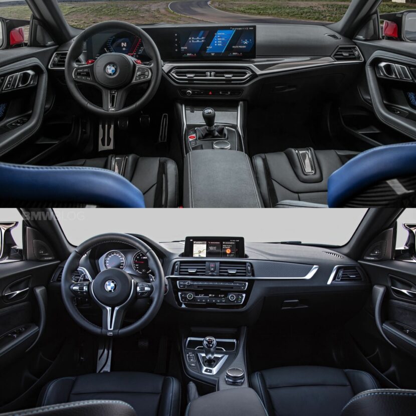
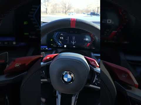
I’ll admit, I’m a bit conflicted about the interior of the G87. There are some things I love. The new carbon buckets are fantastic and love them in every BMW they’re in, I like the center console layout, and I like the M colored touches. However, I prefer the F87’s analog gauges far, far, far better than the digital ones on the G87 (even if they are improved over the standard 2 Series), and the massive iDrive 8 screen on the G87 seems a bit too big and distracting for an M car. Ultimately, I think the G87 takes it, but I do with it had the F87’s gauges. And, please, BMW, would you give M cars a special steering wheel?
Overall
On the whole, the older F87 BMW M2 looks better than this new G87 car. It’s simpler, more handsome, more sophisticated, and it wears its muscularity more naturally. It’s graceful in its aggressiveness, whereas the G87 seems to want to beat you over the head with it. While that brazen aggressiveness can be cool sometimes (think E30 M3), it isn’t as good looking or as timeless as gentle aggression (think E46 M3). So while the G87 has some good things going on, its predecessor is still the better looking car.


