BMW’s oldest rivalry is evolving. As both BMW and Mercedes head into the electrified future, their approaches are drifting. For decades, whenever either BMW or Mercedes zigged, the other one would zig too. Now, one is zigging and one is zagging, without either brand knowing which will work in these untested waters. That couldn’t be more true in their designs.
Both BMW and Mercedes took drastically different approaches to designing their electric luxury performance sedans. BMW took a boxy, brutish approach, whereas Mercedes went with aero. So, since we can’t test the new BMW i7 M70 out just yet, let’s see how its design compares to a car from BMW’s oldest rival.
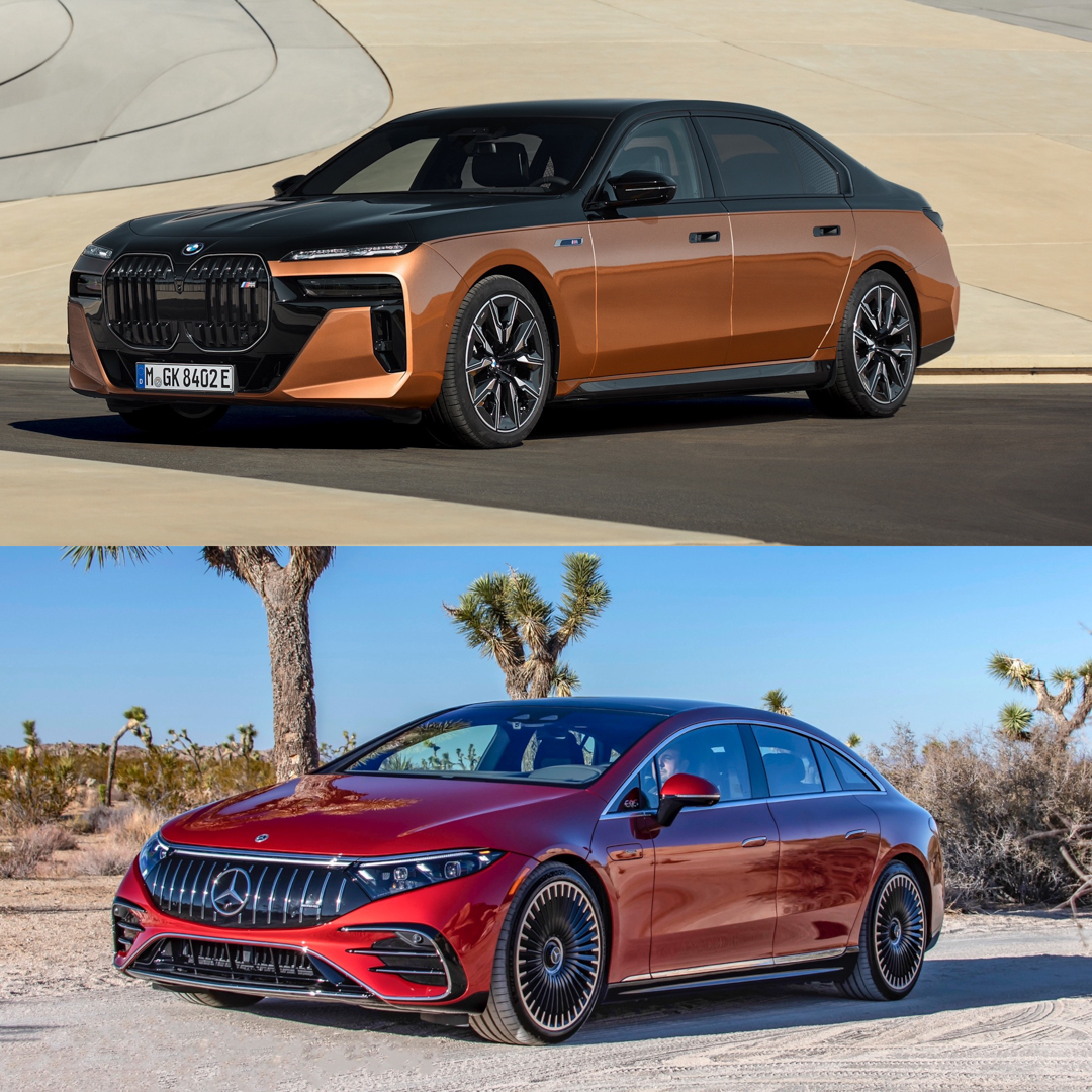
Up Front
BMW’s i7 is at its most controversial up front. Its monster grilles, oddly split headlights, and aggressive front apron are a mixed bag but the main issue is how upright and boxy it is. Whereas the Mercedes is sleek, it’s swoopy, and it’s classy. In many ways, it’s far more conventional than the i7 M70 but that’s OK, as its convention works. So the Mercedes wins this one by default.
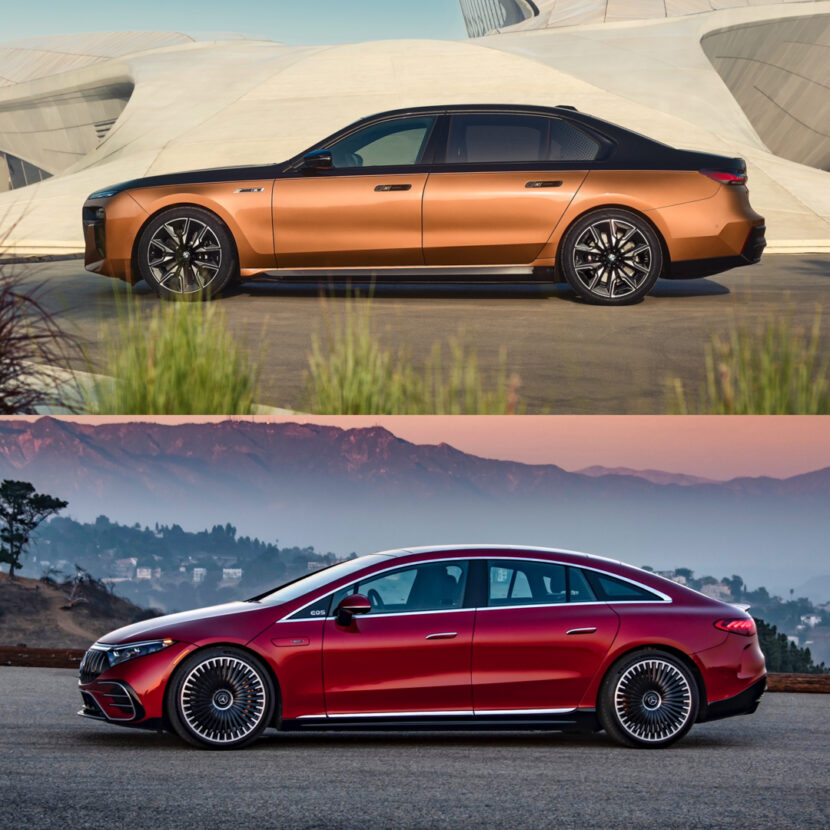
In Profile
Mercedes clearly designed the EQS AMG in a wind tunnel and nothing else. It’s among the most aerodynamic vehicles on the planet and its roofline is a byproduct of that. And it just looks like someone split an egg in half vertically and then just stuck it on wheels. While the BMW i7 M70 has about as much styling as a pair of Costco sweatpants from the side, it’s still better looking than the Mercedes. So the Bimmer gets a shocking point here.
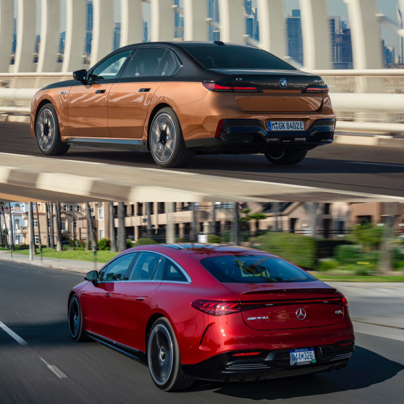
Out Back
I’m having a hard time deciding this one here, as I like neither car from the rear. The BMW i7 M70 has a boxier and sportier butt. However, the Mercedes has an interesting light bar and more curves. So it really comes down to what you’re into. I can’t bring myself to choose one, so it’s a wash.
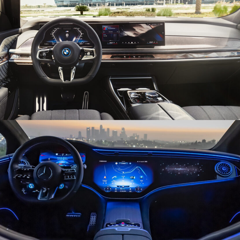
Inside
I never though I’d see the day when BMW has a far more interesting interior design than Mercedes. However, that’s the case with the i7 and EQS, as the former’s cabin is just fantastic looking. It’s sporty, premium, and looks packed with the richest of materials. The EQS AMG is lovely, don’t get me wrong, but I think BMW nailed the design here. The Mercedes is just a bit too screen heavy, which means that it lacks the gorgeous trim work Mercedes is usually known for. Plastic screens aren’t pretty, they aren’t premium, and they don’t make a car feel expensive. It’s impressive spectacle but the i7 absolutely looks more luxurious inside.
Conclusion
According to the scoreboard, BMW won—2.5 points versus 1.5—and it deserved to. It’s actually be designed to look like something, even if that something isn’t exactly pretty. Whereas the Mercedes was designed solely to get absurd aero figures. It does get those but its looks suffer because of it. The Mercedes-AMG EQS is an interesting car and one we hope Mercedes continues to develop it but, as of right now, it’s one of the few cars that can lose a comparison to the i7 M70.


