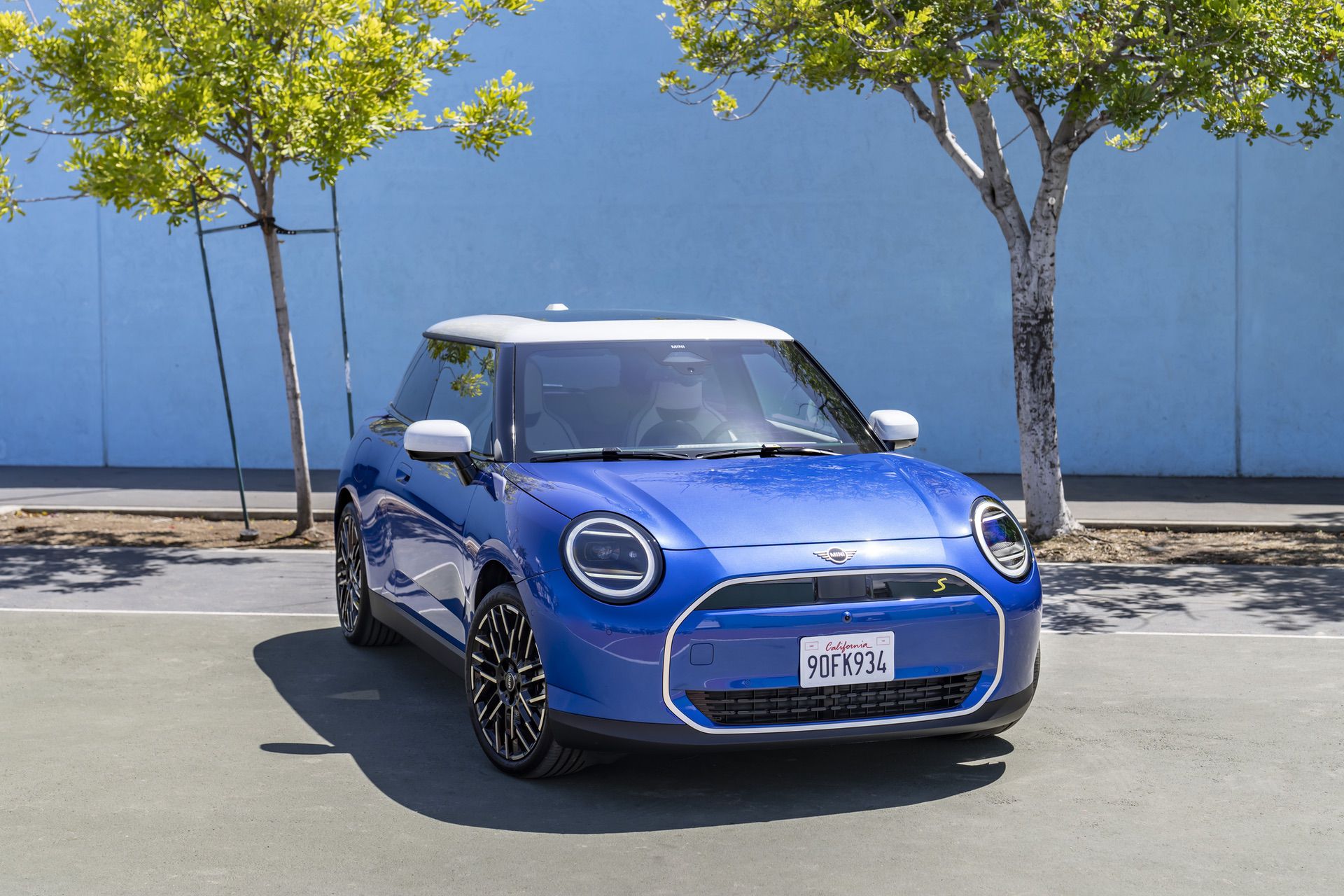
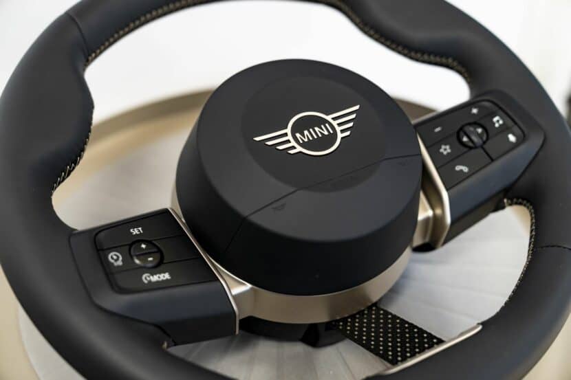
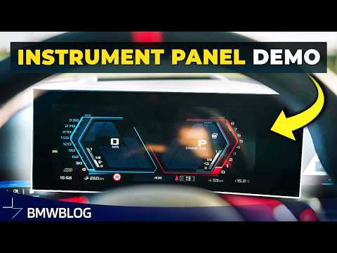
MINI recently revealed the exterior of its upcoming Cooper E electric hatchback early, after some leaked photos had shown it in a less flattering light. The idea was to show what it looks like in high-res and with professional photographers, so as to make it look as good as possible. However, MINI kept the interior a secret, hoping to keep it under wraps until the full official reveal. Unfortunately for MINI, pesky spy photographers make such a task impossible, as some new spy shots show off the new 2025 MINI Cooper E interior and its new infotainment system. (We don’t own the spy photos but they can be seen here)
The big news here is the infotainment system. All 2024 and 2025 MINIs, starting with the Countryman and Cooper E, will get their own version of BMW’s iDrive 9. However, the user interface looks quite a bit different from what we’ve seen of iDrive 8.5, which is already incredibly similar to iDrive 9. So it seems MINI is carving its own path and it’s rather interesting.
For starters, MINI’s infotainment system is built into the massive circular screen mounted in the center of the dash, as with all previous MINIs. However, MINI also moved all driver’s gauges back to the center, deleting the screen from behind the steering wheel, as it’s been since the original MINI. So everything—gauges, infotainment, and system controls—is built into the one circular screen.
From the look of it, though, it looks surprisingly intuitive. All of that packed into one screen sounds a bit messy but MINI seems to have done a good job with the UI, as it looks pretty simple. The very top section of the circle is cut off and looks like it permanently houses the driver info, such as speed, current gear, range, and speed limit. Turn-by-turn navigation instructions may also pop up in there, too. The rest of the screen then houses whatever information the driver is currently accessing, be it media, navigation, or system settings. In the spy photos, you can see the driver is looking through radio stations.
At the bottom, though, there seems to be an iPhone-like pill-shaped window that looks like it will stay there regardless of what else is on the screen. It holds climate, media, home, nav, and phone shortcut icons, so it’s likely there to stay. Underneath that, you can see the exterior ambient temperature and the time. Flanking that pill, toward the outer edges of the circle, are the two climate zone temperatures and controls.
Underneath the circle is a horizontal array of some interesting physical controls. In the center of them is the starter switch. Rather than a push button (like most cars) or a toggle switch (like all current MINIs), the new MINI has a key-like ignition switch. It’s entirely electronic of course but it’s cool to bring back the key-twist motion to start the car. It’s gimmicky but those are the sort of gimmicks that make ownership fun. To the left of the starter switch is a gear-select toggle and to the right is an “Experience” toggle, which is likely for selecting different drive modes, such as Sport or Comfort, or whatever MINI calls them. While I can’t quite make out what’s to the left and right of all of those, it seems as the left-most knob is for volume and the right-most knob is for tuning radio/media tuning, which would be lovely if true. Under all of that, you can see a few helpful physical buttons, such as for the parking sensors, hazard lights, and both defrosters.
The whole setup looks really intuitive actually, far more so than anything I’ve seen from BMW since iDrive 7. And if you don’t like that, there’s still a flip-up head-up display ahead of the driver, like on current MINIs. I’m actually really excited to jump behind the wheel of one of these new MINIs to check it all out.
[Source: Car Scoops]


