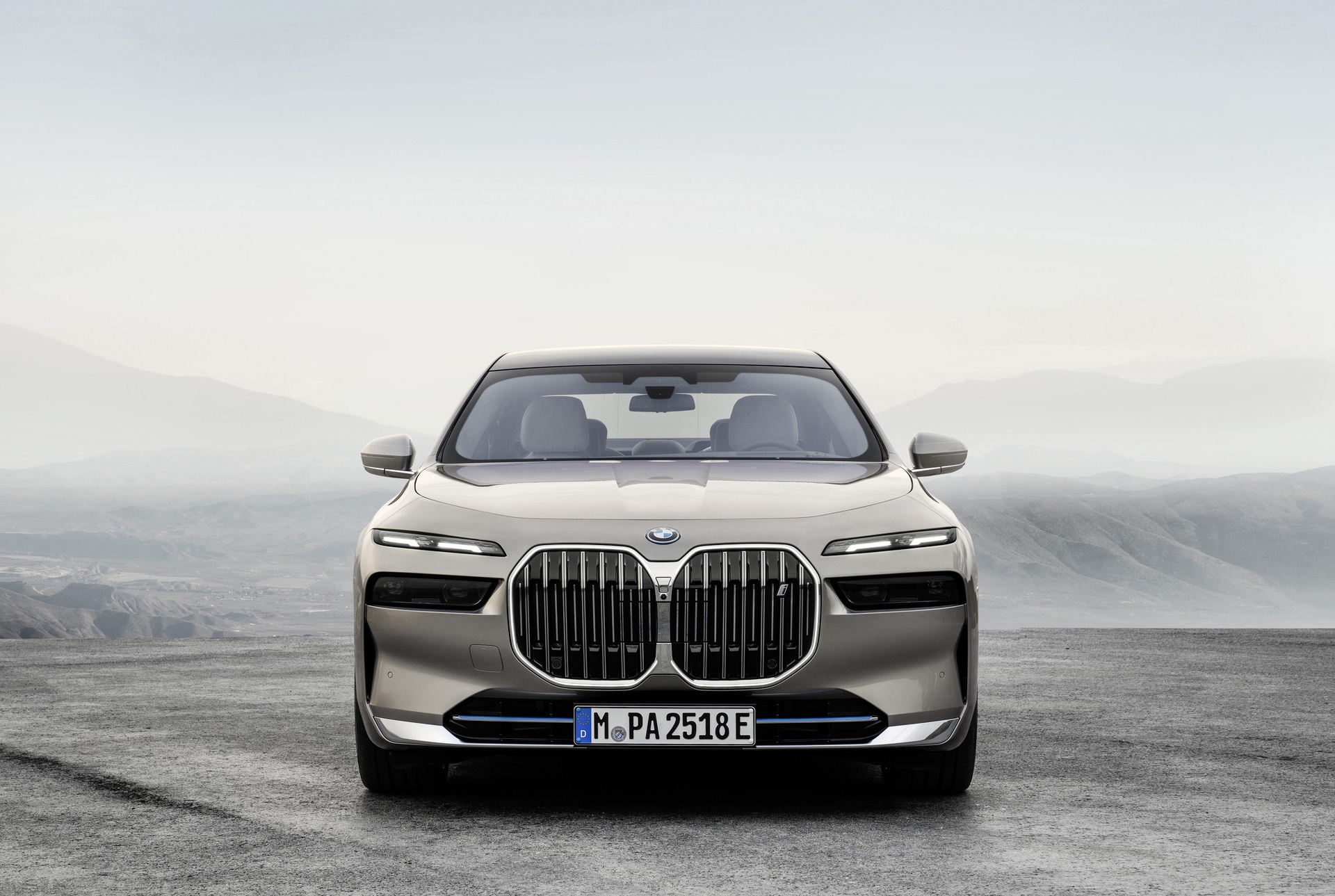
Frank Stephenson certainly isn’t wrong, when he talks about beating the dead horse that is BMW’s kidney grille design. It’s our job to discuss designs of cars but it often feels like kicking someone while they’re down, as every new BMW gets the exact same criticism — the grilles are awful. However, with the new 7 Series, former BMW designer Frank Stephenson isn’t as down on it as he has been on previous modern Bimmers.
In his latest video, Stephenson breaks down the 7 Series’ new design language, talks about what works (and why it works), while also discussing some of its less attractive parts. Obviously, the front end is one such part. Even though Stephenson doesn’t seem to hate the front end, he does feel it could have been better and he even offers some suggestions and shows how they would look with a render.
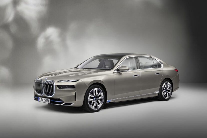
What does he like about the 7 Series? He says it looks like a cohesively designed car, like it’s one single designer’s vision, and that its proportions are good for a luxury car of its size. Also, for the most part, he says it looks and feels like a proper BMW. However, he does feel that BMW could have done the headlights a bit differently.
While he doesn’t hate the new split-headlight design, he feels that BMW could have done away with the split, merged the top half of the split headlights in to the bottom half, and still kept them tinted and semi-hidden. He referenced old-school split-headlights, which were hidden until needed, and how much customers loved those back in the ’80s. He also feels BMW should have shrunken the grille (shocker, I know) but also lowered it, to give the front end a lower, sportier look.
The only thing about the car that really bothers him is the two cut lines just above the headlight, which create a sort of “offset arrowhead” and, once you see them, it’s hard to not see how messy they look.
Overall, though, Stephenson seems to think more highly of the new 7 Series than other recent BMWs, which I guess is progress.


