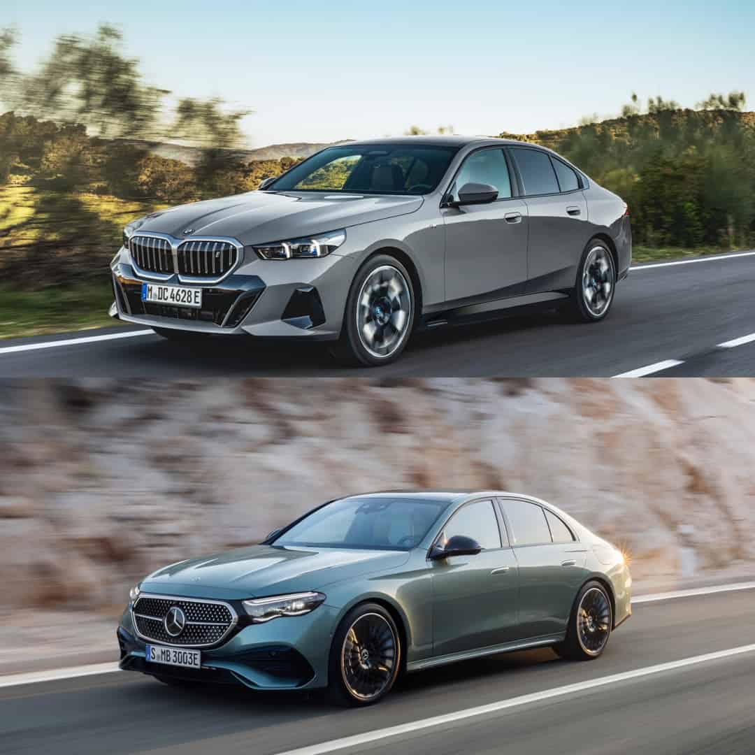
For decades, Mercedes was the more stylish brand, while BMW was the more understated brand. Even when Mercedes was pumping out gloriously boxy Bruno Sacco-penned designs, they were slick and stylish. However, in recent years, Mercedes has smoothed its design language out with pebble-like obscurity. At the same time, BMW has been going for bigger, bolder designs and that’s never been truer than with the new 2024 BMW 5 Series and Mercedes E-Class.
Mercedes debuted its E-Class first and it looks very much like the E-Class it replaces, just with an even smoother design, new headlights, new taillights, and an even more tech-focused interior. The 2024 BMW 5 Series just debuted and it’s shockingly bold in the best way possible. So let’s take a look at how the two cars’ designs stack up.
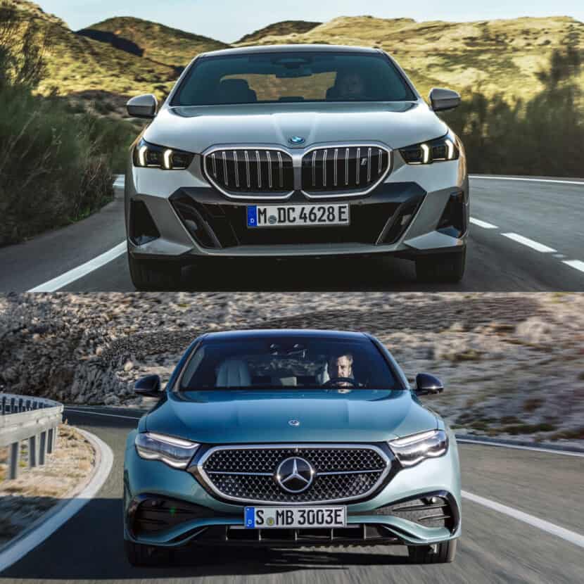
Up Front
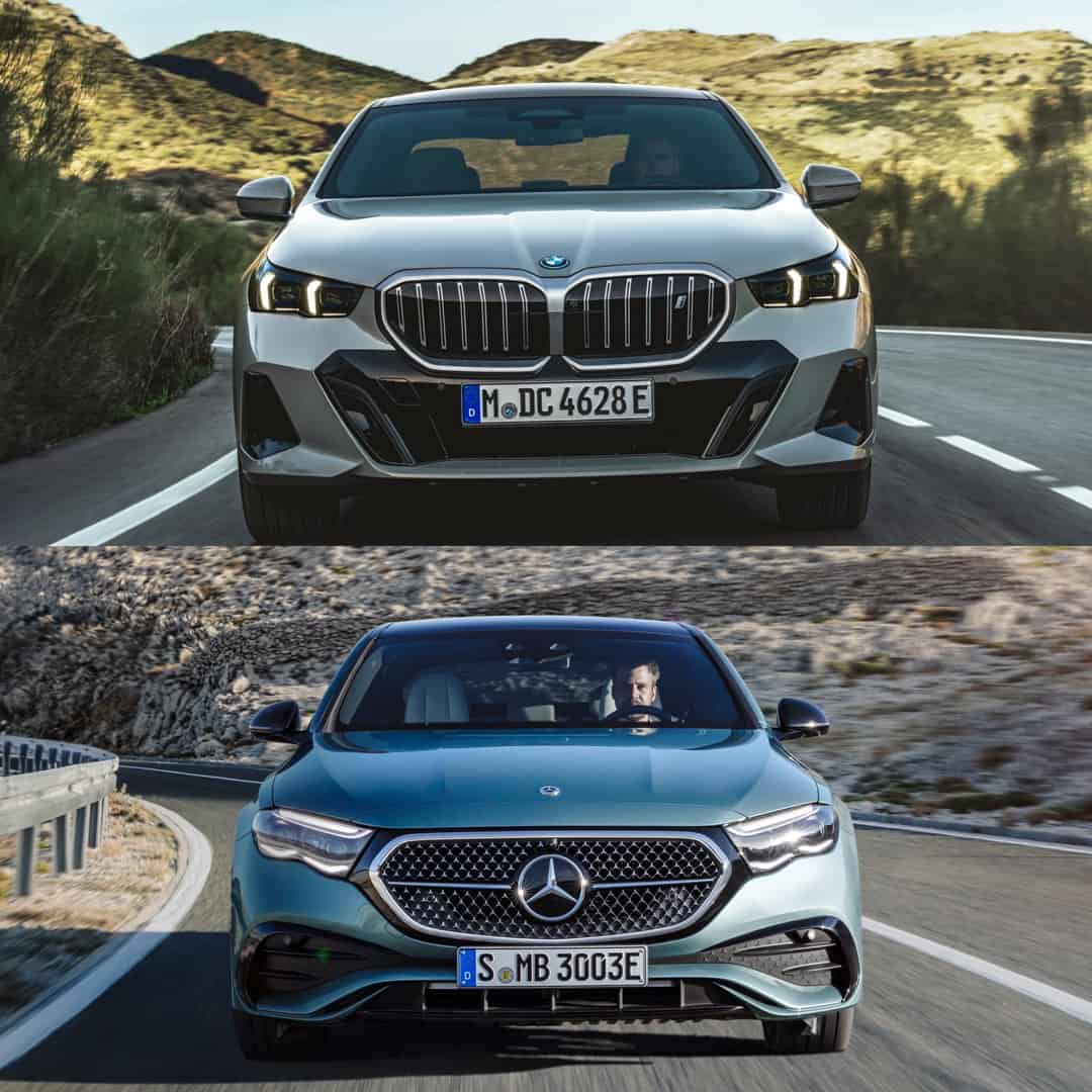
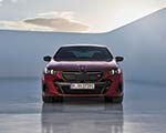
In a weird coincidence, both cars have similarly stepped headlights, with little notches on the bottom. That’s where their similarities end, however. The new 5 Series is sharp, sporty, and futuristic looking. Its kidney grille is still big but it’s downright tiny compared to the brand’s other new models. In contrast with the E-Class, whose single grille is very typically Mercedes, the 5 Series looks exciting and edgy. While the Mercedes is handsome, sophisticated, and understated, it’s a bit too familiar and a bit too boring. So the 5er takes this one.
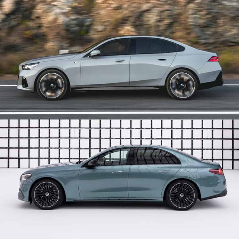
From the Side
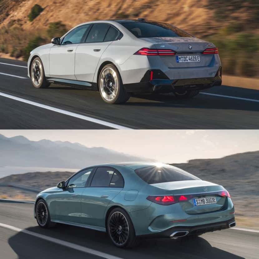
Interestingly, both cars actually have similar silhouettes. Both features low rooflines, aggressive A and C-pillars, and subtle shoulder lines. Again, the Mercedes is smooth and understated, looking like a luxurious executive car. While the 5 Series is sharper, sportier and more aggressive. So both cars are handsome, I’d say that this is a tie and your personal taste will matter more here. If you like sportier cars, you’ll like the 5 Series. If you prefer luxury, go for the E-Class.
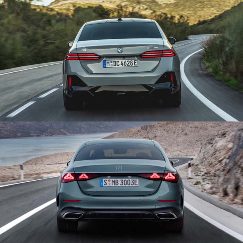
Out Back
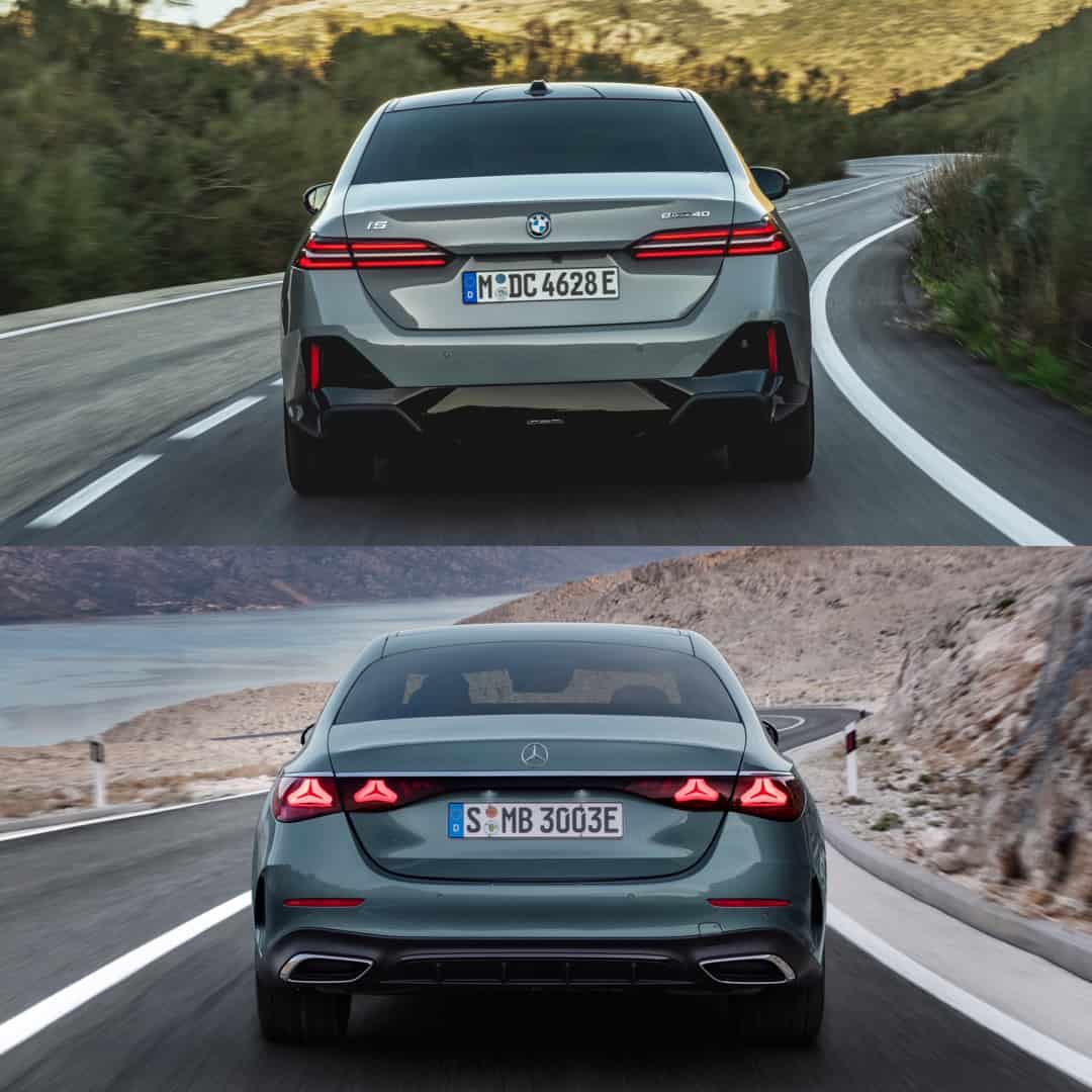
I’ve long been a big lover of Mercedes’s design language but even I can admit that Mercedes doesn’t make the best looking rear ends. They all look sad and droopy, as if they’re melting. The new E-Class follows that trend, as the two points in each of the taillights’ design point downward, which is exacerbated by the triangle LED lighting elements inside. While the Bimmer’s slim, horizontal, dual-LED approach is sharp, slick, and high-tech looking. So the Bimmer wins, here.
Inside
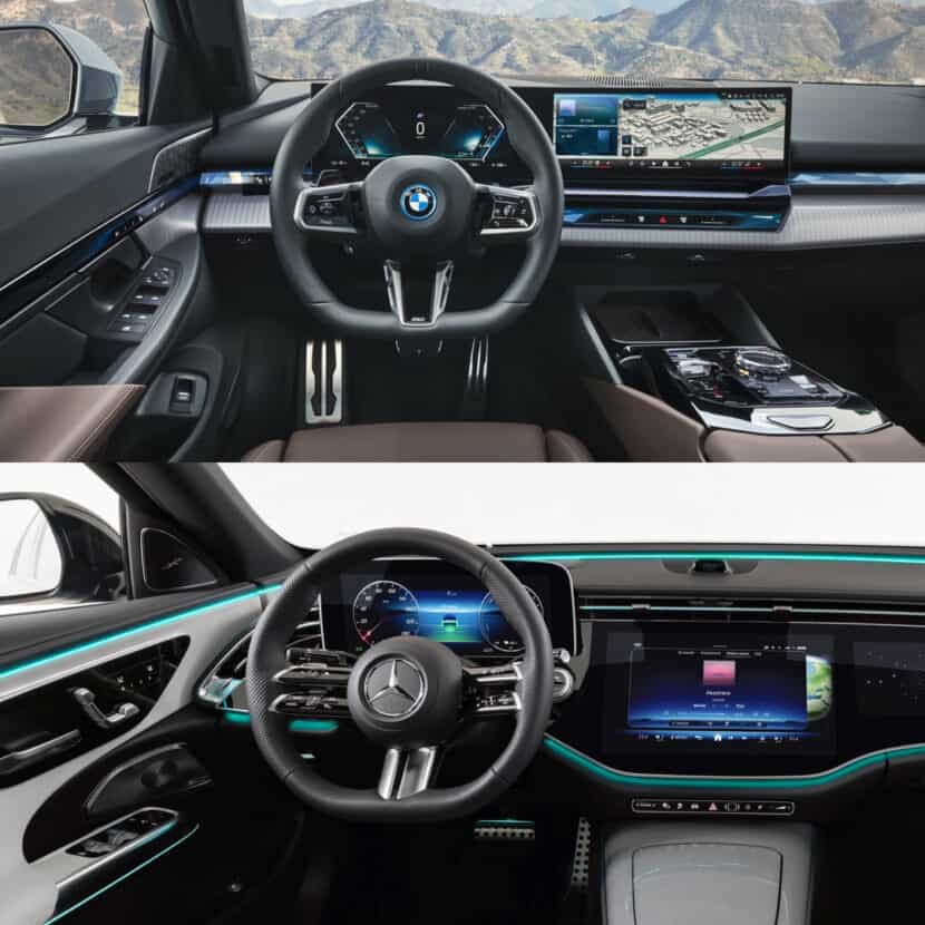
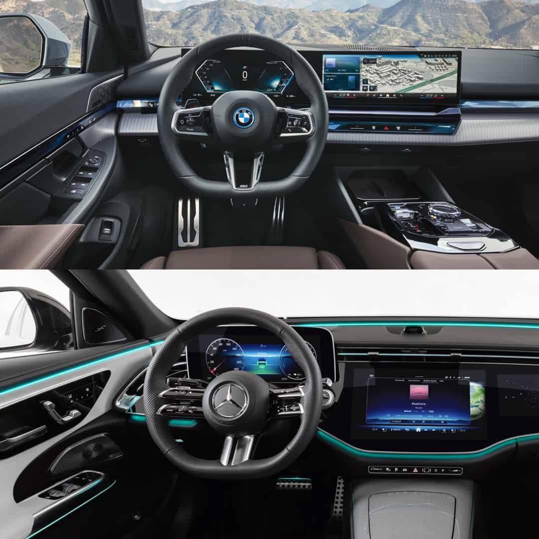
BMW crushed the 7 Series interior design, so it smartly migrated that over to the 5 Series, which looks fabulous inside. It has 90 percent of the fantastic features that make the 7 Series cabin so good, just packed into a tighter, less complex version of the same design. The 5 Series has a variety of different materials, such as real wood, real leather, and real metal. While the Mercedes E-Class has nice materials, its design is domintated by its Hyperscreen, which is just code for a lot of black piano black plastic.
Conclusion
I can’t believe I’m saying this but the BMW 5 Series beat the E-Class’s design. BMW almost always loses design comparisons to Mercedes, whose designs have been consistently excellent for years. However, this time, the tables have turned and now it’s the BMW 5 Series that’s beaten its main rival.


